Wondering how your logo performs? 🧐
Get professional logo reviews in seconds and catch design issues in time.
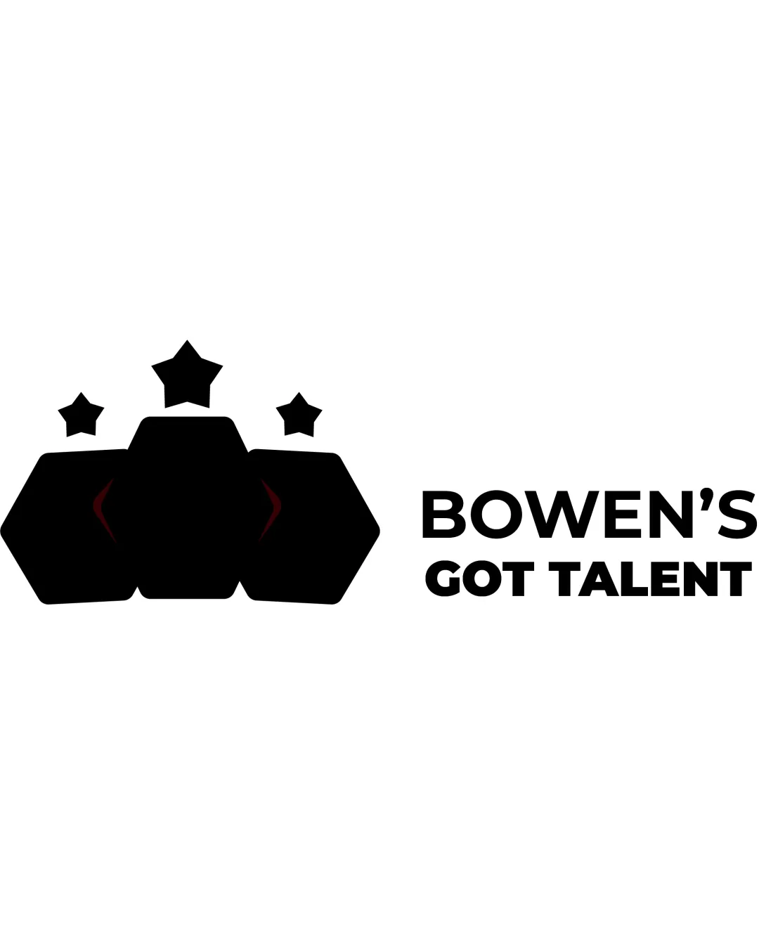
Try it Now!Logo review of BOWEN'S GOT TALENT
 Logo analysis by AI
Logo type:
Style:
Detected symbol:
Detected text:
Business industry:
Review requested by Jeremyjaunty
**If AI can recognize or misinterpret it, so can people.
Structured logo review
Legibility
![]() Clear, bold sans-serif font that is easy to read.
Clear, bold sans-serif font that is easy to read.![]() Excellent contrast between text and background.
Excellent contrast between text and background.
Scalability versatility
![]() Simple shapes and clear text support scalability for print and web.
Simple shapes and clear text support scalability for print and web.![]() Works well for signage, T-shirts, and larger digital applications.
Works well for signage, T-shirts, and larger digital applications.
![]() Hexagonal symbol with stars might lose clarity at very small sizes, such as favicons or embroidery.
Hexagonal symbol with stars might lose clarity at very small sizes, such as favicons or embroidery.![]() Symbol and text separation could be problematic for square or circular applications.
Symbol and text separation could be problematic for square or circular applications.
200x250 px
100×125 px
50×62 px
Balance alignment
![]() Good alignment and spacing between symbol and text.
Good alignment and spacing between symbol and text.![]() Visual hierarchy is established with the symbol on the left and text on the right.
Visual hierarchy is established with the symbol on the left and text on the right.
![]() Symbol feels visually heavier than the text, causing slight imbalance.
Symbol feels visually heavier than the text, causing slight imbalance.![]() Hexagons and stars create a dense mass compared to the clean right-justified text.
Hexagons and stars create a dense mass compared to the clean right-justified text.

Originality
![]() Crown motif is appropriate for a talent show theme.
Crown motif is appropriate for a talent show theme.
![]() Symbols (stars, hexagons) are common and not uniquely integrated.
Symbols (stars, hexagons) are common and not uniquely integrated.![]() Overall design feels generic and lacks a distinctive feature or twist.
Overall design feels generic and lacks a distinctive feature or twist.
Logomark wordmark fit
![]() General style is consistent between bold symbol and font.
General style is consistent between bold symbol and font.
![]() Logomark is visually much heavier than the wordmark, causing disconnect.
Logomark is visually much heavier than the wordmark, causing disconnect.![]() The geometric motif does not complement the rounded, friendly wordmark as cohesively as it could.
The geometric motif does not complement the rounded, friendly wordmark as cohesively as it could.
Aesthetic look
![]() Clean, modern aesthetic with minimal clutter.
Clean, modern aesthetic with minimal clutter.![]() Sensible black-and-white palette.
Sensible black-and-white palette.
![]() Arrangement is visually busy due to three stars and hexagons.
Arrangement is visually busy due to three stars and hexagons.![]() Lacks visual refinement and comes off as slightly generic.
Lacks visual refinement and comes off as slightly generic.
Dual meaning and misinterpretations
![]() No inappropriate or controversial imagery detected.
No inappropriate or controversial imagery detected.
Color harmony
![]() Limited to two high-contrast colors, suitable for branding.
Limited to two high-contrast colors, suitable for branding.
Black
#000000
White
#FFFFFF