Wondering how your logo performs? 🧐
Get professional logo reviews in seconds and catch design issues in time.
Try it Now!Logo review of BOWEN'S GOT TALENT
 Logo analysis by AI
Logo type:
Style:
Detected symbol:
Detected text:
Business industry:
Review requested by Jeremyjaunty
**If AI can recognize or misinterpret it, so can people.
Structured logo review
Legibility
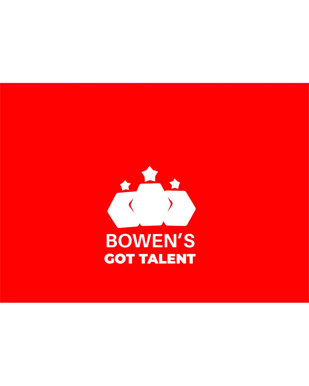
Text is clear, high contrast white on red background
Font is bold and easy to read
Scalability versatility
Simple shapes and clear text provide reasonable clarity at moderate sizes
Works on signage, posters, or digital banners
Small details in the crown shape and the stars could be lost at very small sizes such as favicons or embroidery
Stacked elements may become crowded or illegible in minimal formats

200x250 px

100×125 px

50×62 px
Balance alignment
Central alignment provides a strong, intentional focus
Text is well positioned below the symbol, maintaining hierarchy
Stars above the crown introduce some vertical imbalance and excess negative space at the top


Originality
Geometric crown concept attempts to integrate industry relevance
Crown and stars motif is overused in entertainment logos
No distinct, unique stylistic interpretation of the crown
Logomark wordmark fit
Both logomark and wordmark use bold lines, good stylistic unity
The modern geometric approach is consistent throughout
Relative sizing could be adjusted; the symbol slightly overpowers the text
Aesthetic look
Clean execution and limited color scheme feel modern
Consistent use of geometric shapes
Generic appearance due to overused crown/stars visual
Heavy red background can overwhelm and reduce subtlety
Dual meaning and misinterpretations
Overall clear representation of crown and stars, matches entertainment industry
Hexagon arrangement could be interpreted as abstract or disconnected from brand intent by some viewers
Color harmony
Strong, simple red and white palette is highly legible and unified
Red
#FF0000
White
#FFFFFF

