Wondering how your logo performs? 🧐
Get professional logo reviews in seconds and catch design issues in time.
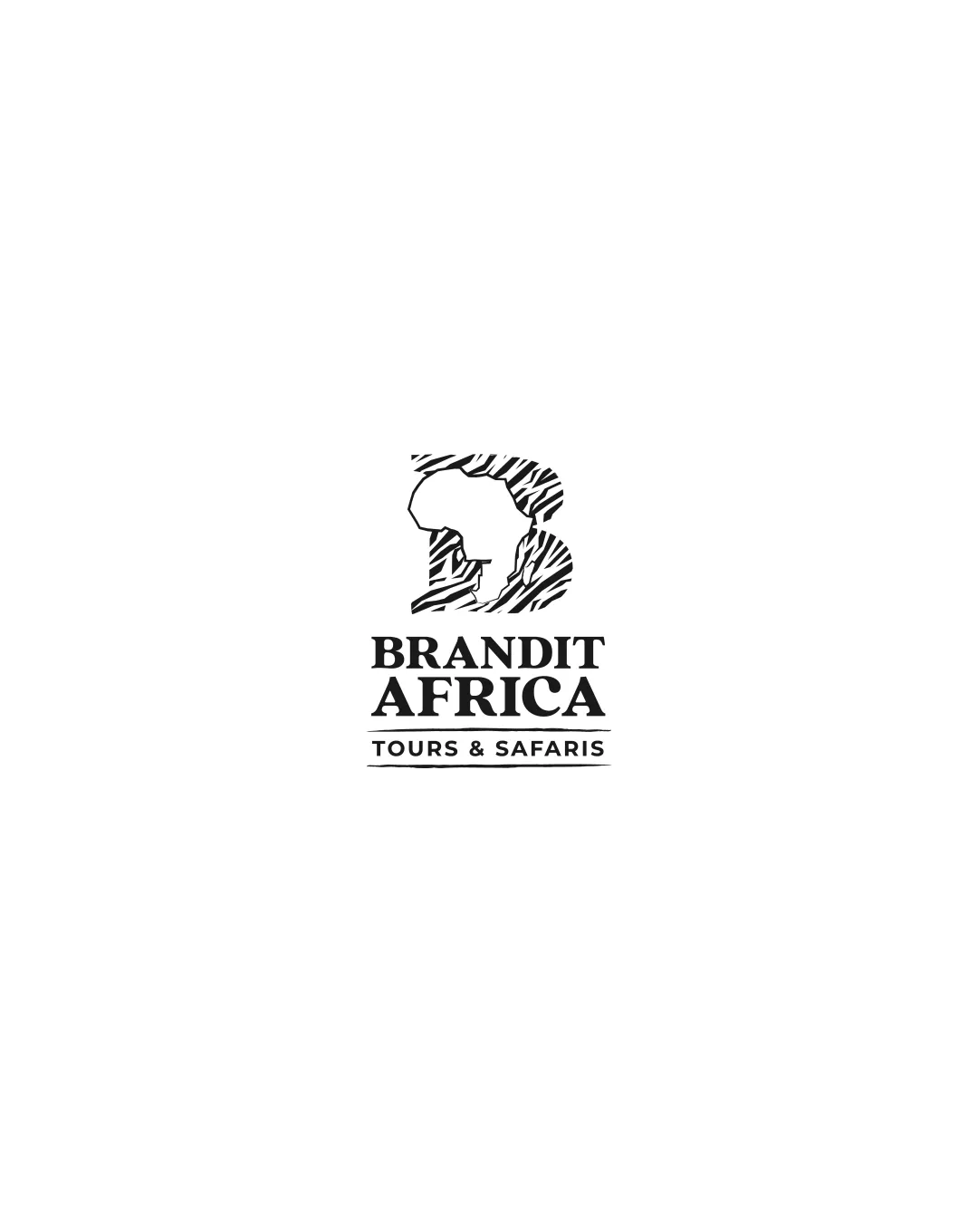
Try it Now!Logo review of BRANDIT AFRICA TOURS & SAFARIS
 Logo analysis by AI
Logo type:
Style:
Detected symbol:
Negative space:
Detected text:
Business industry:
Review requested by GazzaMcSteez
**If AI can recognize or misinterpret it, so can people.
Structured logo review
Legibility
![]() Text is clear, bold, and easily readable even at smaller sizes
Text is clear, bold, and easily readable even at smaller sizes![]() Strong contrast between typography and background enhances legibility
Strong contrast between typography and background enhances legibility
Scalability versatility
![]() Logo mark and wordmark are distinct and will scale well on digital formats and print like brochures and signage
Logo mark and wordmark are distinct and will scale well on digital formats and print like brochures and signage![]() Simple monochromatic palette aids in versatility
Simple monochromatic palette aids in versatility
![]() Fine zebra line details in the logomark may be lost at very small scales, such as on favicon or embroidery
Fine zebra line details in the logomark may be lost at very small scales, such as on favicon or embroidery
200x250 px
100×125 px
50×62 px
Balance alignment
![]() Excellent vertical and horizontal alignment between logomark and wordmark
Excellent vertical and horizontal alignment between logomark and wordmark![]() Proportions between each section are well considered and visually balanced
Proportions between each section are well considered and visually balanced

Originality
![]() Creative integration of continent silhouette and zebra stripes into the 'B' offers a distinctive touch
Creative integration of continent silhouette and zebra stripes into the 'B' offers a distinctive touch![]() Original approach for the travel and safari industry context
Original approach for the travel and safari industry context
![]() Using the African continent shape is fairly common for this industry, but the 'B' and zebra pattern elevate it somewhat above cliché
Using the African continent shape is fairly common for this industry, but the 'B' and zebra pattern elevate it somewhat above cliché
Logomark wordmark fit
![]() Typography is strong and matches the boldness of the logomark
Typography is strong and matches the boldness of the logomark![]() Consistent style and weighting unite the logomark and wordmark visually
Consistent style and weighting unite the logomark and wordmark visually
Aesthetic look
![]() Clean, modern, and professional look
Clean, modern, and professional look![]() Elegant use of monochrome and zebra stripes creates an appealing and geographically relevant design
Elegant use of monochrome and zebra stripes creates an appealing and geographically relevant design
Dual meaning and misinterpretations
![]() No inappropriate or confusing symbolism detected
No inappropriate or confusing symbolism detected
Color harmony
![]() Sophisticated and universal black and white palette
Sophisticated and universal black and white palette![]() Monochrome ensures excellent application across various media
Monochrome ensures excellent application across various media
Black
#000000
White
#FFFFFF