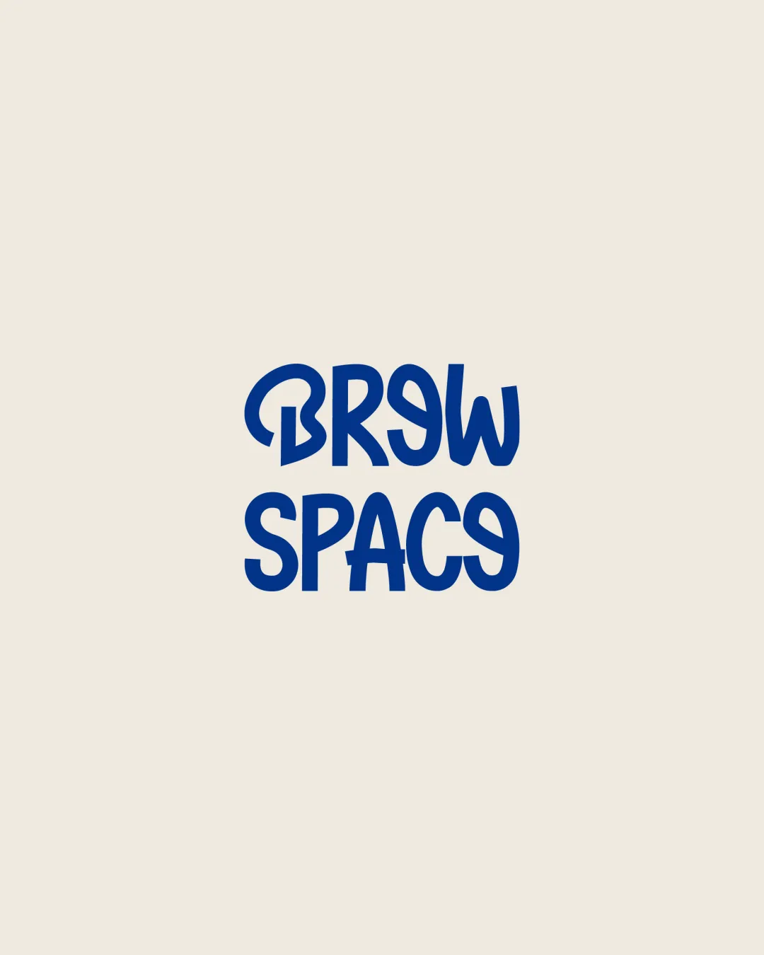
BREW SPACE logo review
3.0 / 5
Logo score
Logo review of

Brew Space

The logo stands out for its energy and uniqueness, but needs increased clarity in letterforms for professional use.

Wordmark Playful, Hand-drawn, Modern Cafe Or Coworking Space
2.5/5
Legibility
4/5
Originality
4/5
Misread
3/5
Balance
3/5
Scale
Action plan

What to fix first

The most important fixes to handle before polishing the full presentation.

1

Simplify the most distorted letters (especially 'E', 'A', and 'C') while preserving the playful vibe.

High priority

Quick readability is critical for wordmarks, especially at a glance.

Impact: Improves Legibility Without Sacrificing Originality. · Effort: Medium

2

Test logo in smaller sizes and across various backgrounds.

Medium priority

Will help confirm the logo’s impact and legibility at all scales.

Impact: Ensures Versatility And Visual Clarity In Practical Uses. · Effort: Low

Detailed review

Logo performance breakdown

2.5/5

Legibility

Checkmark icon Energetic and original type style.

Warning icon Certain letters (notably 'E', 'A', and 'C') are hard to recognize at a glance, hurting quick readability.

4/5

Originality

Checkmark icon Highly distinctive letter construction.
Checkmark icon Playful, non-generic style.

Warning icon Letter distortion risks confusion.

3.5/5

Color harmony

Checkmark icon Strong contrast; blue on cream is legible and contemporary.

Warning icon Limited palette may restrict some applications.

Blue
#123D94

Cream
#F8F6ED

Your palette is close. Refine the color roles and combinations before updating the logo.

Build brand colors
3/5

Balance alignment

Checkmark icon Consistent letter height and spacing between lines.

Warning icon Irregular letter forms create a visually uneven edge; some letters feel disproportionately wide.

logo 200x250 pixels scalability test alignment grid overlay
3/5

Scalability

Checkmark icon Bold strokes allow for small-scale usage.

Warning icon Unusual shapes may blur at tiny sizes or be harder to decipher, particularly in the second word.

logo 200x250 pixels scalability test

200x250 px

logo 100x125 pixels scalability test

100×125 px

logo 50x62 pixels scalability test

50×62 px

4/5

Misinterpretations

Checkmark icon No negative or confusing secondary meanings.

Brief match

Checkmark icon Creativity/energy: The logo style conveys a lively, informal feeling suited for a modern social or workspace brand.

Try your own review

Wondering how your logo performs?

Get a clear logo score, key risks, and priority fix ideas before your client or audience sees it.

Review my logo