Wondering how your logo performs? 🧐
Get professional logo reviews in seconds and catch design issues in time.
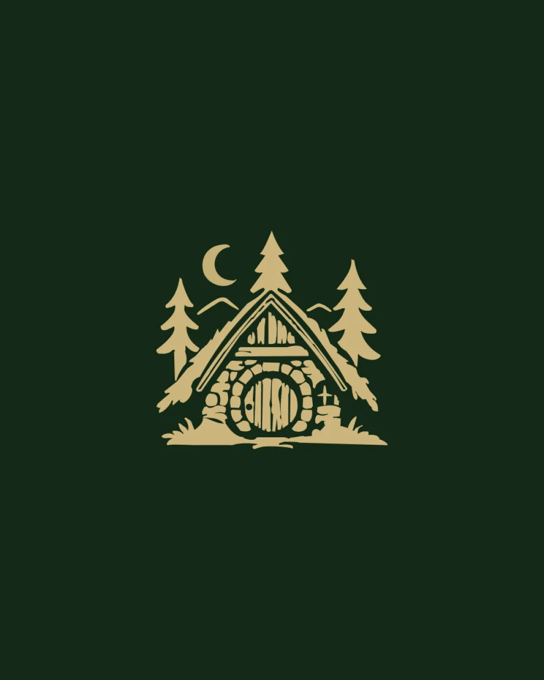
Try it Now!Logo review of cabin or house with round wooden door, pine trees,..
 Logo analysis by AI
Logo type:
Style:
Detected symbol:
Business industry:
Review requested by Thiago25_
**If AI can recognize or misinterpret it, so can people.
Structured logo review
Scalability versatility
![]() Single color scheme increases adaptability for different backgrounds.
Single color scheme increases adaptability for different backgrounds.![]() Readable symbol at medium sizes; works on signage, web, merchandise.
Readable symbol at medium sizes; works on signage, web, merchandise.
![]() Numerous thin lines and small interior details risk being lost at small scales (e.g., favicon, embroidery).
Numerous thin lines and small interior details risk being lost at small scales (e.g., favicon, embroidery).![]() Intricate illustration makes it harder to reproduce crisply in very small or single-color contexts.
Intricate illustration makes it harder to reproduce crisply in very small or single-color contexts.
200x250 px
100×125 px
50×62 px
Balance alignment
![]() Symmetrical composition provides a strong visual anchor.
Symmetrical composition provides a strong visual anchor.![]() Trees and moon balance the scene horizontally and vertically.
Trees and moon balance the scene horizontally and vertically.
![]() Moon and tree positioning introduces slight asymmetry to the upper portion.
Moon and tree positioning introduces slight asymmetry to the upper portion.![]() Complexity toward the center may make the bottom feel visually heavier.
Complexity toward the center may make the bottom feel visually heavier.

Originality
![]() Custom, illustrative style departs from typical generic cabin icons.
Custom, illustrative style departs from typical generic cabin icons.![]() Inclusion of the moon and environmental detail adds uniqueness.
Inclusion of the moon and environmental detail adds uniqueness.
![]() Cabin-in-the-woods is a somewhat common hospitality/camping trope.
Cabin-in-the-woods is a somewhat common hospitality/camping trope.
Aesthetic look
![]() Charming, warm, and approachable atmosphere matches rustic/lodge aesthetics.
Charming, warm, and approachable atmosphere matches rustic/lodge aesthetics.![]() Color choice is subtle and appropriately earthy.
Color choice is subtle and appropriately earthy.
![]() Detail level can become visually overwhelming, especially in small formats.
Detail level can become visually overwhelming, especially in small formats.![]() Busy interior lines reduce minimalism.
Busy interior lines reduce minimalism.
Dual meaning and misinterpretations
![]() No inappropriate symbols or misinterpretations detected.
No inappropriate symbols or misinterpretations detected.![]() Design reads clearly as a rustic cabin in context.
Design reads clearly as a rustic cabin in context.
Color harmony
![]() Strong, harmonious contrast between the gold and dark green.
Strong, harmonious contrast between the gold and dark green.![]() Limited color palette supports broad applications and print methods.
Limited color palette supports broad applications and print methods.
Teak
#D8C27A
Green
#112611