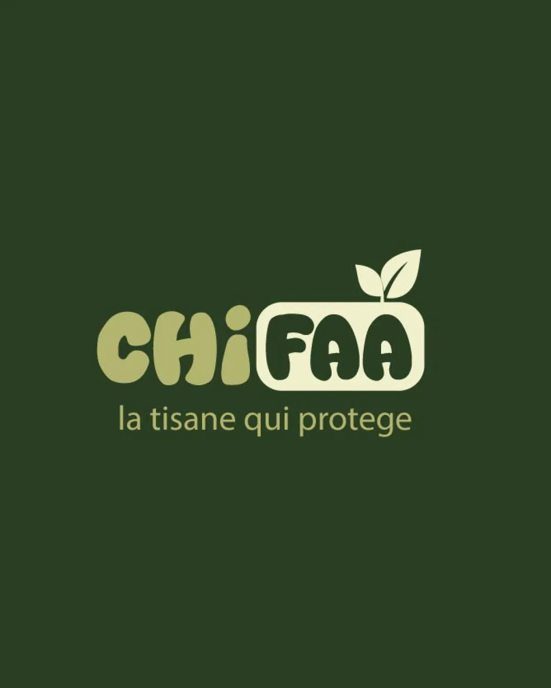
CHIFAA la tisane qui protege logo review
4/5
Logo score
Logo review of

Chifaa La Tisane Qui Protege

A well-aligned organic logo concept with minor size and balance tweaks needed for optimal use.

Combination Mark Rounded, Organic, Friendly Tea, Herbal Remedies, Wellness
4/5
Legibility
4/5
Originality
5/5
Misread
4/5
Balance
3/5
Scale
Your next steps

What to fix first

Focus on the changes that matter. Keep what makes the logo work.

1

Tagline

Increase tagline weight or test larger size for better readability at small scales.

Optional refinement High priority Low effort
Area to inspectApproximate location

The tagline is relatively small and uses a thin, light font which may lose clarity when scaled down.

How to check

Print the logo at business card and social icon sizes to confirm tagline legibility.

See the category review
2

Leaf and rectangular mark

Slightly adjust the leaf angle or size to improve overall symmetry and visual weight.

Optional refinement Medium priority Low effort
Area to inspectApproximate location

The leaf emerging from the top right could be more visually balanced with the rest of the logomark.

How to check

Visually compare the logo before and after adjustment to ensure a more harmonious silhouette.

See the category review
Detailed review

Logo performance breakdown

4/5

Brief & logo match

Based on an inferred industry
Compared with

Herbal tea or wellness product leveraging nature and protection cues.

Logo clearly communicates an herbal wellness product, but tagline size could improve for broader utility.

  • Botanical/natural Theme

    The leaf symbol and green color scheme directly communicate a natural, plant-based product.

  • Product Protection/safety

    The tagline 'la tisane qui protege' and the soft, guarded letterforms support a sense of care and wellbeing.

4/5

Legibility

  • Wordmark is clear and friendly
  • Primary name stands out from tagline
  • The tagline is relatively small and uses a thin, light font which may lose clarity when scaled down.

    Optional refinement Tagline

    Try: Increase tagline weight or test larger size for better readability at small scales.

    Check: Print the logo at business card and social icon sizes to confirm tagline legibility.

    Area to inspectApproximate location
4/5

Originality

  • Custom blend of typography and botanically-themed mark
  • Leaf device adds distinctive flair
5/5

Color harmony

  • Natural palette feels appropriate and harmonious
  • Good contrast between elements
OliveGreen#424F2C
PaleYellowGreen#E6E7AF

Estimated colors. Use the original design file for exact values.

Create a full color palette using these colors

Create new palette
4/5

Balance alignment

  • Organic shapes complement each other
  • Overall well-centered composition
  • The leaf emerging from the top right could be more visually balanced with the rest of the logomark.

    Optional refinement Leaf and rectangular mark

    Try: Slightly adjust the leaf angle or size to improve overall symmetry and visual weight.

    Check: Visually compare the logo before and after adjustment to ensure a more harmonious silhouette.

    Area to inspectApproximate location
Uploaded logoAlignment guide overlay

Inspect spacing with the guide. Optical balance may differ from geometric centering.

3/5

Scalability

  • Simple forms favor scaling
  • Potential single-color adaptation
  • Fine detail in the leaf and rounded rectangle might blur at very small sizes or in single-color use.

    Worth testing Overall logo (especially leaf detail)

    Try: Test in single color and at small sizes to confirm all shapes remain clear.

    Check: Produce mockups at 24px and in monochrome to ensure recognizability.

Uploaded logo at 200 pixels wide
200 × 250 px
Uploaded logo at 100 pixels wide
100 × 125 px
Uploaded logo at 50 pixels wide
50 × 63 px

Compare the detail at different sizes. Labels show the full image dimensions.

5/5

Misinterpretations

  • No unintended or distracting alternate readings detected
5/5

Symbol & text fit

  • Mark and wordmark are tightly integrated
  • Botanical mark reinforces product positioning

Black & white

Does the shape still work without color?

These tests are available only for logos uploaded in vector (SVG) format.

Background contrast

Find the surfaces where your logo stays clear.

These tests are available only for logos uploaded in vector (SVG) format.

Blur & silhouette

A 3px blur softens fine details so you can check whether the overall shape stays recognizable. If key gaps close or elements merge, the logo may rely too heavily on detail.

These tests are available only for logos uploaded in vector (SVG) format.

Try your own review

Wondering how your logo performs?

Get a clear logo score, key risks, and priority fix ideas before your client or audience sees it.

Review my logo