Wondering how your logo performs? 🧐
Get professional logo reviews in seconds and catch design issues in time.
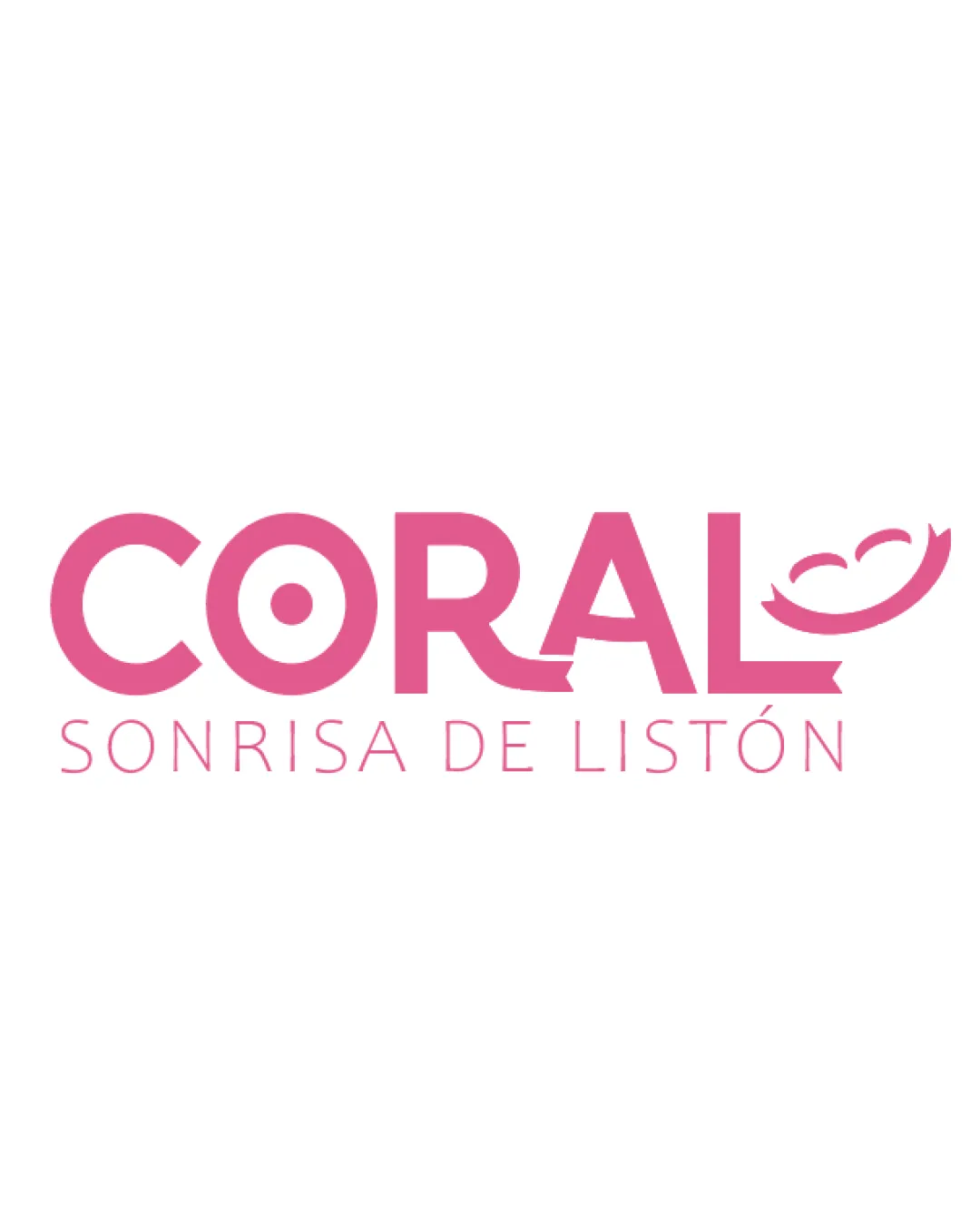
Try it Now!Logo review of CORAL SONRISA DE LISTÓN
 Logo analysis by AI
Logo type:
Style:
Detected symbol:
Negative space:
Detected text:
Business industry:
Review requested by Nannu
**If AI can recognize or misinterpret it, so can people.
Structured logo review
Legibility
![]() Text is clear and readable
Text is clear and readable![]() Contrasting color between text and background enhances visibility
Contrasting color between text and background enhances visibility
![]() The ribbon design on the 'L' and graphics above it could be slightly confusing at smaller sizes
The ribbon design on the 'L' and graphics above it could be slightly confusing at smaller sizes![]() Thinness in subtitle may reduce readability in small applications
Thinness in subtitle may reduce readability in small applications
Scalability versatility
![]() Simple forms ensure some scalability
Simple forms ensure some scalability![]() Logo works on digital and basic print materials
Logo works on digital and basic print materials
![]() Ribbon smile detail and thin subtitle are likely to lose clarity or disappear on smaller formats like product labels or business cards
Ribbon smile detail and thin subtitle are likely to lose clarity or disappear on smaller formats like product labels or business cards![]() The smile symbol may not be clear as a favicon or social profile pic
The smile symbol may not be clear as a favicon or social profile pic
200x250 px
100×125 px
50×62 px
Balance alignment
![]() Text and symbol are horizontally aligned
Text and symbol are horizontally aligned![]() Subtitle is centered beneath the main text
Subtitle is centered beneath the main text
![]() Ribbon smile on the right adds visual weight, making the right side slightly heavier
Ribbon smile on the right adds visual weight, making the right side slightly heavier![]() The O’s target-like mark creates a busy element against the otherwise simple type
The O’s target-like mark creates a busy element against the otherwise simple type

Originality
![]() Unique integration of a smile ribbon into the letter 'L'
Unique integration of a smile ribbon into the letter 'L'![]() Target symbolism adds a distinctive touch to the O
Target symbolism adds a distinctive touch to the O
![]() Ribbon smile feels somewhat expected for a brand about smiles
Ribbon smile feels somewhat expected for a brand about smiles![]() Target in the O is a common geometric detail and does not strongly differentiate the logo
Target in the O is a common geometric detail and does not strongly differentiate the logo
Logomark wordmark fit
![]() The smile ribbon flows naturally from the text, maintaining cohesiveness
The smile ribbon flows naturally from the text, maintaining cohesiveness![]() Both components share the same color and style
Both components share the same color and style
![]() Slight dissonance between geometric simplicity and the decorative ribbon; refining the smile mark could enhance harmony
Slight dissonance between geometric simplicity and the decorative ribbon; refining the smile mark could enhance harmony
Aesthetic look
![]() The logo feels approachable and cheerful
The logo feels approachable and cheerful![]() Soft color palette is inviting
Soft color palette is inviting
![]() Target in the O can make it look busy
Target in the O can make it look busy![]() Overall design verges on cliché for the dental or healthcare sector
Overall design verges on cliché for the dental or healthcare sector
Dual meaning and misinterpretations
![]() No inappropriate or unintended symbolism detected
No inappropriate or unintended symbolism detected
Color harmony
![]() Consistent and harmonious use of one primary color
Consistent and harmonious use of one primary color![]() Monochromatic color palette maintains clarity
Monochromatic color palette maintains clarity
Cerise Pink
#EA619A
White
#FFFFFF


