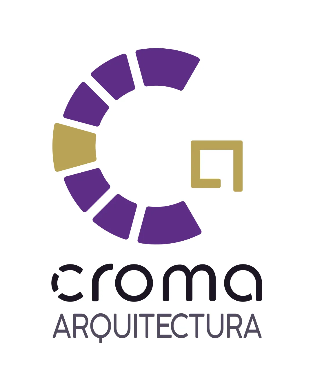
croma ARQUITECTURA logo review
4.0 / 5
Logo score
Logo review of

Croma Arquitectura

Solid, industry-fit logo; refining wordmark and boosting uniqueness would elevate impact.

Combination Mark Modern Geometric Architecture
4/5
Legibility
3/5
Originality
5/5
Misread
5/5
Balance
4/5
Scale
Action plan

What to fix first

The most important fixes to handle before polishing the full presentation.

1

Refine the 'croma' wordmark for slightly improved readability at small sizes

Medium priority

Minor intrusions in the letters may hinder clarity at smaller scales.

Impact: Medium · Effort: Low

2

Explore unique twists or architectural details in the segmented mark to increase originality

Medium priority

Current 'C' shape is visually strong but leans generic for the sector.

Impact: Medium · Effort: Medium

Detailed review

Logo performance breakdown

4/5

Legibility

Checkmark icon 'ARQUITECTURA' is clear and readable
Checkmark icon Main 'croma' logotype is visually distinct

Warning icon Small breaks in 'croma' text may cause minor readability issues at small sizes

3/5

Originality

Checkmark icon Segmented 'C' is recognizable with architecture-inspired geometric flavor

Warning icon Mark is somewhat generic and similar to many tech/design logos

5/5

Color harmony

Checkmark icon Purple and gold provide strong, sophisticated contrast
Checkmark icon Consistent palette across mark and type

Purple
#593187

Gold
#B69A4B

Charcoal
#47474A

5/5

Balance alignment

Checkmark icon Excellent centering of mark and text
Checkmark icon Clear hierarchy between wordmark and descriptor

logo 200x250 pixels scalability test alignment grid overlay
4/5

Scalability

Checkmark icon Simple geometric elements scale well
Checkmark icon Monochrome version would remain clear

Warning icon 'croma' breaks may clutter at extremely small sizes

logo 200x250 pixels scalability test

200x250 px

logo 100x125 pixels scalability test

100×125 px

logo 50x62 pixels scalability test

50×62 px

5/5

Misinterpretations

Checkmark icon No inappropriate or confusing secondary visual meanings detected

Beta

No AI design signals found

Likely designed by a human

Construction and typography appear deliberate with no generative artifacts detected.

  • Consistent geometry in mark and wordmark
  • No malformed or incoherent letterforms

Visual assessment; not definitive proof of authorship.

5 / 5

Logo structure & brief match

Checkmark icon Circular motif harmonizes well with rounded font

Checkmark icon Industry: The geometric motif and modern type are suitable for an architecture studio, conveying structure and creativity.

Try your own review

Wondering how your logo performs?

Get a clear logo score, key risks, and priority fix ideas before your client or audience sees it.

Review my logo