Wondering how your logo performs? 🧐
Get professional logo reviews in seconds and catch design issues in time.
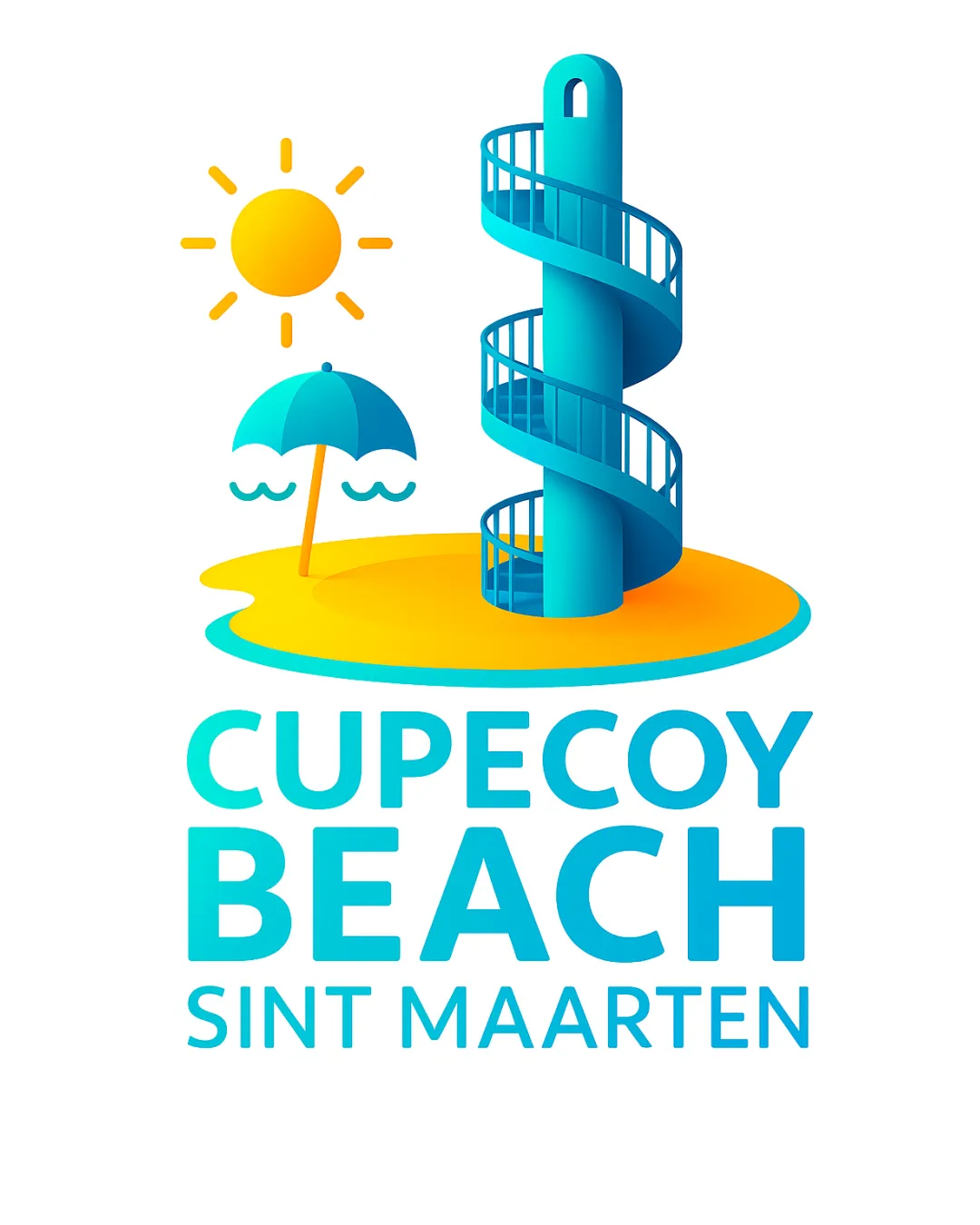
Try it Now!Logo review of CUPECOY BEACH SINT MAARTEN
 Logo analysis by AI
Logo type:
Style:
Detected symbol:
Detected text:
Business industry:
Review requested by RosalynRainbow
**If AI can recognize or misinterpret it, so can people.
Structured logo review
Legibility
![]() Text is large, clear, and well-kerned, making it very readable at various sizes.
Text is large, clear, and well-kerned, making it very readable at various sizes.![]() High color contrast between the text and background ensures maximum legibility.
High color contrast between the text and background ensures maximum legibility.
Scalability versatility
![]() Text element is scalable and would work on signage, t-shirts, and posters.
Text element is scalable and would work on signage, t-shirts, and posters.
![]() Complex illustration with spiral details and multi-color gradients will lose detail and clarity at small sizes (e.g., favicons, embroidery, business cards).
Complex illustration with spiral details and multi-color gradients will lose detail and clarity at small sizes (e.g., favicons, embroidery, business cards).![]() Logo will not reproduce well in single-color formats or on restricted surfaces.
Logo will not reproduce well in single-color formats or on restricted surfaces.
200x250 px
100×125 px
50×62 px
Balance alignment
![]() Artwork and text are generally well centered and aligned.
Artwork and text are generally well centered and aligned.![]() Good visual hierarchy: symbol above, large text below.
Good visual hierarchy: symbol above, large text below.
![]() The umbrella and sun make the left side visually heavier, causing slight asymmetry.
The umbrella and sun make the left side visually heavier, causing slight asymmetry.

Originality
![]() Custom illustration of spiral staircase tower and beachscape is visually impactful and unique for beach tourism.
Custom illustration of spiral staircase tower and beachscape is visually impactful and unique for beach tourism.![]() Combination of elements is distinctive and represents the location.
Combination of elements is distinctive and represents the location.
![]() Use of standard symbols such as a sun and umbrella makes the thematic approach initially appear somewhat generic.
Use of standard symbols such as a sun and umbrella makes the thematic approach initially appear somewhat generic.
Logomark wordmark fit
![]() Color gradients in wordmark and logomark match well, creating a cohesive feel.
Color gradients in wordmark and logomark match well, creating a cohesive feel.![]() Both parts are modern, rounded, and mutually reinforce the theme.
Both parts are modern, rounded, and mutually reinforce the theme.
![]() Text is perhaps too bold compared to the more airy, open logomark, leading to a slight mismatch in visual weight.
Text is perhaps too bold compared to the more airy, open logomark, leading to a slight mismatch in visual weight.
Aesthetic look
![]() Modern use of gradients and drop shadows gives the logo a fresh and lively look.
Modern use of gradients and drop shadows gives the logo a fresh and lively look.![]() Bright and cheerful palette matches the destination's branding message.
Bright and cheerful palette matches the destination's branding message.
![]() The abundance of elements (tower, umbrella, sun, waves) creates a slightly busy composition.
The abundance of elements (tower, umbrella, sun, waves) creates a slightly busy composition.![]() Color gradients may appear dated if design trends shift.
Color gradients may appear dated if design trends shift.
Dual meaning and misinterpretations
![]() All imagery is clear and inoffensive.
All imagery is clear and inoffensive.![]() No inappropriate or ambiguous visual connotations detected.
No inappropriate or ambiguous visual connotations detected.
Color harmony
![]() Colors are cohesive, analogous, and highly relevant to a beach setting.
Colors are cohesive, analogous, and highly relevant to a beach setting.![]() Good separation between warm and cool tones.
Good separation between warm and cool tones.
![]() Use of multiple gradients and a wide color spectrum reduces flexibility and impedes single-color branding.
Use of multiple gradients and a wide color spectrum reduces flexibility and impedes single-color branding.![]() Visually overwhelming when printed in monochrome or grayscale.
Visually overwhelming when printed in monochrome or grayscale.
Cyan
#00BCD4
Sunglow
#FFD600
White
#FFFFFF
Pacific Blue
#0288D1
Vivid Yellow
#FFEB3B


