 View review
Logo score
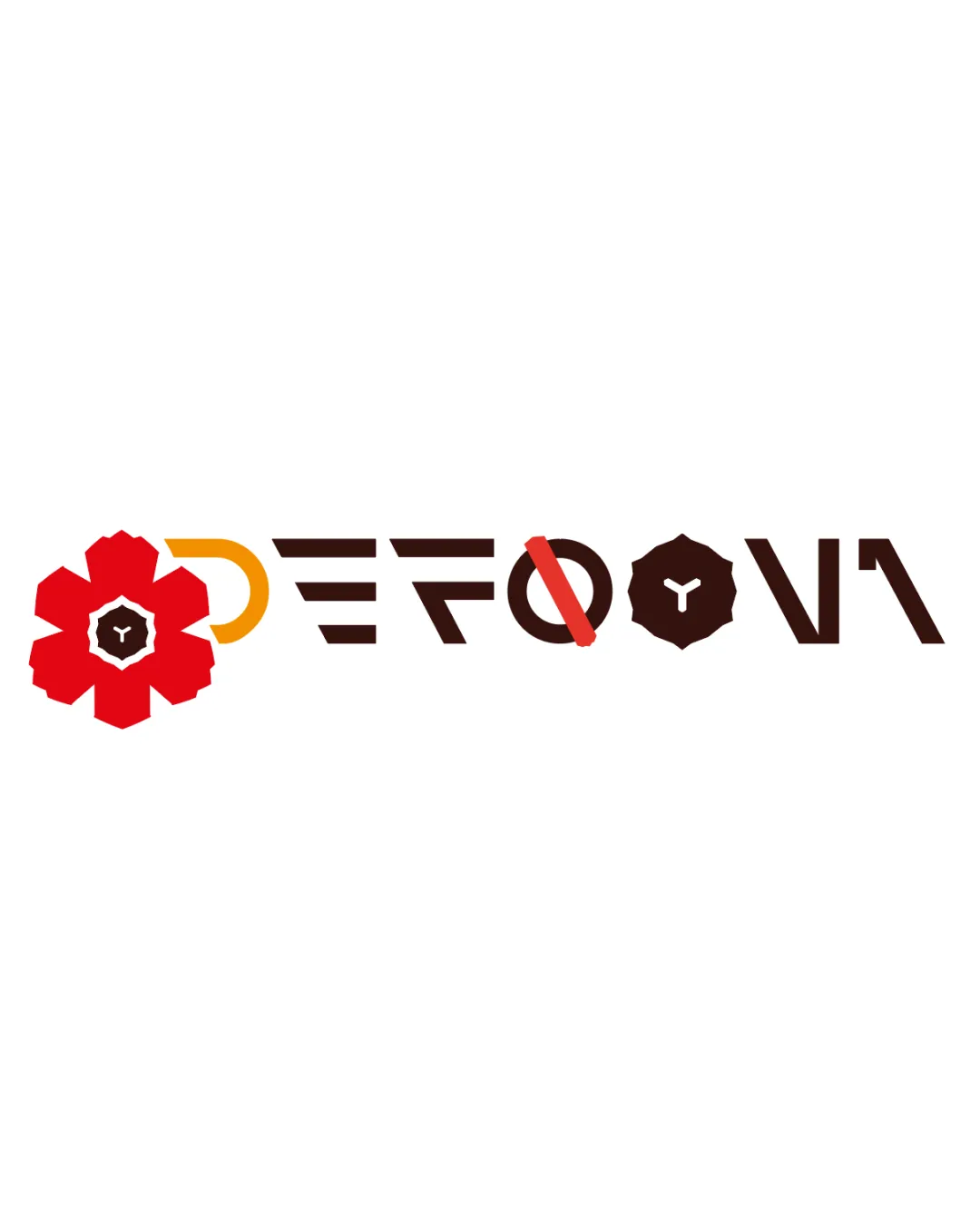
Logo review ofDefoony
Review the detailed scores below to see what is working and what should be refined first.
Legibility
Originality
Misread
Balance
Scale
Action plan
What to fix first
The most important fixes to handle before polishing the full presentation.
1
Fix possible misinterpretation
High priorityO with a red slash may be misinterpreted as a prohibition sign, which could have unintended negative connotations.
Impact: High · Effort: Medium
Detailed review
Logo performance breakdown
Legibility
![]() Unique custom typeface gives an inventive, memorable quality.
Unique custom typeface gives an inventive, memorable quality.![]() Distinct separation of characters using color and shape.
Distinct separation of characters using color and shape.
![]() Overall readability suffers due to extreme abstraction of letters.
Overall readability suffers due to extreme abstraction of letters.![]() D and Y are especially difficult to discern at first glance.
D and Y are especially difficult to discern at first glance.![]() Mixing symbols within characters disrupts reading flow.
Mixing symbols within characters disrupts reading flow.![]() Letter O with a slash can be confused for a prohibited symbol.
Letter O with a slash can be confused for a prohibited symbol.
Originality
![]() Inventive character construction using geometric forms and negative space.
Inventive character construction using geometric forms and negative space.![]() Distinct integration of symbol and type in a custom approach.
Distinct integration of symbol and type in a custom approach.![]() Playful combination of motifs creates a memorable look.
Playful combination of motifs creates a memorable look.
![]() Functional readability is somewhat sacrificed for originality.
Functional readability is somewhat sacrificed for originality.![]() The circle-and-slash element is derivative of 'no' or prohibition signs.
The circle-and-slash element is derivative of 'no' or prohibition signs.
Color harmony
![]() Three-color scheme is impactful but not overwhelming.
Three-color scheme is impactful but not overwhelming.![]() Contrast between red, orange, and deep brown yields vibrancy.
Contrast between red, orange, and deep brown yields vibrancy.
![]() Transition between the warm palette and deep brown can be slightly jarring.
Transition between the warm palette and deep brown can be slightly jarring.![]() Presence of four separate colors (red, orange, brown, white) approaches complexity—simplicity would help.
Presence of four separate colors (red, orange, brown, white) approaches complexity—simplicity would help.
Red
#ED1C24
Orange
#FFB900
Brown
#2D1B16
White
#FFFFFF
Your palette is close. Explore sharper color combinations with Colorfly.design before updating the logo.
Explore palettesBalance alignment
![]() Geometric approach achieves some formal alignment along a baseline.
Geometric approach achieves some formal alignment along a baseline.![]() Uniform height and style attempt to unify disparate character treatments.
Uniform height and style attempt to unify disparate character treatments.
![]() Flower shape at the start is visually much heavier than subsequent characters.
Flower shape at the start is visually much heavier than subsequent characters.![]() Circular badge elements create inconsistent rhythm alongside angular letters.
Circular badge elements create inconsistent rhythm alongside angular letters.![]() Overall visual weight distribution feels skewed to the left.
Overall visual weight distribution feels skewed to the left.

Scalability
![]() Bold shapes ensure some visibility at medium size.
Bold shapes ensure some visibility at medium size.![]() Flat color application aids some scalability.
Flat color application aids some scalability.
![]() Fine inner details (such as the mini-Y shape and intricate flower center) will be lost at small sizes.
Fine inner details (such as the mini-Y shape and intricate flower center) will be lost at small sizes.![]() Complex forms make it unsuitable for embroidery or small-format icons.
Complex forms make it unsuitable for embroidery or small-format icons.![]() Variety in line thickness and shape detail impacts clarity on business cards, mobile app icons, or stamps.
Variety in line thickness and shape detail impacts clarity on business cards, mobile app icons, or stamps.
200x250 px
100×125 px
50×62 px
Misinterpretations
![]() No explicit or inappropriate dual meanings detected.
No explicit or inappropriate dual meanings detected.![]() Creative use of slashes and badge motifs stays largely abstract.
Creative use of slashes and badge motifs stays largely abstract.
![]() O with a red slash may be misinterpreted as a prohibition sign, which could have unintended negative connotations.
O with a red slash may be misinterpreted as a prohibition sign, which could have unintended negative connotations.![]() Multiple visual metaphors (flower, badge, slash) may confuse the brand message.
Multiple visual metaphors (flower, badge, slash) may confuse the brand message.
Try your own review
Review my logo
Wondering how your logo performs?
Get a clear logo score, key risks, and priority fix ideas before your client or audience sees it.
Keep exploring


