Wondering how your logo performs? 🧐
Get professional logo reviews in seconds and catch design issues in time.
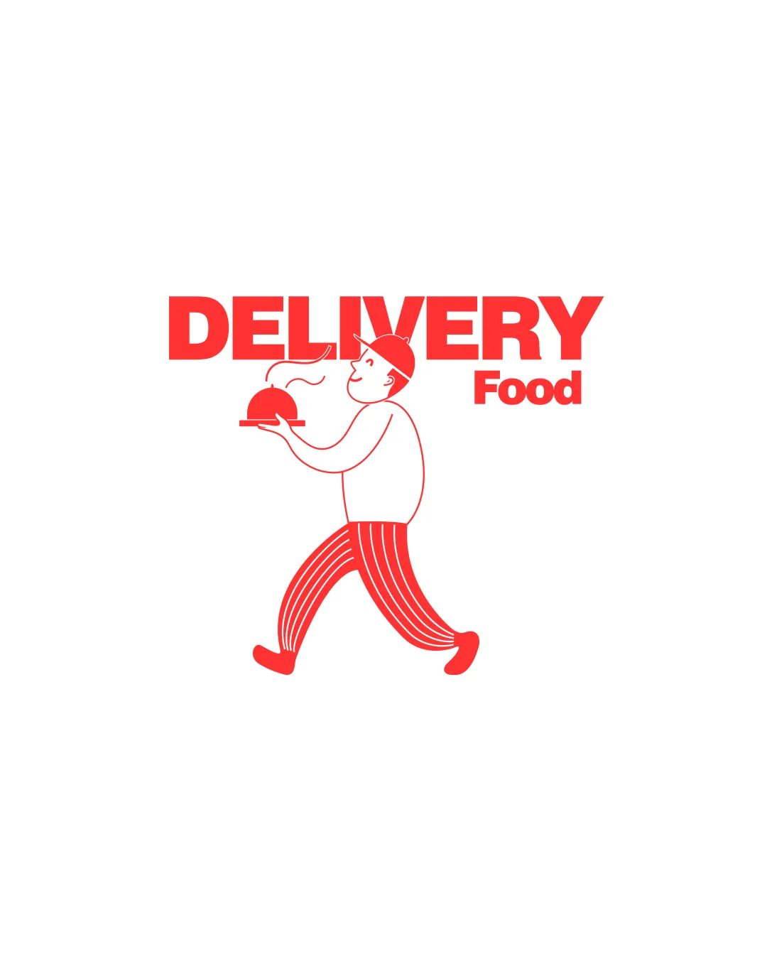
Try it Now!Logo review of DELIVERY Food
 Logo analysis by AI
Logo type:
Style:
Detected symbol:
Detected text:
Business industry:
Review requested by Khatia
**If AI can recognize or misinterpret it, so can people.
Structured logo review
Legibility
![]() Bold typography ensures visibility
Bold typography ensures visibility![]() Clear contrast with white background
Clear contrast with white background
![]() Slight disparity in size between 'DELIVERY' and 'Food' could affect readability
Slight disparity in size between 'DELIVERY' and 'Food' could affect readability
Scalability versatility
![]() Simple color scheme aids scalability
Simple color scheme aids scalability![]() Illustration is distinct in larger formats
Illustration is distinct in larger formats
![]() Detailed illustration may lose clarity when scaled down
Detailed illustration may lose clarity when scaled down![]() Might not reproduce well in monochrome
Might not reproduce well in monochrome
200x250 px
100×125 px
50×62 px
Balance alignment
![]() Text and imagery are centrally aligned
Text and imagery are centrally aligned![]() Stable horizontal layout
Stable horizontal layout
![]() Visual imbalance between large 'DELIVERY' text and smaller illustration
Visual imbalance between large 'DELIVERY' text and smaller illustration

Originality
![]() Unique illustration with a friendly character
Unique illustration with a friendly character![]() Creative depiction of delivery concept
Creative depiction of delivery concept
![]() Common food platter imagery
Common food platter imagery
Aesthetic look
![]() Cohesive red color scheme
Cohesive red color scheme![]() Inviting and lively design
Inviting and lively design
![]() Illustration style may feel slightly generic
Illustration style may feel slightly generic
Dual meaning and misinterpretations
![]() Clear representation of delivery service without misinterpretations
Clear representation of delivery service without misinterpretations
Color harmony
![]() Consistent and harmonious color use
Consistent and harmonious color use![]() Effective use of red for attention and urgency
Effective use of red for attention and urgency