Wondering how your logo performs? 🧐
Get professional logo reviews in seconds and catch design issues in time.
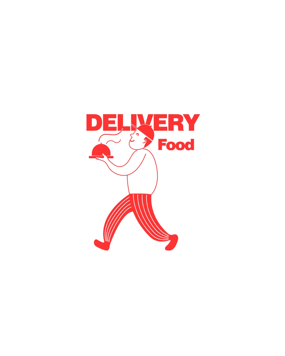
Try it Now!Logo review of DELIVERY Food
 Logo analysis by AI
Logo type:
Style:
Detected symbol:
Detected text:
Business industry:
Review requested by Khatia
**If AI can recognize or misinterpret it, so can people.
Structured logo review
Legibility
![]() Text is bold and easy to read
Text is bold and easy to read![]() Contrast between text and background is strong
Contrast between text and background is strong
![]() Slight size disparity between 'DELIVERY' and 'Food'
Slight size disparity between 'DELIVERY' and 'Food'
Scalability versatility
![]() Simple design ensures some scalability
Simple design ensures some scalability
![]() Might lose detail when scaled down due to thin lines
Might lose detail when scaled down due to thin lines
200x250 px
100×125 px
50×62 px
Balance alignment
![]() Symmetrical layout with clear structure
Symmetrical layout with clear structure
![]() 'Food' text appears slightly misaligned
'Food' text appears slightly misaligned

Originality
![]() Creative depiction of delivery theme
Creative depiction of delivery theme
![]() Concept of a delivery person is somewhat common
Concept of a delivery person is somewhat common
Logomark wordmark fit
![]() Logomark complements the wordmark
Logomark complements the wordmark
![]() Slight size imbalance between elements
Slight size imbalance between elements
Aesthetic look
![]() Cohesive color scheme
Cohesive color scheme![]() Playful and friendly appearance
Playful and friendly appearance
![]() Simplistic color choice may lack sophistication for some brands
Simplistic color choice may lack sophistication for some brands
Dual meaning and misinterpretations
![]() No inappropriate symbols detected
No inappropriate symbols detected
Color harmony
![]() Strong use of a single, cohesive color
Strong use of a single, cohesive color
![]() Limited to one color, which might not be versatile across all media
Limited to one color, which might not be versatile across all media