View review
Designoweb.
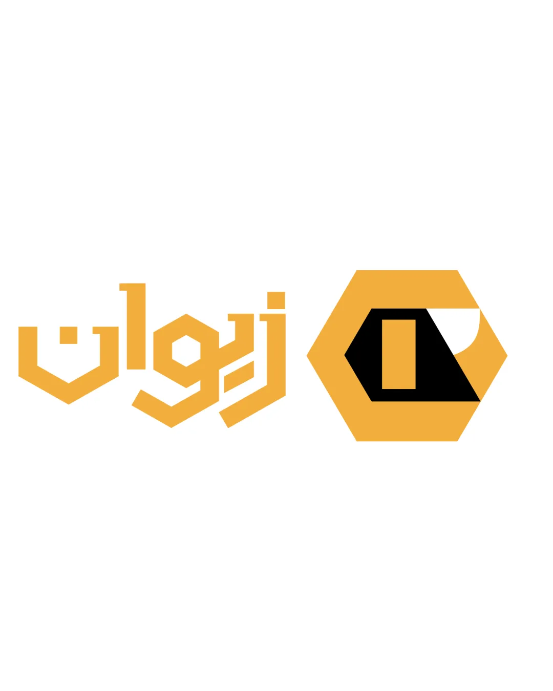
Solid modern logo that is ready for use after minor adjustments, but would benefit from increased clarity and a more unique monogram treatment.
What to fix first
The most important fixes to handle before polishing the full presentation.
Refine the DW monogram for better small-scale clarity (reduce gradient complexity, optimize spacing).
High prioritySmall details and gradients are likely to become indistinct in small or low-res applications.
Impact: Ensures Logo Remains Legible And Recognizable At All Sizes, Improving Overall Utility. · Effort: Medium
Consider a more distinctive twist or flourish for the DW monogram to enhance uniqueness.
Medium priorityOriginality is currently only average; room for a more recognizable identity.
Impact: Would Help The Brand Stand Out In A Crowded Technology/design Market. · Effort: Medium
Logo performance breakdown
Legibility
Wordmark is clean and easily readable.
Monogram is clear at moderate sizes.
Monogram could lose clarity at very small sizes due to spacing.
Originality
Monogram is customized, avoiding stock icon feel.
Approach is common in the tech/design sector; lacks a distinctive creative twist.
Color harmony
Orange gradient gives energy and visibility.
Dot in wordmark echoes brand color, unifying the design.
Subtle gradient could complicate certain applications.
Orange
#F05A22
Black
#000000
White
#FFFFFF
Red
#E54423
Your palette is close. Refine the color roles and combinations before updating the logo.
Build brand colorsBalance alignment
Good alignment between monogram and wordmark.
Visual weight feels well-proportioned.
Slight visual disconnect between the energetic DW and calmer wordmark.
Scalability
Simple overall silhouette, adaptable to various applications.
Gradient in DW may not reproduce well at small scale; dot accent might become indistinct.
200x250 px
100×125 px
50×62 px
Misinterpretations
No negative or confusing secondary meanings.
Logo structure & brief match
DW monogram and wordmark pair cohesively.
Contrast of styles is noticeable but not critical.
Industry: Modern, tech-oriented appearance fits a technology or digital services firm.
Professionalism: Conveys professionalism and energy; suitable for a B2B environment.
Wondering how your logo performs?
Get a clear logo score, key risks, and priority fix ideas before your client or audience sees it.