DESTINY Clothing logo review
3.3 / 5
Logo score
Logo review of

Destiny Clothing

Review the detailed scores below to see what is working and what should be refined first.

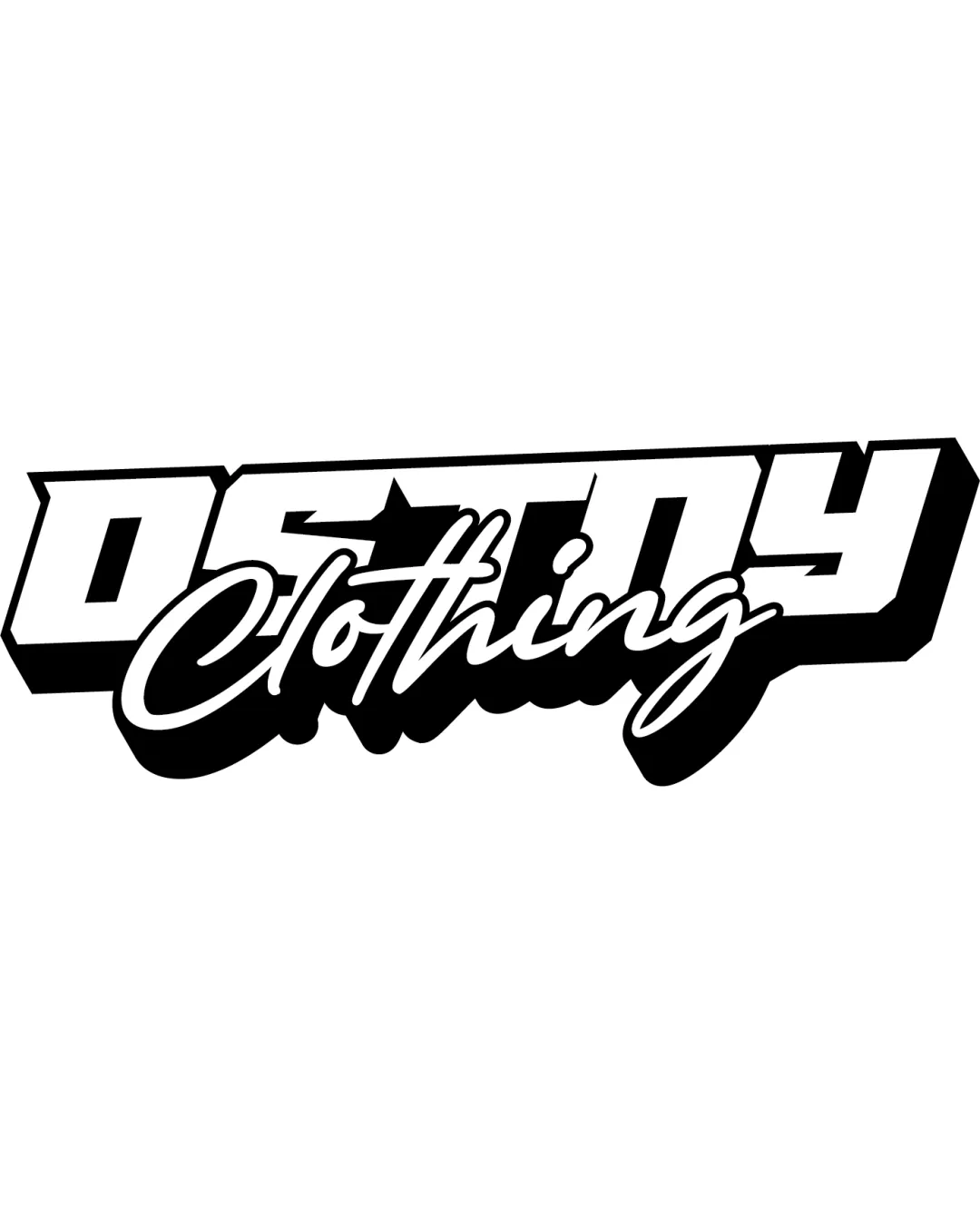
Combination Mark (wordmark + Stylized Script) Urban, Bold, Italicized Sans-serif With Script Overlay Fashion
3/5
Legibility
3/5
Originality
5/5
Misread
3/5
Balance
2/5
Scale
Detailed review

Logo performance breakdown

3/5

Legibility

Checkmark icon The main text 'DESTINY' is bold and mostly easy to read at a distance.
Checkmark icon The white fill against the black outline enhances contrast.

Warning icon 'Clothing' in script overlays part of 'DESTINY,' causing some readability issues.
Warning icon The overlapping and stylistic script font reduces clarity, especially in smaller formats or quick glances.


3/5

Originality

Checkmark icon The overlay of a hand-style script on top of a bold urban wordmark adds some unique character.

Warning icon The combination of block and script fonts is an established style in streetwear branding, lacking significant innovation.
Warning icon There are no unique symbols or inventive uses of negative space.

5/5

Color harmony

Checkmark icon Classic black and white colorway offers high contrast and timeless appeal.
Checkmark icon Simple palette increases adaptability across different colored garments and media.

White
#FFFFFF

Black
#000000

3/5

Balance alignment

Checkmark icon Overall weight is distributed horizontally for a stable impression.
Checkmark icon The combination of sans-serif and script creates visual interest.

Warning icon Overlapping script disrupts visual hierarchy and creates tension points, particularly around the 't' and 'h' intersections in 'Clothing.'
Warning icon The skewed angle and layering can feel visually busy or unbalanced.

logo 200x250 pixels scalability test alignment grid overlay
2/5

Scalability

Checkmark icon Logo will be bold and visible on large display items such as banners and streetwear apparel.
Checkmark icon The thick outlines support screen printing on clothing.

Warning icon Fine script details and overlapping elements in 'Clothing' will be lost or illegible at small sizes (e.g., favicons, tags, embroidery).
Warning icon The complexity and layered look make the logo less versatile for mono-color, compact, or minimalist applications.

logo 200x250 pixels scalability test

200x250 px

logo 100x125 pixels scalability test

100×125 px

logo 50x62 pixels scalability test

50×62 px

5/5

Misinterpretations

Checkmark icon No inappropriate or ambiguous visual forms detected.

2 / 5

Symbol & text fit

Checkmark icon Font styles contrast for differentiation, representing a duality common in fashion branding.

Warning icon Font pairing feels forced; script conflicts with angular geometric sans-serif.
Warning icon The sizing and overlaying of 'Clothing' atop 'DESTINY' lead to a crowded, mismatched effect.

Try your own review

Wondering how your logo performs?

Get a clear logo score, key risks, and priority fix ideas before your client or audience sees it.

Review my logo