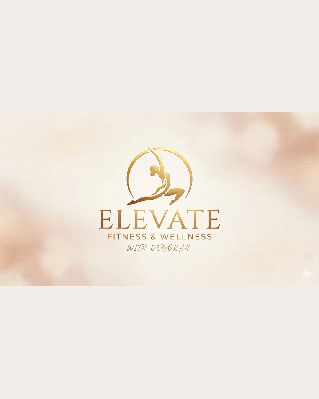
ELEVATE FITNESS & WELLNESS WITH DEBORAH logo review
4.3/5
Logo score
Logo review of

Elevate Fitness & Wellness With Deborah

A polished, elegant fitness and wellness logo with a dynamic central concept and only minor implementation optimizations suggested.

Combination Mark Elegant, Modern, Fitness-inspired Fitness & Wellness
4.5/5
Legibility
4/5
Originality
5/5
Misread
4.5/5
Balance
4/5
Scale
Action plan

What to fix first

The most important fixes to handle before polishing the full presentation.

1

Increase tagline legibility at small sizes by either boosting contrast or reserving a version without tagline for small use.

Medium priority

Tagline fade may reduce usability on small screens.

Impact: Ensures Readability In Digital Icons And Small Applications. · Effort: Low

Detailed review

Logo performance breakdown

4.5/5

Legibility

Checkmark icon Main wordmark is highly legible with clear letterforms and excellent spacing.
Checkmark icon Tagline is smaller but remains readable.

Warning icon Slight contrast fade on the tagline may slightly reduce readability at very small sizes.

4/5

Originality

Checkmark icon Elegant, energetic mark fits the wellness space without being generic.
Checkmark icon Distinctive integration of the human figure and arc.

Warning icon Arched human figure motifs are common in the wellness niche.

4.5/5

Color harmony

Checkmark icon Sophisticated gold gradient fits the upscale wellness positioning.

Warning icon Gold gradients may be harder to reproduce in certain print applications.

Gold
#CAA448

White
#FFFFFF

Beige
#C9B7A2

Your palette is close. Refine the color roles and combinations before updating the logo.

Build brand colors
4.5/5

Balance alignment

Checkmark icon Strong central alignment and a harmonious relationship between the icon and wordmark.

Warning icon Slightly more visual weight is carried in the mark than the type.

logo 200x250 pixels scalability test alignment grid overlay
4/5

Scalability

Checkmark icon Mark and main wordmark will reproduce well at various sizes.

Warning icon Tagline may become hard to read when scaled down.

logo 200x250 pixels scalability test

200x250 px

logo 100x125 pixels scalability test

100×125 px

logo 50x62 pixels scalability test

50×62 px

5/5

Misinterpretations

Checkmark icon No negative or confusing secondary readings.

4.5/5

Logo structure & brief match

Checkmark icon Mark and wordmark feel cohesive and mutually reinforcing.

Checkmark icon Industry Relevance: Conveys wellness, movement, and sophistication appropriate for a fitness and wellness brand.
Checkmark icon Brand Tone: Modern, professional, welcoming.

Try your own review

Wondering how your logo performs?

Get a clear logo score, key risks, and priority fix ideas before your client or audience sees it.

Review my logo