Wondering how your logo performs? 🧐
Get professional logo reviews in seconds and catch design issues in time.
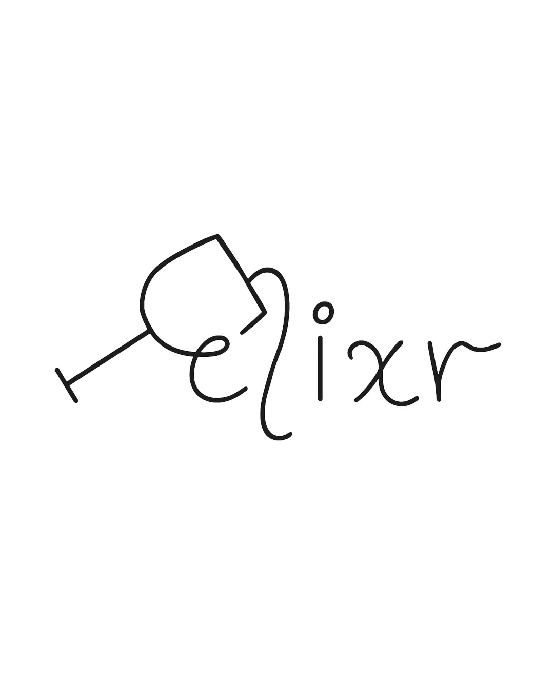
Try it Now!Logo review of elixr
 Logo analysis by AI
Logo type:
Style:
Detected symbol:
Detected text:
Business industry:
Review requested by Ayukta
**If AI can recognize or misinterpret it, so can people.
Structured logo review
Legibility
![]() The script style is elegant and creative.
The script style is elegant and creative.![]() The word 'elixr' is eventually readable with focus.
The word 'elixr' is eventually readable with focus.
![]() The integration of the wine glass into the 'e' reduces legibility—can be misread at first glance.
The integration of the wine glass into the 'e' reduces legibility—can be misread at first glance.![]() The script font for 'x' and 'r' may cause minor ambiguity for quick reading.
The script font for 'x' and 'r' may cause minor ambiguity for quick reading.![]() Spacing between some letters is inconsistent.
Spacing between some letters is inconsistent.
Scalability versatility
![]() Minimalist line art will maintain some clarity when scaled down.
Minimalist line art will maintain some clarity when scaled down.![]() Looks clean and simple on white backgrounds.
Looks clean and simple on white backgrounds.
![]() Thin lines may disappear at very small sizes, making it unsuitable for favicons or embroidery.
Thin lines may disappear at very small sizes, making it unsuitable for favicons or embroidery.![]() On busy or dark backgrounds, the logo might lose visibility without a container or color inverse.
On busy or dark backgrounds, the logo might lose visibility without a container or color inverse.![]() Would struggle for clarity on textured surfaces or product labels at small sizes.
Would struggle for clarity on textured surfaces or product labels at small sizes.
200x250 px
100×125 px
50×62 px
Balance alignment
![]() The placement of the wine glass creatively interacts with the typography.
The placement of the wine glass creatively interacts with the typography.
![]() The tilt of the wine glass creates an imbalance—visual weight is heavier on the left.
The tilt of the wine glass creates an imbalance—visual weight is heavier on the left.![]() The uneven baseline and letter heights create a slightly chaotic alignment.
The uneven baseline and letter heights create a slightly chaotic alignment.

Originality
![]() Smart blending of the wine glass with the 'e' is clever and unique.
Smart blending of the wine glass with the 'e' is clever and unique.![]() Handwritten style adds personalized character.
Handwritten style adds personalized character.
![]() This wine glass and script combination is not highly original within the bar or beverage space, though executed with flair.
This wine glass and script combination is not highly original within the bar or beverage space, though executed with flair.![]() No secondary layer of negative space or dual meaning present.
No secondary layer of negative space or dual meaning present.
Aesthetic look
![]() Modern, minimalist, and stylish appearance suitable for upscale beverage brands.
Modern, minimalist, and stylish appearance suitable for upscale beverage brands.![]() The hand-drawn lines give a human and inviting touch.
The hand-drawn lines give a human and inviting touch.
![]() The logo feels somewhat unfinished due to uneven line thickness and informal script.
The logo feels somewhat unfinished due to uneven line thickness and informal script.
Dual meaning and misinterpretations
![]() No inappropriate symbols or problematic shapes detected.
No inappropriate symbols or problematic shapes detected.
Color harmony
![]() Limited to black on white—exceptionally clean and timeless.
Limited to black on white—exceptionally clean and timeless.
Black
#000000
White
#FFFFFF


