Wondering how your logo performs? 🧐
Get professional logo reviews in seconds and catch design issues in time.
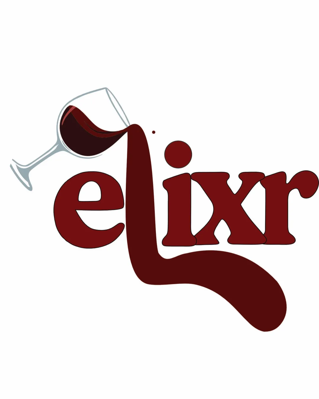
Try it Now!Logo review of elixr
 Logo analysis by AI
Logo type:
Style:
Detected symbol:
Detected text:
Business industry:
Review requested by Ayukta
**If AI can recognize or misinterpret it, so can people.
Structured logo review
Legibility
![]() Text is generally easy to read and distinct against the white background.
Text is generally easy to read and distinct against the white background.![]() Contrasting color helps with visibility.
Contrasting color helps with visibility.
![]() The flowing 'l' creates a visual distraction that slightly interrupts readability for quick glances.
The flowing 'l' creates a visual distraction that slightly interrupts readability for quick glances.![]() Dot on the 'i' blends into the splash, which could be misread.
Dot on the 'i' blends into the splash, which could be misread.
Scalability versatility
![]() Larger formats (signage, posters) retain enough detail to be recognizable.
Larger formats (signage, posters) retain enough detail to be recognizable.![]() Works well for menus, beverage lists, or bar signage.
Works well for menus, beverage lists, or bar signage.
![]() Thin glass outline and the large splash shape would lose detail and clarity at small sizes, making it difficult to reproduce on merchandise, social media profiles, or business cards.
Thin glass outline and the large splash shape would lose detail and clarity at small sizes, making it difficult to reproduce on merchandise, social media profiles, or business cards.![]() Splash effect complicates embroidery or small print applications.
Splash effect complicates embroidery or small print applications.
200x250 px
100×125 px
50×62 px
Balance alignment
![]() The glass and liquid are connected conceptually to the text.
The glass and liquid are connected conceptually to the text.
![]() The large, irregular splash from the 'l' makes the composition bottom-heavy and visually imbalanced.
The large, irregular splash from the 'l' makes the composition bottom-heavy and visually imbalanced.![]() The tilted wine glass makes the left side feel lighter than the right.
The tilted wine glass makes the left side feel lighter than the right.

Originality
![]() Creative integration of the wine glass pouring into the letterform.
Creative integration of the wine glass pouring into the letterform.![]() Playful take that connects name and visual symbol.
Playful take that connects name and visual symbol.
![]() Concept is familiar in the wine/bar niche; wine glass is a common cliché.
Concept is familiar in the wine/bar niche; wine glass is a common cliché.
Aesthetic look
![]() Warm color palette fits the beverage industry.
Warm color palette fits the beverage industry.![]() Balance of type and image makes for a fun, approachable tone.
Balance of type and image makes for a fun, approachable tone.
![]() Splash shape feels uncontrolled and clashes with the solid, stable font.
Splash shape feels uncontrolled and clashes with the solid, stable font.![]() Visual flow is interrupted by the drastic curve of the pour.
Visual flow is interrupted by the drastic curve of the pour.
Dual meaning and misinterpretations
![]() No inappropriate dual meanings apparent.
No inappropriate dual meanings apparent.
Color harmony
![]() Palette is limited and harmonious, echoing wine and sophistication.
Palette is limited and harmonious, echoing wine and sophistication.![]() Contrast is sufficient.
Contrast is sufficient.
![]() Red on white works, but may lack contrast on colored backgrounds.
Red on white works, but may lack contrast on colored backgrounds.![]() Overuse of deep red may flatten the vibrancy.
Overuse of deep red may flatten the vibrancy.
Venetian Red
#661010
White
#FAFAFA
Sangria
#9E3131


