Wondering how your logo performs? 🧐
Get professional logo reviews in seconds and catch design issues in time.
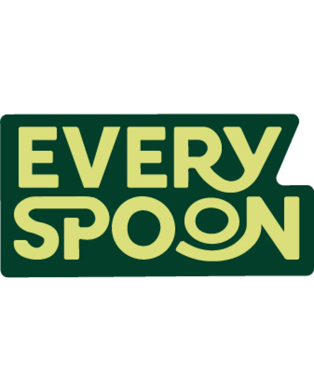
Try it Now!Logo review of EVERY SPOON
 Logo analysis by AI
Logo type:
Style:
Detected symbol:
Negative space:
Detected text:
Business industry:
Review requested by Philodesigns
**If AI can recognize or misinterpret it, so can people.
Structured logo review
Legibility
![]() Text is generally clear and strong due to use of bold geometric type.
Text is generally clear and strong due to use of bold geometric type.![]() Contrast between yellow-green and dark green ensures good visibility.
Contrast between yellow-green and dark green ensures good visibility.
![]() Curved design of 'O' in SPOON and embellishments could potentially slow recognition very slightly.
Curved design of 'O' in SPOON and embellishments could potentially slow recognition very slightly.![]() The overlap of the curved line on 'O' with the background may pose minor legibility issues at very small sizes.
The overlap of the curved line on 'O' with the background may pose minor legibility issues at very small sizes.
Scalability versatility
![]() Boldness and simplicity help maintain identity at medium to large scales.
Boldness and simplicity help maintain identity at medium to large scales.![]() Strong contrast will read well on merchandise and larger prints.
Strong contrast will read well on merchandise and larger prints.
![]() Stylized elements in 'O'/'SPOON' lose clarity at favicon or very small sizes.
Stylized elements in 'O'/'SPOON' lose clarity at favicon or very small sizes.![]() Logo's wide rectangular shape with protrusion might not fit square or circular applications cleanly.
Logo's wide rectangular shape with protrusion might not fit square or circular applications cleanly.![]() Large solid color areas can be problematic in embroidery and very small promotional items.
Large solid color areas can be problematic in embroidery and very small promotional items.
200x250 px
100×125 px
50×62 px
Balance alignment
![]() Text is mostly well-aligned, and the layout is visually cohesive.
Text is mostly well-aligned, and the layout is visually cohesive.![]() Stylistic treatment of 'EVERY' and 'SPOON' brings a proportional feel.
Stylistic treatment of 'EVERY' and 'SPOON' brings a proportional feel.
![]() Right-side protrusion and differences in letter styling (especially ‘N’ and last 'O' in SPOON) introduce slight imbalance.
Right-side protrusion and differences in letter styling (especially ‘N’ and last 'O' in SPOON) introduce slight imbalance.![]() Curved forms at the end create a minor visual weight difference.
Curved forms at the end create a minor visual weight difference.

Originality
![]() Creative use of letterforms, especially the 'O' as a visual spoon/plate, is distinctive.
Creative use of letterforms, especially the 'O' as a visual spoon/plate, is distinctive.![]() Playfulness stands out from generic food logo tropes.
Playfulness stands out from generic food logo tropes.
![]() Overall wordmark approach is commonly used in the industry.
Overall wordmark approach is commonly used in the industry.![]() No unique illustration beyond the letter modification.
No unique illustration beyond the letter modification.
Aesthetic look
![]() Color choices are harmonious and contemporary, suiting a food-related brand.
Color choices are harmonious and contemporary, suiting a food-related brand.![]() Smooth rounded letterforms evoke friendliness and approachability.
Smooth rounded letterforms evoke friendliness and approachability.
![]() Appearance could be interpreted as a bit playful for more premium or mature culinary brands.
Appearance could be interpreted as a bit playful for more premium or mature culinary brands.![]() Rightward block extension slightly disturbs overall visual harmony.
Rightward block extension slightly disturbs overall visual harmony.
Dual meaning and misinterpretations
![]() No inappropriate or unintended imagery detected in the overall composition.
No inappropriate or unintended imagery detected in the overall composition.![]() Spoon/plate in 'O' is clear and relevant.
Spoon/plate in 'O' is clear and relevant.
Color harmony
![]() Two-tone palette creates clarity and brand recognition.
Two-tone palette creates clarity and brand recognition.![]() Good color integration between foreground text and background panel.
Good color integration between foreground text and background panel.
Jungle Green
#294C36
Bitter Lemon
#D9DE7A