Wondering how your logo performs? 🧐
Get professional logo reviews in seconds and catch design issues in time.
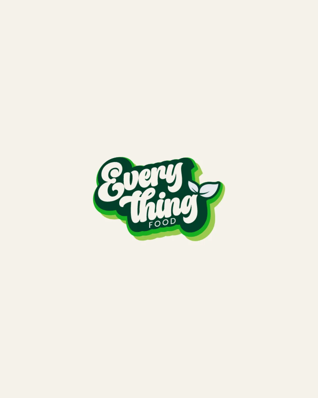
Try it Now!Logo review of Every Thing FOOD
 Logo analysis by AI
Logo type:
Style:
Detected symbol:
Negative space:
Detected text:
Business industry:
Review requested by Philodesigns
**If AI can recognize or misinterpret it, so can people.
Structured logo review
Legibility
![]() Main script is generally easy to read in larger formats.
Main script is generally easy to read in larger formats.![]() Contrast between white text and green background is strong.
Contrast between white text and green background is strong.
![]() Handwritten style may become challenging in small sizes.
Handwritten style may become challenging in small sizes.![]() The smaller 'FOOD' text has reduced clarity and may blur at small scales.
The smaller 'FOOD' text has reduced clarity and may blur at small scales.![]() The closed spacing and connected letters could hamper quick reading at a glance.
The closed spacing and connected letters could hamper quick reading at a glance.
Scalability versatility
![]() Works well on packaging, signage, and social banners.
Works well on packaging, signage, and social banners.![]() Distinctive outline helps on bright backgrounds.
Distinctive outline helps on bright backgrounds.
![]() Fine details and layered outline are likely to get lost in favicons or embroidery.
Fine details and layered outline are likely to get lost in favicons or embroidery.![]() The 'FOOD' subtext is not legible in small applications.
The 'FOOD' subtext is not legible in small applications.![]() Gradients and outlines may complicate monochrome/one-color reproduction.
Gradients and outlines may complicate monochrome/one-color reproduction.
200x250 px
100×125 px
50×62 px
Balance alignment
![]() Overall shape is compact and unified.
Overall shape is compact and unified.![]() Leaf accent visually balances the composition.
Leaf accent visually balances the composition.
![]() Subtext 'FOOD' feels crammed under the wordmark and risks imbalance.
Subtext 'FOOD' feels crammed under the wordmark and risks imbalance.![]() Hand-lettered style may result in minor spacing inconsistencies.
Hand-lettered style may result in minor spacing inconsistencies.

Originality
![]() Playful script and integrated leaf are visually engaging.
Playful script and integrated leaf are visually engaging.![]() Organic style distinguishes it within the food sector.
Organic style distinguishes it within the food sector.
![]() Leaf symbol is common for natural/food brands and lacks unique execution.
Leaf symbol is common for natural/food brands and lacks unique execution.![]() General hand-lettered trend is widespread in the industry.
General hand-lettered trend is widespread in the industry.
Aesthetic look
![]() Appealing, friendly color palette.
Appealing, friendly color palette.![]() Smooth, cohesive contours enhance approachability.
Smooth, cohesive contours enhance approachability.
![]() Outline and gradient risk creating a busy look in smaller formats.
Outline and gradient risk creating a busy look in smaller formats.![]() Could be perceived as overdecorated if reduced further.
Could be perceived as overdecorated if reduced further.
Dual meaning and misinterpretations
![]() No inappropriate or confusing shapes detected.
No inappropriate or confusing shapes detected.![]() Leaf iconography is universally positive in the context.
Leaf iconography is universally positive in the context.
Color harmony
![]() Palette uses only a few harmonious colors tied to healthy/natural themes.
Palette uses only a few harmonious colors tied to healthy/natural themes.![]() Contrast is sufficient for legibility and vibrancy.
Contrast is sufficient for legibility and vibrancy.
Evergreen
#14532D
Green
#22C55E
Beige
#F1EFE6


