 View review
Logo score
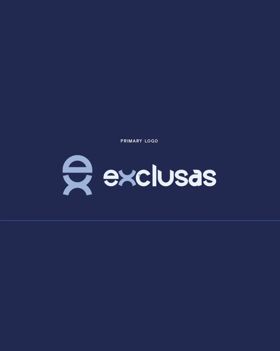
Logo review ofExclusas
Review the detailed scores below to see what is working and what should be refined first.
Legibility
Originality
Misread
Balance
Scale
Detailed review
Logo performance breakdown
Legibility
![]() Text is clear and easy to read.
Text is clear and easy to read.![]() Consistent typography.
Consistent typography.
![]() The stylized 'x' could be slightly confusing at smaller sizes.
The stylized 'x' could be slightly confusing at smaller sizes.
Originality
![]() Creative use of letters.
Creative use of letters.![]() Unique integration of 'e' and 'x'.
Unique integration of 'e' and 'x'.
![]() Similar designs could exist in the tech industry, affecting perceived originality.
Similar designs could exist in the tech industry, affecting perceived originality.
Color harmony
![]() Color scheme is cohesive and consistent.
Color scheme is cohesive and consistent.
![]() Limited palette might lack vibrancy in some contexts.
Limited palette might lack vibrancy in some contexts.
Your palette is close. Explore sharper color combinations with Colorfly.design before updating the logo.
Explore palettesBalance alignment
![]() Well-balanced between the symbol and text.
Well-balanced between the symbol and text.![]() Good alignment and proportion.
Good alignment and proportion.

Scalability
![]() Simple design lends itself to scalability.
Simple design lends itself to scalability.![]() Clear features when resized.
Clear features when resized.
![]() The fine details in the monogram might lose clarity in very small sizes.
The fine details in the monogram might lose clarity in very small sizes.
200x250 px
100×125 px
50×62 px
Misinterpretations
![]() No inappropriate symbols detected.
No inappropriate symbols detected.
Symbol & text fit
![]() The monogram and wordmark are well integrated.
The monogram and wordmark are well integrated.
![]() Styles complement each other.
Styles complement each other.
Try your own review
Review my logo
Wondering how your logo performs?
Get a clear logo score, key risks, and priority fix ideas before your client or audience sees it.
Keep exploring


