Wondering how your logo performs? 🧐
Get professional logo reviews in seconds and catch design issues in time.
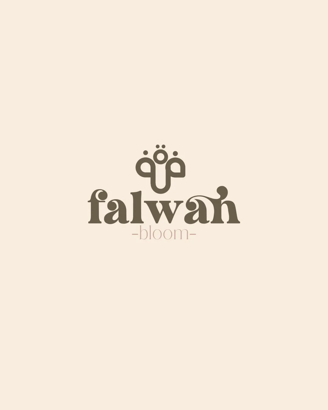
Try it Now!Logo review of falwah bloom
 Logo analysis by AI
Logo type:
Style:
Detected symbol:
Negative space:
Detected text:
Business industry:
Review requested by Reel_21m
**If AI can recognize or misinterpret it, so can people.
Structured logo review
Legibility
![]() Primary wordmark 'falwah' is unique and mostly clear
Primary wordmark 'falwah' is unique and mostly clear![]() Contrast between background and text is high, aiding readability
Contrast between background and text is high, aiding readability
![]() Stylized 'w' and 'a' create slight ambiguity at first glance
Stylized 'w' and 'a' create slight ambiguity at first glance![]() 'bloom' in subtext is quite thin and loses legibility at reduced sizes
'bloom' in subtext is quite thin and loses legibility at reduced sizes
Scalability versatility
![]() Floral symbol is bold enough for print and digital use
Floral symbol is bold enough for print and digital use![]() Logo would work well on boutique packaging and spa signage
Logo would work well on boutique packaging and spa signage
![]() Wordmark details, especially in 'bloom', may disappear at smaller scales
Wordmark details, especially in 'bloom', may disappear at smaller scales![]() Thin and decorative lines in the logomark may blur in embroidery or small favicons
Thin and decorative lines in the logomark may blur in embroidery or small favicons
200x250 px
100×125 px
50×62 px
Balance alignment
![]() Strong vertical and horizontal alignment between symbol and wordmark
Strong vertical and horizontal alignment between symbol and wordmark![]() Visually cohesive structure
Visually cohesive structure
![]() Upper logomark feels slightly detached due to generous spacing above text
Upper logomark feels slightly detached due to generous spacing above text![]() The flourish on the 'h' in 'falwah' disrupts the bottom alignment subtly
The flourish on the 'h' in 'falwah' disrupts the bottom alignment subtly

Originality
![]() Original abstract floral concept
Original abstract floral concept![]() Customized letterforms in the wordmark add uniqueness
Customized letterforms in the wordmark add uniqueness
![]() Abstract marks using floral forms are somewhat common in wellness and beauty sectors
Abstract marks using floral forms are somewhat common in wellness and beauty sectors
Logomark wordmark fit
![]() Both logomark and wordmark use similar thickness and organic curves
Both logomark and wordmark use similar thickness and organic curves![]() Visual theme of blooming is echoed in both
Visual theme of blooming is echoed in both
![]() Slight stylistic disconnect between the geometric top mark and the swashy details in 'falwah'
Slight stylistic disconnect between the geometric top mark and the swashy details in 'falwah'
Aesthetic look
![]() Minimalistic, elegant color palette
Minimalistic, elegant color palette![]() Refined ornamental details
Refined ornamental details
![]() Swash in the 'h' could be perceived as overdecorated, distracting from overall minimalism
Swash in the 'h' could be perceived as overdecorated, distracting from overall minimalism
Dual meaning and misinterpretations
![]() No inappropriate or ambiguous visuals detected
No inappropriate or ambiguous visuals detected![]() Symbol and text communicate positive, nature-inspired intent
Symbol and text communicate positive, nature-inspired intent
Color harmony
![]() Excellent restrained two-color palette
Excellent restrained two-color palette![]() Warm and inviting tones, strong contrast but harmonious
Warm and inviting tones, strong contrast but harmonious
Olive Drab
#675B4C
Parchment
#EFE2D0