Wondering how your logo performs? 🧐
Get professional logo reviews in seconds and catch design issues in time.
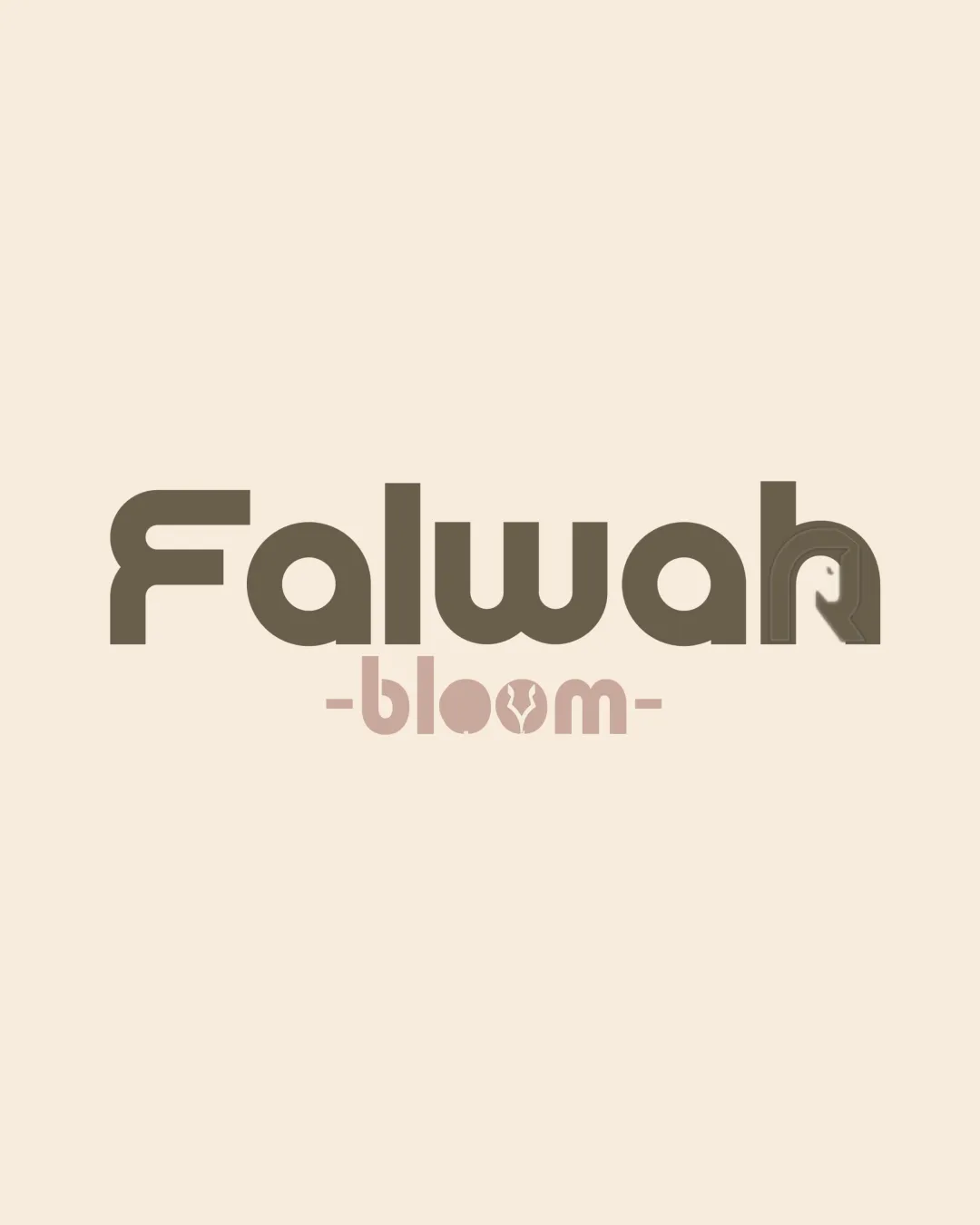
Try it Now!Logo review of Falwah bloom
 Logo analysis by AI
Logo type:
Style:
Detected symbol:
Negative space:
Detected text:
Business industry:
Review requested by Reel_21m
**If AI can recognize or misinterpret it, so can people.
Structured logo review
Legibility
![]() Both 'Falwah' and 'bloom' are mostly clear and easy to read
Both 'Falwah' and 'bloom' are mostly clear and easy to read![]() Text size and spacing are appropriate for different sizes
Text size and spacing are appropriate for different sizes
![]() The final 'h' in 'Falwah' incorporates an unusual negative space symbol, making it slightly less readable at a glance
The final 'h' in 'Falwah' incorporates an unusual negative space symbol, making it slightly less readable at a glance![]() The symbol inside the second 'o' in 'bloom' is visually busy and could cause legibility issues in small sizes
The symbol inside the second 'o' in 'bloom' is visually busy and could cause legibility issues in small sizes
Scalability versatility
![]() Clean geometric lines help with scalability for large formats like signage or packaging
Clean geometric lines help with scalability for large formats like signage or packaging![]() Limited color palette is adaptable
Limited color palette is adaptable
![]() Details in the 'o' of 'bloom' and the stylized 'h' risk getting lost or muddled in smaller applications such as favicons or embroidery
Details in the 'o' of 'bloom' and the stylized 'h' risk getting lost or muddled in smaller applications such as favicons or embroidery![]() Thin negative space elements decrease clarity at small sizes
Thin negative space elements decrease clarity at small sizes
200x250 px
100×125 px
50×62 px
Balance alignment
![]() Text elements are generally aligned and centered
Text elements are generally aligned and centered![]() Consistent geometric style throughout
Consistent geometric style throughout
![]() The weight and complexity of the stylized 'h' in 'Falwah' create a visual imbalance compared to the other letters
The weight and complexity of the stylized 'h' in 'Falwah' create a visual imbalance compared to the other letters![]() The extra decoration in 'bloom' disrupts visual harmony
The extra decoration in 'bloom' disrupts visual harmony

Originality
![]() Unique incorporation of negative space in 'Falwah' and a custom symbol in 'bloom'
Unique incorporation of negative space in 'Falwah' and a custom symbol in 'bloom'![]() Ownership of brand identity through combined marks
Ownership of brand identity through combined marks
![]() The negative space in 'h' feels slightly forced and not entirely distinctive
The negative space in 'h' feels slightly forced and not entirely distinctive![]() The concept of inserting shapes in letterforms is common, though execution here is better than average
The concept of inserting shapes in letterforms is common, though execution here is better than average
Logomark wordmark fit
![]() Symbolic and typographic elements maintain similar geometric styling
Symbolic and typographic elements maintain similar geometric styling![]() Color and shape are cohesive across text and accents
Color and shape are cohesive across text and accents
![]() Variation in decoration level (minimal in 'Falwah', maximal in 'bloom') creates a slight mismatch in style
Variation in decoration level (minimal in 'Falwah', maximal in 'bloom') creates a slight mismatch in style![]() Typography strength in 'Falwah' isn't mirrored in the lighter 'bloom' style
Typography strength in 'Falwah' isn't mirrored in the lighter 'bloom' style
Aesthetic look
![]() Modern, soft, and appealing color palette fits the beauty/wellness sector
Modern, soft, and appealing color palette fits the beauty/wellness sector![]() Overall look is clean and visually appealing
Overall look is clean and visually appealing
![]() Some overdecoration with symbols can distract, especially in 'bloom'
Some overdecoration with symbols can distract, especially in 'bloom'![]() Lacks the simplicity that boosts timelessness in logo design
Lacks the simplicity that boosts timelessness in logo design
Dual meaning and misinterpretations
![]() No clear inappropriate or unintended dual meanings detected
No clear inappropriate or unintended dual meanings detected
Color harmony
![]() Soft, harmonious tones reinforce an elegant, natural brand image
Soft, harmonious tones reinforce an elegant, natural brand image![]() Excellent contrast and balance between the two color themes
Excellent contrast and balance between the two color themes
Olive Drab
#6B5B42
Pale Taupe
#C6B1A4
Beige
#EFE2D6