Wondering how your logo performs? 🧐
Get professional logo reviews in seconds and catch design issues in time.
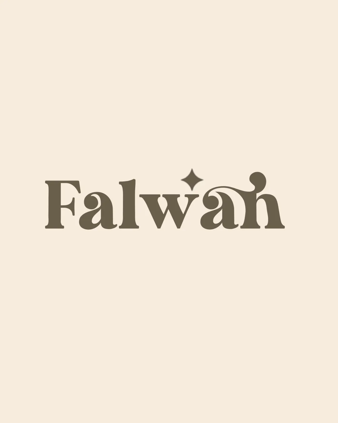
Try it Now!Logo review of Falwah
 Logo analysis by AI
Logo type:
Style:
Detected symbol:
Negative space:
Detected text:
Business industry:
Review requested by Reel_21m
**If AI can recognize or misinterpret it, so can people.
Structured logo review
Legibility
![]() Primary letterforms are mostly clear and readable
Primary letterforms are mostly clear and readable![]() High contrast between text and background
High contrast between text and background
![]() Ornamental flourish on 'a' and 'h' can make quick reading less immediate
Ornamental flourish on 'a' and 'h' can make quick reading less immediate![]() Star element slightly distracts from the word
Star element slightly distracts from the word
Scalability versatility
![]() Simple palette supports single-color adaptation
Simple palette supports single-color adaptation![]() Works well in large formats such as print and web headers
Works well in large formats such as print and web headers
![]() Thin swash details may become illegible at favicon or small print scale
Thin swash details may become illegible at favicon or small print scale![]() Star Detail can disappear in small applications
Star Detail can disappear in small applications
200x250 px
100×125 px
50×62 px
Balance alignment
![]() Typographic elements feel mostly balanced
Typographic elements feel mostly balanced![]() Starburst is centered above the mid-point of the word
Starburst is centered above the mid-point of the word
![]() Swash connecting the 'a' and 'h' makes right side visually heavier
Swash connecting the 'a' and 'h' makes right side visually heavier![]() Slight tip of weight at the end due to embellishments
Slight tip of weight at the end due to embellishments

Originality
![]() Custom ligature-like flourish is distinctive for the wordmark
Custom ligature-like flourish is distinctive for the wordmark![]() Starburst adds memorable detail
Starburst adds memorable detail
![]() Stylized serif approach is currently trendy and appears in multiple lifestyle brands
Stylized serif approach is currently trendy and appears in multiple lifestyle brands![]() Starburst is a fairly common accent symbol in branding
Starburst is a fairly common accent symbol in branding
Aesthetic look
![]() Elegant and visually pleasing use of custom typography
Elegant and visually pleasing use of custom typography![]() Star accent brings a whimsical, upscale touch
Star accent brings a whimsical, upscale touch
![]() Right-side flourish can be visually jarring against the otherwise contained typeface
Right-side flourish can be visually jarring against the otherwise contained typeface![]() Slightly overdecorated for very minimalist applications
Slightly overdecorated for very minimalist applications
Dual meaning and misinterpretations
![]() No obvious misinterpretations or inappropriate symbols detected
No obvious misinterpretations or inappropriate symbols detected
Color harmony
![]() Restrained, harmonious color palette
Restrained, harmonious color palette![]() Excellent contrast for readability
Excellent contrast for readability
Teak
#B7996E
Almond
#E8DFC8