Wondering how your logo performs? 🧐
Get professional logo reviews in seconds and catch design issues in time.
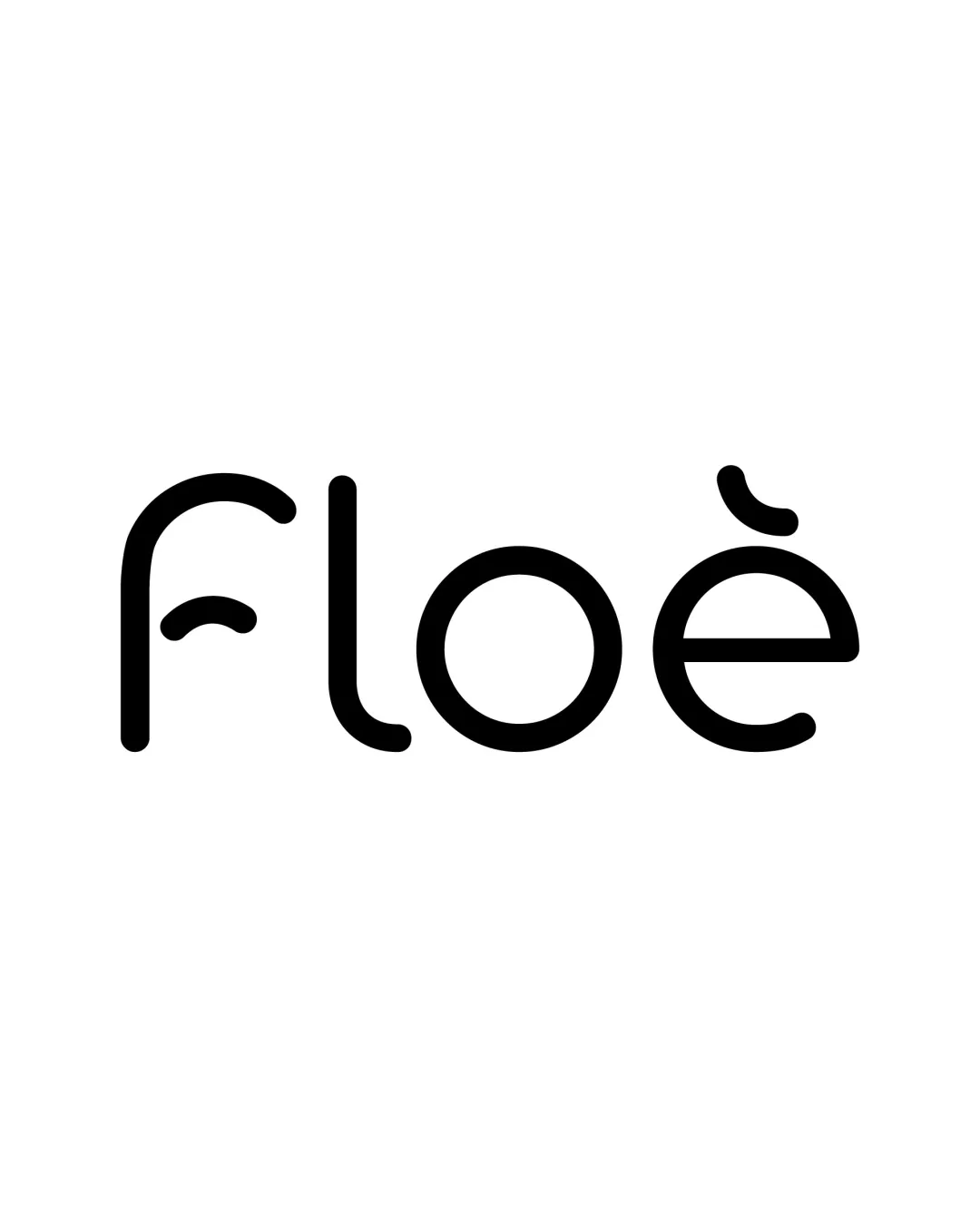
Try it Now!Logo review of floe
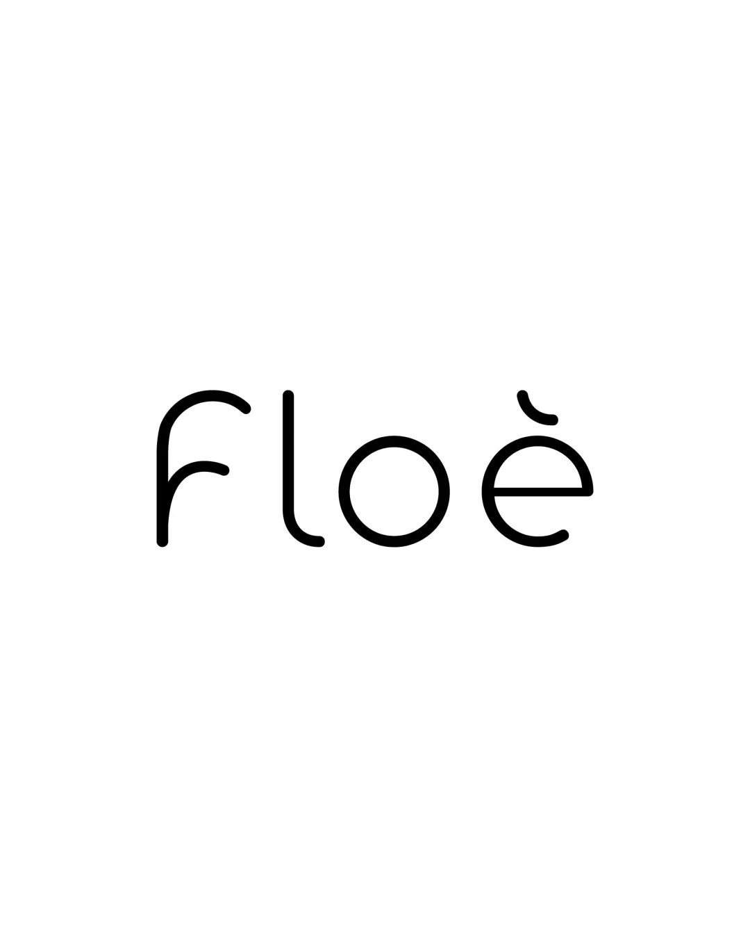
 Logo analysis by AI
Logo type:
Style:
Detected symbol:
Detected text:
Business industry:
Review requested by John_sianang_
**If AI can recognize or misinterpret it, so can people.
Structured logo review
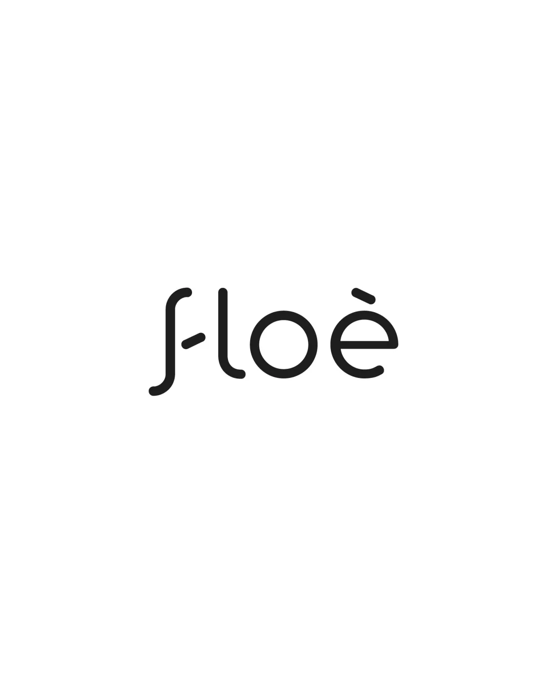
Legibility
![]() Simple, clear type design ensures easy reading.
Simple, clear type design ensures easy reading.![]() No over-decoration or extreme stylization.
No over-decoration or extreme stylization.
![]() The custom accent mark over the 'e' might confuse some viewers or be seen as unnecessary stylization.
The custom accent mark over the 'e' might confuse some viewers or be seen as unnecessary stylization.![]() The lowercase 'l' and 'o' could be misread at very small sizes or by those unfamiliar with the font.
The lowercase 'l' and 'o' could be misread at very small sizes or by those unfamiliar with the font.
Scalability versatility
![]() Minimalist design scales well and remains recognizable from large signage to small app icons.
Minimalist design scales well and remains recognizable from large signage to small app icons.![]() Single color allows easy adaptation for monochrome applications.
Single color allows easy adaptation for monochrome applications.
![]() Very thin lines might lose presence or become faint in very small print or embroidery applications.
Very thin lines might lose presence or become faint in very small print or embroidery applications.
200x250 px
100×125 px
50×62 px
Balance alignment
![]() Excellent use of negative space and balanced letterforms create visual harmony.
Excellent use of negative space and balanced letterforms create visual harmony.![]() Even spacing between letters and consistent line weight.
Even spacing between letters and consistent line weight.

Originality
![]() Custom accent on the 'e' adds a distinctive touch.
Custom accent on the 'e' adds a distinctive touch.![]() Typography choice feels contemporary and clean.
Typography choice feels contemporary and clean.
![]() Sans-serif rounded style is highly popular and risks feeling generic without stronger distinguishing features.
Sans-serif rounded style is highly popular and risks feeling generic without stronger distinguishing features.
Aesthetic look
![]() Minimalist and clean, appealing to modern aesthetic sensibilities.
Minimalist and clean, appealing to modern aesthetic sensibilities.![]() Visual simplicity makes it elegant and versatile.
Visual simplicity makes it elegant and versatile.
![]() Minimalist approach, while attractive, may lack memorable features that help long-term brand recall.
Minimalist approach, while attractive, may lack memorable features that help long-term brand recall.
Dual meaning and misinterpretations
![]() No inappropriate symbols or dual-meaning issues detected.
No inappropriate symbols or dual-meaning issues detected.![]() Accent adds visual interest without negative connotations.
Accent adds visual interest without negative connotations.
Color harmony
![]() Basic black and white palette ensures total design cohesion.
Basic black and white palette ensures total design cohesion.![]() Maximum versatility across backgrounds and applications.
Maximum versatility across backgrounds and applications.
Black
#000000
White
#FFFFFF