Wondering how your logo performs? 🧐
Get professional logo reviews in seconds and catch design issues in time.
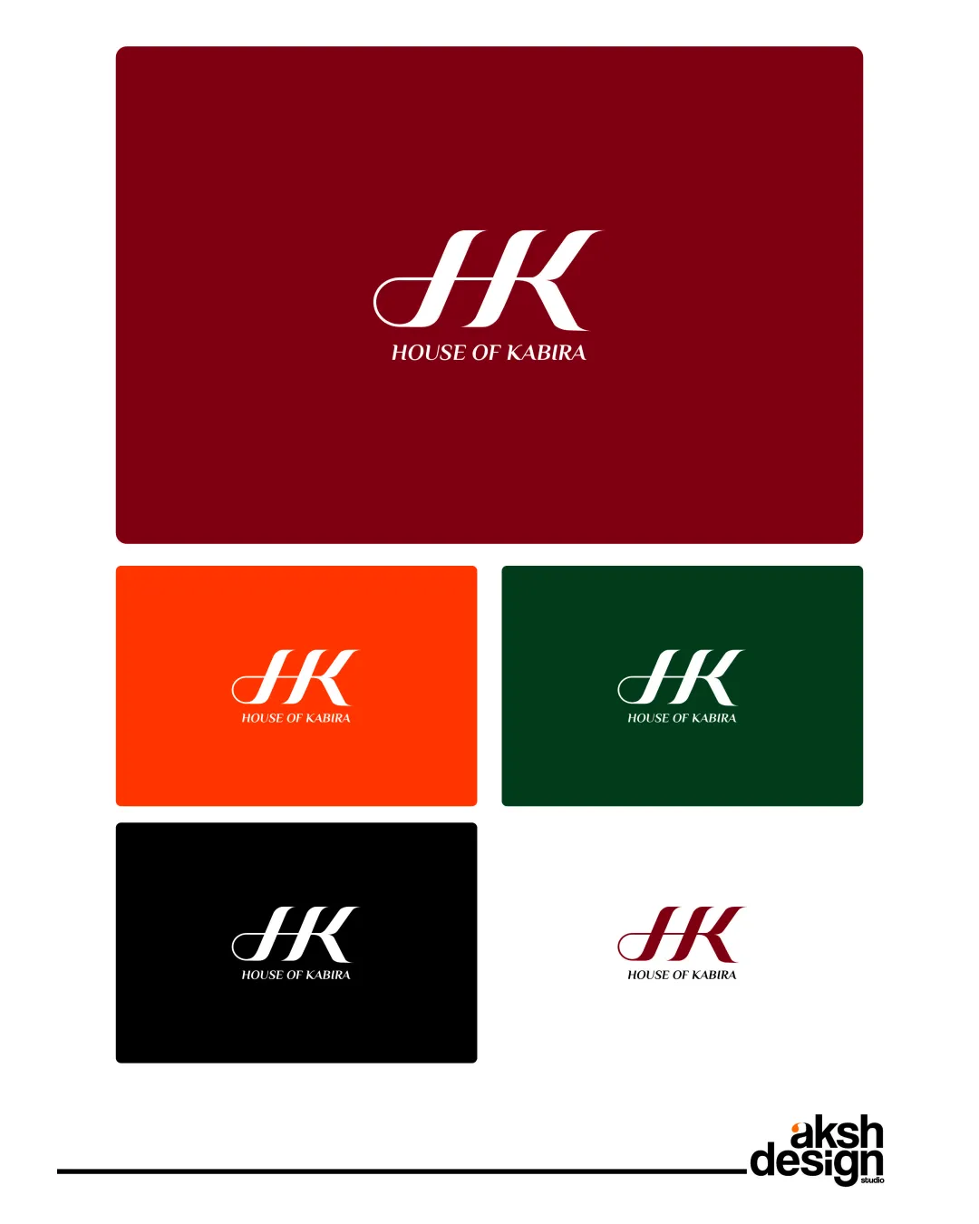
Try it Now!Logo review of HOUSE OF KABIRA
 Logo analysis by AI
Logo type:
Style:
Detected symbol:
Detected text:
Business industry:
Review requested by Ra.ra.raa.rahul
**If AI can recognize or misinterpret it, so can people.
Structured logo review
Legibility
![]() The text 'HOUSE OF KABIRA' is clear, uppercase, and uses a readable serif typeface.
The text 'HOUSE OF KABIRA' is clear, uppercase, and uses a readable serif typeface.![]() The HK monogram is distinct and stands out.
The HK monogram is distinct and stands out.
![]() The thin connecting stroke in the 'H' could reduce clarity at very small sizes.
The thin connecting stroke in the 'H' could reduce clarity at very small sizes.![]() The script-like flourish on the 'H' might be misinterpreted or missed at a glance.
The script-like flourish on the 'H' might be misinterpreted or missed at a glance.
Scalability versatility
![]() Logo adapts well to different background colors, as shown in mockups.
Logo adapts well to different background colors, as shown in mockups.![]() Clean lines and limited detail support clarity at various sizes.
Clean lines and limited detail support clarity at various sizes.
![]() The thin stroke of the 'H' flourish may lose visibility or appear uneven when reduced to favicon or embroidery scale.
The thin stroke of the 'H' flourish may lose visibility or appear uneven when reduced to favicon or embroidery scale.![]() The intricate serif of 'K' may blur on very tiny applications.
The intricate serif of 'K' may blur on very tiny applications.
200x250 px
100×125 px
50×62 px
Balance alignment
![]() HK monogram and text are visually centered and proportionate.
HK monogram and text are visually centered and proportionate.![]() Consistent spacing and clear separation between the symbol and wordmark.
Consistent spacing and clear separation between the symbol and wordmark.
![]() The tail flourish on the 'H' slightly disrupts symmetry, leading to minor imbalance.
The tail flourish on the 'H' slightly disrupts symmetry, leading to minor imbalance.![]() Top of the HK mark slightly outweighs the textual component when viewed at small sizes.
Top of the HK mark slightly outweighs the textual component when viewed at small sizes.

Originality
![]() Custom letter treatment in 'H' provides a unique identity.
Custom letter treatment in 'H' provides a unique identity.![]() Monogram approach is appropriate for the luxury/fashion space.
Monogram approach is appropriate for the luxury/fashion space.
![]() HK monogram is a common format in the fashion industry, leading to only moderate uniqueness.
HK monogram is a common format in the fashion industry, leading to only moderate uniqueness.![]() No use of negative space or additional creative twists found.
No use of negative space or additional creative twists found.
Logomark wordmark fit
![]() The serif style of both monogram and wordmark match, creating a cohesive look.
The serif style of both monogram and wordmark match, creating a cohesive look.![]() Sizing feels harmonious across all versions and backgrounds.
Sizing feels harmonious across all versions and backgrounds.
Aesthetic look
![]() Elegant, minimal, and modern aesthetic aligned with luxury branding.
Elegant, minimal, and modern aesthetic aligned with luxury branding.![]() Color versions are bold and sophisticated.
Color versions are bold and sophisticated.
![]() Lacks a highly distinctive feature, which could enhance memorability.
Lacks a highly distinctive feature, which could enhance memorability.![]() The flourish may polarize stylistic preference (subjective aesthetic).
The flourish may polarize stylistic preference (subjective aesthetic).
Dual meaning and misinterpretations
![]() No inappropriate or confusing symbols detected.
No inappropriate or confusing symbols detected.![]() No risk of unwanted associations or offensive misinterpretations.
No risk of unwanted associations or offensive misinterpretations.
Color harmony
![]() Each color palette is limited and well-chosen, allowing strong contrast and brand flexibility.
Each color palette is limited and well-chosen, allowing strong contrast and brand flexibility.![]() No overwhelming or clashing colors present.
No overwhelming or clashing colors present.
Dark Red
#78141B
Orange
#FF4500
Dark Green
#184428
Black
#000000
White
#FFFFFF