Wondering how your logo performs? 🧐
Get professional logo reviews in seconds and catch design issues in time.
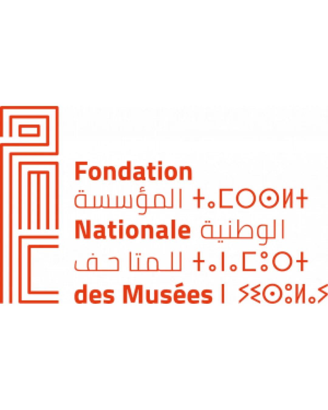
Try it Now!Logo review of Fondation Nationale des Musées (also in Arabic an..
 Logo analysis by AI
Logo type:
Style:
Detected symbol:
Detected text:
Business industry:
Review requested by Gamixa7550
**If AI can recognize or misinterpret it, so can people.
Structured logo review
Legibility
![]() French and Arabic text portions are mostly legible
French and Arabic text portions are mostly legible![]() Clear typographic hierarchy for the French text
Clear typographic hierarchy for the French text
![]() Tifinagh script and stylized geometric forms are difficult to decipher for those unfamiliar with the alphabet
Tifinagh script and stylized geometric forms are difficult to decipher for those unfamiliar with the alphabet![]() Red-orange color on white background results in low contrast, especially in thin-line areas
Red-orange color on white background results in low contrast, especially in thin-line areas![]() Small and condensed glyphs in certain scripts further hinder legibility
Small and condensed glyphs in certain scripts further hinder legibility
Scalability versatility
![]() Symbol is geometric and relatively simple, which helps at small sizes
Symbol is geometric and relatively simple, which helps at small sizes
![]() Thin lines in both the symbol and multilingual wordmark may disappear on small-scale applications (e.g., business cards, web favicons, embroidery)
Thin lines in both the symbol and multilingual wordmark may disappear on small-scale applications (e.g., business cards, web favicons, embroidery)![]() Complexity increases with three scripts, making full logo unsuitable for compact digital icons or badges
Complexity increases with three scripts, making full logo unsuitable for compact digital icons or badges
200x250 px
100×125 px
50×62 px
Balance alignment
![]() Visual balance achieved between symbol and text block
Visual balance achieved between symbol and text block![]() Horizontal alignment between scripts is consistent
Horizontal alignment between scripts is consistent
![]() Block of multilingual text feels dense compared to the lighter monogram, slight imbalance in visual weight
Block of multilingual text feels dense compared to the lighter monogram, slight imbalance in visual weight![]() Some inconsistencies in spacing between scripts
Some inconsistencies in spacing between scripts

Originality
![]() Unique integration of multiple scripts (Arabic, Latin, Tifinagh) and geometrically styled monogram
Unique integration of multiple scripts (Arabic, Latin, Tifinagh) and geometrically styled monogram![]() Abstract geometric style distinguishes it from generic cultural or institutional logos
Abstract geometric style distinguishes it from generic cultural or institutional logos
Logomark wordmark fit
![]() Geometric character of symbol and text complements one another
Geometric character of symbol and text complements one another![]() Color harmony is consistent between components
Color harmony is consistent between components
![]() Wordmark becomes visually complex and crowded when all scripts are used together
Wordmark becomes visually complex and crowded when all scripts are used together
Aesthetic look
![]() Modern, visually intriguing, and culturally relevant
Modern, visually intriguing, and culturally relevant![]() Bold use of a single color creates unity
Bold use of a single color creates unity
![]() Slightly overcomplicated due to three scripts side by side
Slightly overcomplicated due to three scripts side by side
Dual meaning and misinterpretations
![]() No inappropriate or unintended visual associations detected
No inappropriate or unintended visual associations detected
Color harmony
![]() Consistent, unified use of warm red-orange creates visual impact
Consistent, unified use of warm red-orange creates visual impact![]() Limited color palette enhances brand recognition
Limited color palette enhances brand recognition
Red
#F04C22
White
#FFFFFF