Wondering how your logo performs? 🧐
Get professional logo reviews in seconds and catch design issues in time.
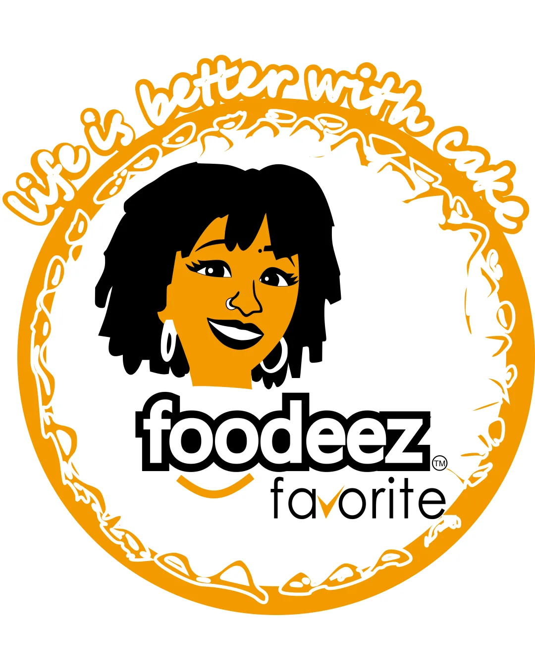
Try it Now!Logo review of foodeez favorite, Life is better with cake
 Logo analysis by AI
Logo type:
Style:
Detected symbol:
Detected text:
Business industry:
Review requested by Excelgker
**If AI can recognize or misinterpret it, so can people.
Structured logo review
Legibility
![]() Primary brand name 'foodeez' uses a bold, high-contrast sans-serif type that's easy to read.
Primary brand name 'foodeez' uses a bold, high-contrast sans-serif type that's easy to read.![]() The tagline and 'favorite' are legible at medium size.
The tagline and 'favorite' are legible at medium size.
![]() Tagline 'Life is better with cake' and the word 'favorite' may become difficult to read at small sizes due to thin and decorative script font.
Tagline 'Life is better with cake' and the word 'favorite' may become difficult to read at small sizes due to thin and decorative script font.![]() The color contrast in some areas of the script tagline against an orange/yellow background may reduce overall legibility.
The color contrast in some areas of the script tagline against an orange/yellow background may reduce overall legibility.
Scalability versatility
![]() Strong central symbol and main 'foodeez' wordmark can be recognized at moderate sizes.
Strong central symbol and main 'foodeez' wordmark can be recognized at moderate sizes.![]() Appropriate for signage or large packaging.
Appropriate for signage or large packaging.
![]() Complex details in the hair, face illustration, and cake border will be lost at small scales, like social icons or embroidery.
Complex details in the hair, face illustration, and cake border will be lost at small scales, like social icons or embroidery.![]() Script text in the tagline will become illegible at smaller sizes, making the logo less versatile for digital avatars, stamps, or small merchandise.
Script text in the tagline will become illegible at smaller sizes, making the logo less versatile for digital avatars, stamps, or small merchandise.
200x250 px
100×125 px
50×62 px
Balance alignment
![]() Central face illustration is well placed above the wordmark and enclosed by the cake-like border.
Central face illustration is well placed above the wordmark and enclosed by the cake-like border.
![]() The top-heavy decorative script and oversized border creates a visual imbalance, pulling attention away from the brand name.
The top-heavy decorative script and oversized border creates a visual imbalance, pulling attention away from the brand name.![]() The bottom 'favorite' text feels disconnected and less visually integrated with the rest of the design.
The bottom 'favorite' text feels disconnected and less visually integrated with the rest of the design.

Originality
![]() Custom illustrated face provides personality and strong brand recognition.
Custom illustrated face provides personality and strong brand recognition.![]() Handwritten script tagline and stylized cake ring add a unique, playful touch.
Handwritten script tagline and stylized cake ring add a unique, playful touch.
![]() The cake border, while illustrative, is not conceptually unique for a food or bakery brand.
The cake border, while illustrative, is not conceptually unique for a food or bakery brand.![]() Overall aesthetic draws on familiar bakery and food branding visuals.
Overall aesthetic draws on familiar bakery and food branding visuals.
Logomark wordmark fit
![]() The playfulness of the illustrated face complements the rounded, friendly type in 'foodeez.'
The playfulness of the illustrated face complements the rounded, friendly type in 'foodeez.'
![]() The illustrative face and the structured sans-serif do not fully harmonize in style.
The illustrative face and the structured sans-serif do not fully harmonize in style.![]() Visual weight of the facial illustration and wordmark are slightly mismatched, especially when compared to the thin 'favorite' lettering.
Visual weight of the facial illustration and wordmark are slightly mismatched, especially when compared to the thin 'favorite' lettering.
Aesthetic look
![]() Friendly, energetic, and inviting overall vibe.
Friendly, energetic, and inviting overall vibe.![]() Strong use of a limited color palette.
Strong use of a limited color palette.
![]() Overly busy due to detailed illustration, bold script, and text-heavy layout.
Overly busy due to detailed illustration, bold script, and text-heavy layout.![]() Variations in font weights and styles reduce aesthetic cohesion.
Variations in font weights and styles reduce aesthetic cohesion.![]() Cake border is overly thick and distracts from the core brand elements.
Cake border is overly thick and distracts from the core brand elements.
Dual meaning and misinterpretations
![]() No inappropriate or confusing dual imagery detected.
No inappropriate or confusing dual imagery detected.
Color harmony
![]() Limited color palette keeps the design cohesive and visually appealing.
Limited color palette keeps the design cohesive and visually appealing.![]() Good contrast between black, orange, and white.
Good contrast between black, orange, and white.
![]() Some areas of orange on white or vice versa may create slight legibility or print issues.
Some areas of orange on white or vice versa may create slight legibility or print issues.![]() Adding a third accent or using shadow/gradient could increase vibrancy but risks breaking harmony if overdone.
Adding a third accent or using shadow/gradient could increase vibrancy but risks breaking harmony if overdone.
Orange
#F4A300
Black
#000000
White
#FFFFFF