Wondering how your logo performs? 🧐
Get professional logo reviews in seconds and catch design issues in time.
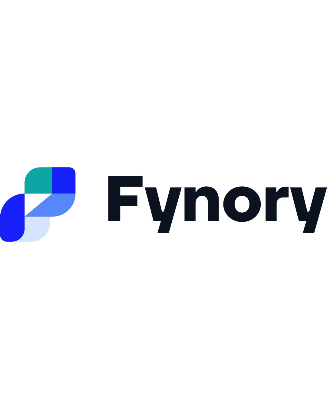
Try it Now!Logo review of Fynory
 Logo analysis by AI
Logo type:
Style:
Detected symbol:
Detected text:
Business industry:
Review requested by Bywuilgonzalez
**If AI can recognize or misinterpret it, so can people.
Structured logo review
Legibility
![]() Wordmark is set in a clean, high-contrast sans-serif typeface ensuring excellent readability.
Wordmark is set in a clean, high-contrast sans-serif typeface ensuring excellent readability.![]() Letter spacing and boldness make the brand name easy to recognize at various sizes.
Letter spacing and boldness make the brand name easy to recognize at various sizes.
Scalability versatility
![]() Simple forms and restrained details aid in scalability on most branding surfaces.
Simple forms and restrained details aid in scalability on most branding surfaces.![]() Abstract icon is distinguishable at small sizes, usable for app icons, favicons, and business cards.
Abstract icon is distinguishable at small sizes, usable for app icons, favicons, and business cards.
![]() Transparent overlays and color blending in the symbol may lose clarity when printed very small or in monotone applications.
Transparent overlays and color blending in the symbol may lose clarity when printed very small or in monotone applications.![]() Intricate overlapping shapes may present challenges on embroidered merchandise.
Intricate overlapping shapes may present challenges on embroidered merchandise.
200x250 px
100×125 px
50×62 px
Balance alignment
![]() Proportions between logomark and wordmark create a visually harmonious composition.
Proportions between logomark and wordmark create a visually harmonious composition.![]() Vertical alignment between the symbol and text is precise, with appropriate spacing.
Vertical alignment between the symbol and text is precise, with appropriate spacing.

Originality
![]() Geometric form is well-crafted with thoughtful layering and subtle color play.
Geometric form is well-crafted with thoughtful layering and subtle color play.![]() Symbol does not directly reference generic tech icons, offering some uniqueness.
Symbol does not directly reference generic tech icons, offering some uniqueness.
![]() Geometric, abstract shapes are somewhat common in the tech sector, resulting in a moderate sense of uniqueness.
Geometric, abstract shapes are somewhat common in the tech sector, resulting in a moderate sense of uniqueness.
Logomark wordmark fit
![]() Stylistic consistency between the smooth curves of the logomark and the rounded terminal of the wordmark's typeface.
Stylistic consistency between the smooth curves of the logomark and the rounded terminal of the wordmark's typeface.![]() Color palette integrates seamlessly across both elements.
Color palette integrates seamlessly across both elements.
Aesthetic look
![]() Clean, modern, and professional with a subtle layered look.
Clean, modern, and professional with a subtle layered look.![]() Visually appealing color scheme and proportional form.
Visually appealing color scheme and proportional form.
![]() Symbol feels slightly generic due to the repeated use of overlapping geometric shapes in the industry.
Symbol feels slightly generic due to the repeated use of overlapping geometric shapes in the industry.
Dual meaning and misinterpretations
![]() No suggestive, violent, or inappropriate connotations detected.
No suggestive, violent, or inappropriate connotations detected.
Color harmony
![]() Colors are well-chosen, vibrant, and complementary without clashing.
Colors are well-chosen, vibrant, and complementary without clashing.![]() Balanced use of three main hues avoids visual noise.
Balanced use of three main hues avoids visual noise.
Curious Blue
#2186EB
Jungle Green
#2BB5A8
Seashell
#F2F5FA
Raisin Black
#181D24