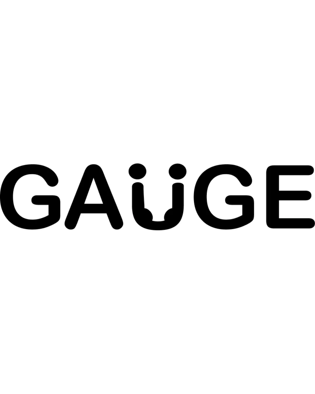
GAUGE logo review
4.5/5
Logo score
Logo review of

Gauge

A clever, highly relevant wordmark that is memorable and nearly production-ready except for small-scale clarity.

Wordmark Modern Geometric Sans-serif With Integrated Symbolism Recruitment/assessment
4.5/5
Legibility
4.5/5
Originality
5/5
Misread
4/5
Balance
4/5
Scale
Your next steps

What to fix first

Focus on the changes that matter. Keep what makes the logo work.

1

stylized 'U'

Test logo legibility and gauge motif clarity at smaller scales; simplify if necessary.

Worth testing Medium priority Low effort
Area to inspectApproximate location

The visual elements above the 'U' and its open-bottom form may lose clarity at very small sizes.

How to check

Render at favicon and mobile app icon sizes to verify if the stylization remains understandable.

See the category review
2

whole wordmark

Slightly refine stroke weights to balance the overall wordmark.

Optional refinement Low priority Low effort

The 'U' is slightly heavier visually than the rest of the letters due to the gauge styling, causing a mild imbalance in the wordmark.

How to check

Compare optical balance after minor stroke adjustments.

See the category review
Detailed review

Logo performance breakdown

5/5

Brief & logo match

Based on your brief
Compared with

Brand is an interviewing, recruitment, and assessment agency.

The logo communicates assessment and evaluation excellently through the integrated gauge motif.

  • Industry Relevance

    The gauge motif directly references measurement, aligning with assessment and interviewing.

  • Professional Tone

    Modern, geometric typography communicates reliability and clarity, suitable for a recruitment agency.

4.5/5

Legibility

  • Highly readable wordmark with creative character modification.
4.5/5

Originality

  • Distinctive 'U' integration as a gauge create instant relevance and memorability.
4/5

Balance alignment

  • Letter spacing is clean and modern.
  • The 'U' is slightly heavier visually than the rest of the letters due to the gauge styling, causing a mild imbalance in the wordmark.

    Optional refinement whole wordmark

    Try: Slightly refine stroke weights to balance the overall wordmark.

    Check: Compare optical balance after minor stroke adjustments.

Uploaded logoAlignment guide overlay

Inspect spacing with the guide. Optical balance may differ from geometric centering.

4/5

Scalability

  • Simplicity aids reproduction on many surfaces.
  • The visual elements above the 'U' and its open-bottom form may lose clarity at very small sizes.

    Worth testing stylized 'U'

    Try: Test logo legibility and gauge motif clarity at smaller scales; simplify if necessary.

    Check: Render at favicon and mobile app icon sizes to verify if the stylization remains understandable.
    Area to inspectApproximate location
Uploaded logo at 200 pixels wide
200 × 250 px
Uploaded logo at 100 pixels wide
100 × 125 px
Uploaded logo at 50 pixels wide
50 × 63 px

Compare the detail at different sizes. Labels show the full image dimensions.

5/5

Misinterpretations

  • No plausible misreadings or unintended shapes detected.

Black & white

Does the shape still work without color?

These tests are available only for logos uploaded in vector (SVG) format.

Background contrast

Find the surfaces where your logo stays clear.

These tests are available only for logos uploaded in vector (SVG) format.

Blur & silhouette

A 3px blur softens fine details so you can check whether the overall shape stays recognizable. If key gaps close or elements merge, the logo may rely too heavily on detail.

These tests are available only for logos uploaded in vector (SVG) format.

Try your own review

Wondering how your logo performs?

Get a clear logo score, key risks, and priority fix ideas before your client or audience sees it.

Review my logo