View review
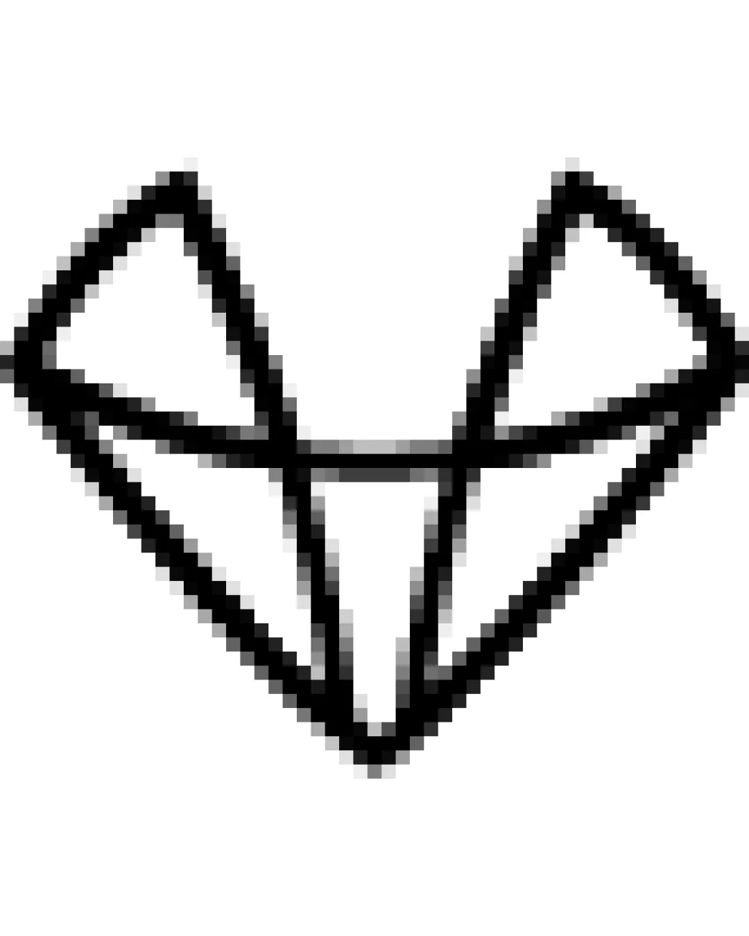
Geometric Fox Head
Review the detailed scores below to see what is working and what should be refined first.
Logo performance breakdown
Originality
Abstract rendering of a fox head provides distinction compared to generic animal icons.
Minimalist approach feels contemporary and unique.
Fox head in geometric style has been used in various tech/creative industries, slightly reducing uniqueness.

Color harmony
Restrained black-and-white palette is professional, versatile, and conveys clarity.
White
#FFFFFF
Black
#000000
Balance alignment
Overall symmetrical form creates a sense of balance.
Geometric alignment provides a structured look.
Inner lines are not perfectly uniform, causing slight dissonance in symmetry.
Weight of lower vertical lines draws visual attention downward.
Scalability
Simple geometric shape ensures it is recognizable at medium to large sizes.
Single-color design makes it adaptable for different media.
Thin line weight may be lost on small scale applications like favicons or embroidery.
Pixelation or jagged edges appear at current resolution, compromising reproduction quality in certain formats.
200x250 px
100×125 px
50×62 px
Misinterpretations
No accidental inappropriate or misleading double meanings detected.
Wondering how your logo performs?
Get a clear logo score, key risks, and priority fix ideas before your client or audience sees it.