Wondering how your logo performs? 🧐
Get professional logo reviews in seconds and catch design issues in time.
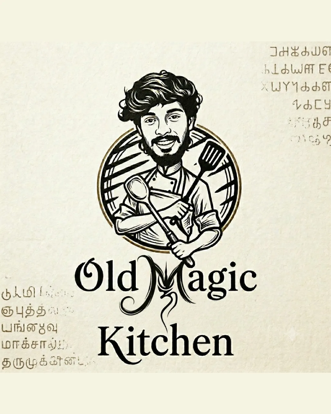
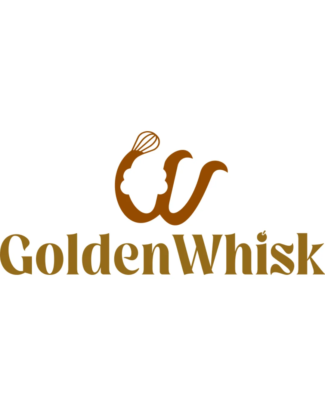
Try it Now!Logo review of GoldenWhisk
 Logo analysis by AI
Logo type:
Style:
Detected symbol:
Negative space:
Detected text:
Business industry:
Review requested by Koya122024
**If AI can recognize or misinterpret it, so can people.
Structured logo review
Legibility
![]() Text is clear and distinguishable.
Text is clear and distinguishable.![]() Consistent font style matches the brand theme.
Consistent font style matches the brand theme.
![]() Slightly stylized W could be misread at smaller scales.
Slightly stylized W could be misread at smaller scales.![]() The small dot on the 'k' may create minor confusion at very small sizes.
The small dot on the 'k' may create minor confusion at very small sizes.
Scalability versatility
![]() Simple color palette aids printing and digital reproduction.
Simple color palette aids printing and digital reproduction.![]() Logo mark and wordmark are distinct enough for most medium-sized applications.
Logo mark and wordmark are distinct enough for most medium-sized applications.
![]() Whisk and chef hat details might get lost on very small formats like favicons or embroidery.
Whisk and chef hat details might get lost on very small formats like favicons or embroidery.![]() W’s illustrative features may not translate well on ultra-small or low-res formats.
W’s illustrative features may not translate well on ultra-small or low-res formats.
200x250 px
100×125 px
50×62 px
Balance alignment
![]() Strong visual weight distribution between symbol and type.
Strong visual weight distribution between symbol and type.![]() Wordmark aligns horizontally for clean presentation.
Wordmark aligns horizontally for clean presentation.
![]() Chef hat above the W slightly unbalances the mark, pulling the eye upward.
Chef hat above the W slightly unbalances the mark, pulling the eye upward.

Originality
![]() Clever integration of a whisk and chef hat with the W.
Clever integration of a whisk and chef hat with the W.![]() Customized letterform stands out from typical food logos.
Customized letterform stands out from typical food logos.
![]() Chef hat + utensil motif is somewhat common in the food industry.
Chef hat + utensil motif is somewhat common in the food industry.
Logomark wordmark fit
![]() Wordmark font and logomark style are visually harmonious.
Wordmark font and logomark style are visually harmonious.![]() Unified color palette strengthens connection between elements.
Unified color palette strengthens connection between elements.
![]() Logomark’s playful feel is slightly at odds with the more formal serif, though the difference is minor.
Logomark’s playful feel is slightly at odds with the more formal serif, though the difference is minor.
Aesthetic look
![]() Inviting and visually appealing design.
Inviting and visually appealing design.![]() Color tone is warm and suits the bakery/culinary category well.
Color tone is warm and suits the bakery/culinary category well.
![]() The chef hat’s puffy outline feels less refined than the rest; could be simplified for elegance.
The chef hat’s puffy outline feels less refined than the rest; could be simplified for elegance.
Dual meaning and misinterpretations
![]() No accidental or inappropriate meanings detected.
No accidental or inappropriate meanings detected.![]() Imagery is clearly related to culinary activities.
Imagery is clearly related to culinary activities.
Color harmony
![]() Restriction to warm brown/gold tones creates a unified, appetizing feel.
Restriction to warm brown/gold tones creates a unified, appetizing feel.![]() Strong contrast between logo and white background for high visibility.
Strong contrast between logo and white background for high visibility.
Golden Brown
#A96811
Light Gold
#BF8C2C
White
#FFFFFF