Wondering how your logo performs? 🧐
Get professional logo reviews in seconds and catch design issues in time.
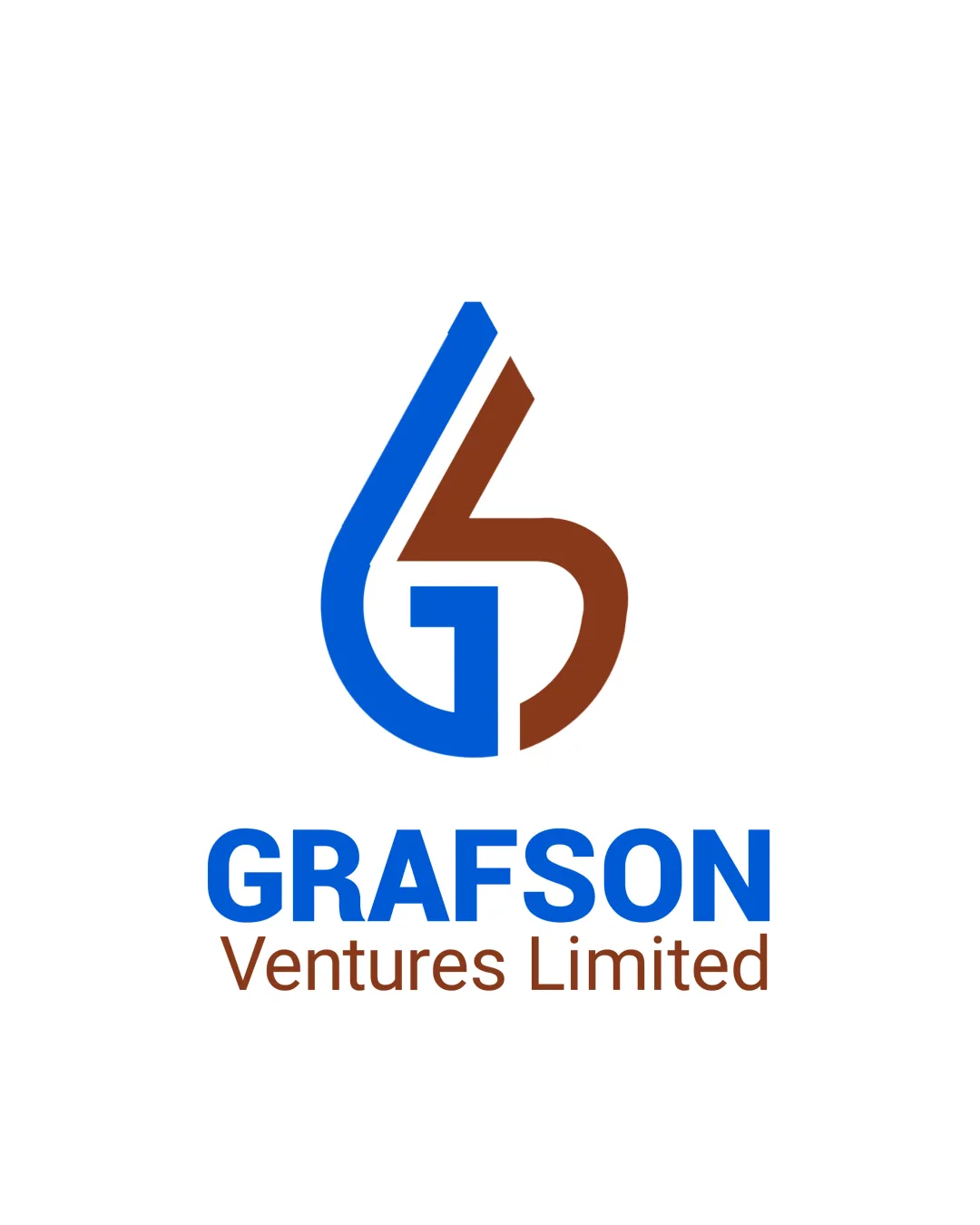
Try it Now!Logo review of GRAFSON, Ventures Limited
 Logo analysis by AI
Logo type:
Style:
Detected symbol:
Negative space:
Detected text:
Business industry:
Review requested by FolaGraphics
**If AI can recognize or misinterpret it, so can people.
Structured logo review
Legibility
![]() The main business name 'GRAFSON' is bold, clear, and very readable.
The main business name 'GRAFSON' is bold, clear, and very readable.![]() Secondary text 'Ventures Limited' is still legible, though much thinner.
Secondary text 'Ventures Limited' is still legible, though much thinner.
![]() Color contrast between brown secondary text and white background is slightly lower than ideal.
Color contrast between brown secondary text and white background is slightly lower than ideal.![]() Hierarchical separation between primary and secondary text may be too stark for smaller applications.
Hierarchical separation between primary and secondary text may be too stark for smaller applications.
Scalability versatility
![]() Simple monogram and strong typography are generally scalable and could work well on digital platforms and print.
Simple monogram and strong typography are generally scalable and could work well on digital platforms and print.![]() Logo should render sharply on business cards and letterheads.
Logo should render sharply on business cards and letterheads.
![]() Thin separation line in the monogram may lose clarity at very small sizes such as favicons or embroidery.
Thin separation line in the monogram may lose clarity at very small sizes such as favicons or embroidery.![]() Dual-tone color requirement may restrict single-color applications, reducing versatility.
Dual-tone color requirement may restrict single-color applications, reducing versatility.
200x250 px
100×125 px
50×62 px
Balance alignment
![]() Symmetrical monogram provides a sense of visual balance.
Symmetrical monogram provides a sense of visual balance.![]() Logical vertical alignment of monogram and wordmark.
Logical vertical alignment of monogram and wordmark.
![]() Slight visual weight imbalance caused by the color and thickness differences between G (blue) and V (brown).
Slight visual weight imbalance caused by the color and thickness differences between G (blue) and V (brown).

Originality
![]() Creative integration of G and V into a single form provides distinction.
Creative integration of G and V into a single form provides distinction.![]() Modern geometric monogram is not commonly seen.
Modern geometric monogram is not commonly seen.
![]() The overall concept of letter-based monograms is relatively standard in the finance/venture industry.
The overall concept of letter-based monograms is relatively standard in the finance/venture industry.![]() No hidden or secondary symbol in the negative space to elevate uniqueness.
No hidden or secondary symbol in the negative space to elevate uniqueness.
Logomark wordmark fit
![]() Bold, geometric logomark complements the sans-serif wordmark.
Bold, geometric logomark complements the sans-serif wordmark.![]() Color harmony between the logo symbol and textual elements.
Color harmony between the logo symbol and textual elements.
![]() Disparity in boldness between 'GRAFSON' (bold) and 'Ventures Limited' (thin) may make the overall look feel slightly fragmented.
Disparity in boldness between 'GRAFSON' (bold) and 'Ventures Limited' (thin) may make the overall look feel slightly fragmented.
Aesthetic look
![]() Clean, modern, and professional look.
Clean, modern, and professional look.![]() Strong color pairing provides a distinctive and memorable aesthetic.
Strong color pairing provides a distinctive and memorable aesthetic.
![]() Slight visual disconnect between the blue and brown can create a less cohesive impression for some viewers.
Slight visual disconnect between the blue and brown can create a less cohesive impression for some viewers.![]() Overall look is professional but not groundbreaking.
Overall look is professional but not groundbreaking.
Dual meaning and misinterpretations
![]() No inappropriate shapes or unintended connotations detected.
No inappropriate shapes or unintended connotations detected.![]() Interlocking design is clear and purpose-driven.
Interlocking design is clear and purpose-driven.
Color harmony
![]() Limited to two prominent colors, keeping visual harmony intact.
Limited to two prominent colors, keeping visual harmony intact.![]() Colors are clearly separated and not visually overwhelming.
Colors are clearly separated and not visually overwhelming.
![]() The blue and brown pairing could be polarizing; testing alternative palettes for broader appeal is recommended.
The blue and brown pairing could be polarizing; testing alternative palettes for broader appeal is recommended.
True Blue
#0066CC
Russet Brown
#7B3F1D
White
#FFFFFF