 View review
Logo score
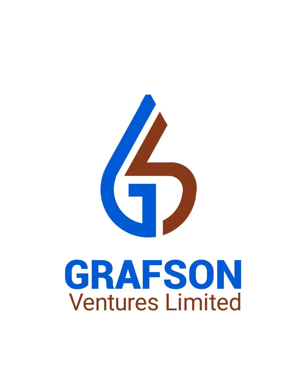
Logo review ofGrafson Ventures Limited
Review the detailed scores below to see what is working and what should be refined first.
Legibility
Originality
Misread
Balance
Scale
Detailed review
Logo performance breakdown
Legibility
![]() Primary wordmark GRAFSON uses a bold, clear sans-serif typeface with excellent contrast against the background.
Primary wordmark GRAFSON uses a bold, clear sans-serif typeface with excellent contrast against the background.![]() Secondary text 'Ventures Limited' is readable and visually separated by color and weight.
Secondary text 'Ventures Limited' is readable and visually separated by color and weight.
![]() Secondary text is smaller and brown, making it less prominent and less impactful from a distance.
Secondary text is smaller and brown, making it less prominent and less impactful from a distance.![]() The use of two font weights and colors in close proximity can cause a break in unity.
The use of two font weights and colors in close proximity can cause a break in unity.
Originality
![]() Creative integration of G and V into a cohesive monogram is distinctive.
Creative integration of G and V into a cohesive monogram is distinctive.![]() Balanced synergy between letters avoids outright genericism.
Balanced synergy between letters avoids outright genericism.
![]() Monogram style is a common approach in finance and venture industries, reducing distinctiveness.
Monogram style is a common approach in finance and venture industries, reducing distinctiveness.![]() Color pairing, while unique, does not push boundaries or provide a notably fresh visual.
Color pairing, while unique, does not push boundaries or provide a notably fresh visual.
Color harmony
![]() Restrained use of color keeps the design clean and professional.
Restrained use of color keeps the design clean and professional.![]() Blue and brown provide subtle, non-overbearing contrast.
Blue and brown provide subtle, non-overbearing contrast.
![]() Color pairing is unconventional and may not feel harmonious for some applications.
Color pairing is unconventional and may not feel harmonious for some applications.![]() Contrast of brown and blue may not be optimal on all backgrounds.
Contrast of brown and blue may not be optimal on all backgrounds.
blue
#0074D9
brown
#8D4B2D
white
#FFFFFF
Your palette is close. Explore sharper color combinations with Colorfly.design before updating the logo.
Explore palettesBalance alignment
![]() The logomark is proportionally sized to the wordmark, with clean central alignment.
The logomark is proportionally sized to the wordmark, with clean central alignment.![]() Both textual elements are horizontally aligned, providing a stable base.
Both textual elements are horizontally aligned, providing a stable base.
![]() Difference in font weights between 'GRAFSON' and 'Ventures Limited' causes slight imbalance in visual hierarchy.
Difference in font weights between 'GRAFSON' and 'Ventures Limited' causes slight imbalance in visual hierarchy.![]() The monogram's right-heavy nature from the brown element creates minute imbalance.
The monogram's right-heavy nature from the brown element creates minute imbalance.

Scalability
![]() Simple geometric construction and limited color palette favor reduction and enlargement.
Simple geometric construction and limited color palette favor reduction and enlargement.![]() Should work on standard collateral like business cards, website headers, and print.
Should work on standard collateral like business cards, website headers, and print.
![]() Thin gaps and complex overlap in the monogram may lose clarity at smaller scales such as mobile icons or embroidery.
Thin gaps and complex overlap in the monogram may lose clarity at smaller scales such as mobile icons or embroidery.![]() Color contrast may be harder to discern on non-white backgrounds; lacks a one-color variant.
Color contrast may be harder to discern on non-white backgrounds; lacks a one-color variant.
200x250 px
100×125 px
50×62 px
Misinterpretations
![]() No inappropriate or confusing hidden imagery detected.
No inappropriate or confusing hidden imagery detected.![]() Clear letter forms reduce risk of misinterpretation.
Clear letter forms reduce risk of misinterpretation.
Symbol & text fit
![]() Font choice and geometric style of the logomark complement the bold, modern typography of the wordmark.
Font choice and geometric style of the logomark complement the bold, modern typography of the wordmark.
![]() Color pairing is consistent between logomark and wordmark elements.
Color pairing is consistent between logomark and wordmark elements.
![]() There’s a slight disconnect in personality; the logomark is more playful and dynamic, while the wordmark is strictly corporate.
There’s a slight disconnect in personality; the logomark is more playful and dynamic, while the wordmark is strictly corporate.
![]() Variance in type weights can lessen harmony.
Variance in type weights can lessen harmony.
Try your own review
Review my logo
Wondering how your logo performs?
Get a clear logo score, key risks, and priority fix ideas before your client or audience sees it.
Keep exploring


