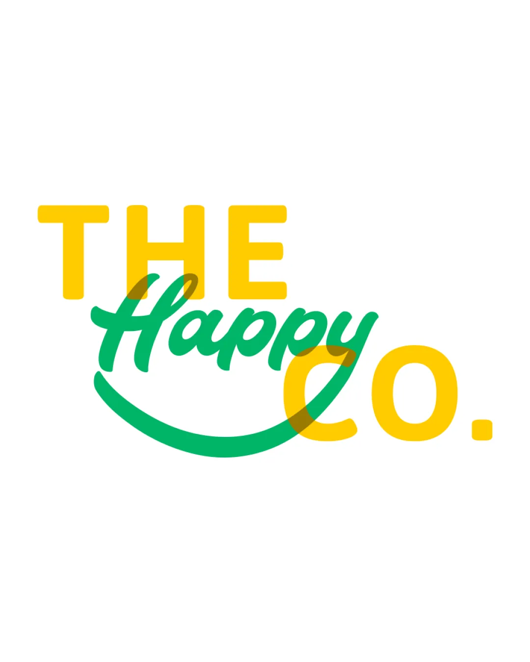
THE Happy CO. logo review
4/5
Logo score
Logo review of

The Happy Co.

A cheerful, inviting wordmark with strong personality that requires minor spatial refinement where styles overlap.

Wordmark Playful Layered Text With A Script Accent Cannabis Edibles
4/5
Legibility
4/5
Originality
5/5
Misread
3.5/5
Balance
4/5
Scale
Your next steps

What to fix first

Focus on the changes that matter. Keep what makes the logo work.

1

wordmark

Adjust overlap and spacing between the 'Happy' script and 'CO.' to improve clarity.

Optional refinement Medium priority Medium effort
Area to inspectApproximate location

The overlapping of the 'Happy' script and 'CO.' creates slight visual congestion at the intersection, mildly reducing clarity.

How to check

Review intersection for better optical balance and clear legibility.

See the category review
Detailed review

Logo performance breakdown

4/5

Brief & logo match

Based on your brief
Compared with

Cannabic edible company targeting women and LGBTQ with a joyful, playful, relaxed approach.

Conveys joy and inclusivity well, but visual congestion at the overlap limits expressive clarity.

  • Playful, Joyful Tone

    Bright colors and a 'smile' underline evoke happiness, aligning well with a playful brand voice.

  • Appeal To Women And LGBTQ+

    Rounded type and lively colors are inclusive and soft, indirectly appealing to diverse audiences as described.

4/5

Legibility

  • Distinct word separation
  • Font styles are easy to read
4/5

Originality

  • Distinctive typographic combination
  • Playful smile underline stands out
4/5

Color harmony

  • Lively, harmonious yellow and green palette
Yellow#FFD600
Green#07B25D

Estimated colors. Use the original design file for exact values.

Create a full color palette using these colors

Create new palette
3.5/5

Balance alignment

  • Strong left-right balance
  • The overlapping of the 'Happy' script and 'CO.' creates slight visual congestion at the intersection, mildly reducing clarity.

    Optional refinement wordmark

    Try: Adjust overlap and spacing between the 'Happy' script and 'CO.' to improve clarity.

    Check: Review intersection for better optical balance and clear legibility.

    Area to inspectApproximate location
Uploaded logoAlignment guide overlay

Inspect spacing with the guide. Optical balance may differ from geometric centering.

4/5

Scalability

  • Clean forms support small-scale use
  • Limited detail ensures versatility
Uploaded logo at 200 pixels wide
200 × 250 px
Uploaded logo at 100 pixels wide
100 × 125 px
Uploaded logo at 50 pixels wide
50 × 63 px

Compare the detail at different sizes. Labels show the full image dimensions.

5/5

Misinterpretations

  • No unintended readings observed

Black & white

Does the shape still work without color?

These tests are available only for logos uploaded in vector (SVG) format.

Background contrast

Find the surfaces where your logo stays clear.

These tests are available only for logos uploaded in vector (SVG) format.

Blur & silhouette

A 3px blur softens fine details so you can check whether the overall shape stays recognizable. If key gaps close or elements merge, the logo may rely too heavily on detail.

These tests are available only for logos uploaded in vector (SVG) format.

Try your own review

Wondering how your logo performs?

Get a clear logo score, key risks, and priority fix ideas before your client or audience sees it.

Review my logo