Wondering how your logo performs? 🧐
Get professional logo reviews in seconds and catch design issues in time.
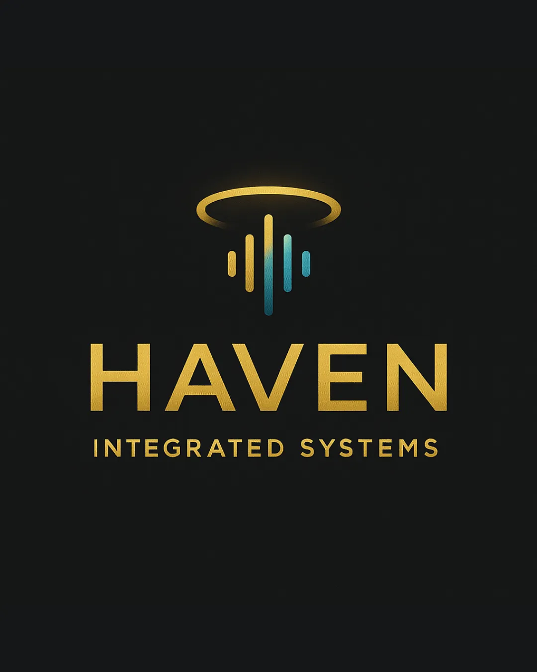
Try it Now!Logo review of HAVEN INTEGRATED SYSTEMS
 Logo analysis by AI
Logo type:
Style:
Detected symbol:
Detected text:
Business industry:
Review requested by Weavel23
**If AI can recognize or misinterpret it, so can people.
Structured logo review
Legibility
![]() Text is highly legible with clear, geometric sans-serif font.
Text is highly legible with clear, geometric sans-serif font.![]() The gold color delivers strong contrast against the dark background.
The gold color delivers strong contrast against the dark background.
Scalability versatility
![]() Logo has clean lines and is simple enough for reduction to small sizes.
Logo has clean lines and is simple enough for reduction to small sizes.![]() Symbol and wordmark will reproduce well in digital and print, including business cards and product labels.
Symbol and wordmark will reproduce well in digital and print, including business cards and product labels.![]() Would work for illuminated signage or screen applications.
Would work for illuminated signage or screen applications.
![]() Gradient effect may lose impact and clarity when printed in very small scale or in grayscale/monochrome applications such as embroidery or one-color stamps.
Gradient effect may lose impact and clarity when printed in very small scale or in grayscale/monochrome applications such as embroidery or one-color stamps.
200x250 px
100×125 px
50×62 px
Balance alignment
![]() Centered alignment between symbol, primary wordmark, and tagline ensures visual stability.
Centered alignment between symbol, primary wordmark, and tagline ensures visual stability.![]() Adequate spacing between all elements creates a cohesive composition.
Adequate spacing between all elements creates a cohesive composition.
![]() Slight vertical disconnect between halo and downward bars could feel a bit detached, visually separating the symbol from the wordmark.
Slight vertical disconnect between halo and downward bars could feel a bit detached, visually separating the symbol from the wordmark.

Originality
![]() Combination of a halo and abstract bars suggests integration, protection, or digital systems in a fresh way.
Combination of a halo and abstract bars suggests integration, protection, or digital systems in a fresh way.![]() Gradient color adds distinctiveness.
Gradient color adds distinctiveness.
![]() Halo and sound-wave or bar motifs are moderately common in tech/logistics branding, though combined here with a nice twist.
Halo and sound-wave or bar motifs are moderately common in tech/logistics branding, though combined here with a nice twist.
Logomark wordmark fit
![]() Symbol and wordmark are stylistically unified by color palette and geometric structure.
Symbol and wordmark are stylistically unified by color palette and geometric structure.![]() Sizing and proportions are well-matched for clear hierarchy.
Sizing and proportions are well-matched for clear hierarchy.
Aesthetic look
![]() Gold and cyan gradients add a professional, premium look.
Gold and cyan gradients add a professional, premium look.![]() Minimalism and a strong focal point create visual impact.
Minimalism and a strong focal point create visual impact.
Dual meaning and misinterpretations
![]() No inappropriate or confusing imagery detected.
No inappropriate or confusing imagery detected.![]() Overall message supports positive brand associations: security, technology, innovation.
Overall message supports positive brand associations: security, technology, innovation.
Color harmony
![]() Gold and blue gradients are harmonious and visually appealing.
Gold and blue gradients are harmonious and visually appealing.![]() Strong contrast with background ensures clarity.
Strong contrast with background ensures clarity.
Gold
#FFD95C
Cyan
#1BD8F4
Dark Gray
#232323