Wondering how your logo performs? 🧐
Get professional logo reviews in seconds and catch design issues in time.
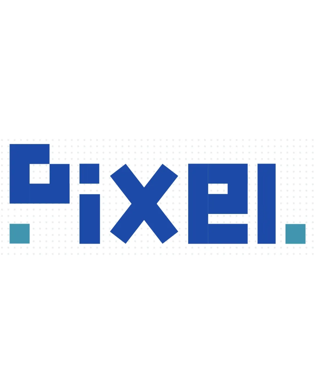
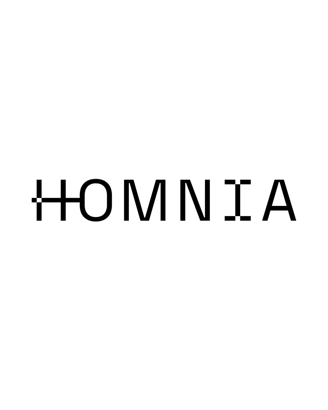
Try it Now!Logo review of HOMNIA
 Logo analysis by AI
Logo type:
Style:
Detected symbol:
Negative space:
Detected text:
Business industry:
Review requested by Anto.mosca
**If AI can recognize or misinterpret it, so can people.
Structured logo review
Legibility
![]() Most letters are clear and easy to read.
Most letters are clear and easy to read.![]() Distinct geometric treatment hints at modernity and digital relevance.
Distinct geometric treatment hints at modernity and digital relevance.
![]() The letter 'H' is nearly abstracted and may be misread at a glance.
The letter 'H' is nearly abstracted and may be misread at a glance.![]() The letter 'I' is stylized, which may confuse viewers, especially at a small size.
The letter 'I' is stylized, which may confuse viewers, especially at a small size.
Scalability versatility
![]() Simplicity benefits large-scale applications such as signage and web banners.
Simplicity benefits large-scale applications such as signage and web banners.![]() Minimal color supports reproduction on monochrome mediums.
Minimal color supports reproduction on monochrome mediums.
![]() Fine pixel details in the 'H' and 'I' will blur or disappear at small scales (e.g., business cards, app icons, embroidery).
Fine pixel details in the 'H' and 'I' will blur or disappear at small scales (e.g., business cards, app icons, embroidery).![]() May lose visual clarity when reduced in size or reproduced in low-resolution contexts.
May lose visual clarity when reduced in size or reproduced in low-resolution contexts.
200x250 px
100×125 px
50×62 px
Balance alignment
![]() Letter spacing is consistent and the wordmark feels horizontally balanced.
Letter spacing is consistent and the wordmark feels horizontally balanced.![]() Weights and heights of characters mostly match, supporting harmony.
Weights and heights of characters mostly match, supporting harmony.
![]() Pixel details on 'H' and 'I' draw disproportionate attention compared to other letters, slightly disrupting visual equilibrium.
Pixel details on 'H' and 'I' draw disproportionate attention compared to other letters, slightly disrupting visual equilibrium.

Originality
![]() Integration of pixel/grid elements into the letters is a distinctive approach that relates to technology.
Integration of pixel/grid elements into the letters is a distinctive approach that relates to technology.![]() Letter modifications add a unique, creative twist.
Letter modifications add a unique, creative twist.
![]() The use of pixel effects is a moderately common device in tech branding.
The use of pixel effects is a moderately common device in tech branding.![]() No hidden meanings beyond the evident pixel motif.
No hidden meanings beyond the evident pixel motif.
Aesthetic look
![]() Minimalist aesthetic with a modern, clean outlook.
Minimalist aesthetic with a modern, clean outlook.![]() Black and white palette is timeless and professional.
Black and white palette is timeless and professional.
![]() Pixel accents on only two letters make the design slightly unharmonious.
Pixel accents on only two letters make the design slightly unharmonious.![]() Visual enhancements could be distributed or refined for greater cohesion.
Visual enhancements could be distributed or refined for greater cohesion.
Dual meaning and misinterpretations
![]() No inappropriate or confusing imagery.
No inappropriate or confusing imagery.
Color harmony
![]() Monochrome palette ensures maximum clarity and adaptability.
Monochrome palette ensures maximum clarity and adaptability.![]() Strong contrast between text and background.
Strong contrast between text and background.
Black
#000000
White
#FFFFFF