Wondering how your logo performs? 🧐
Get professional logo reviews in seconds and catch design issues in time.
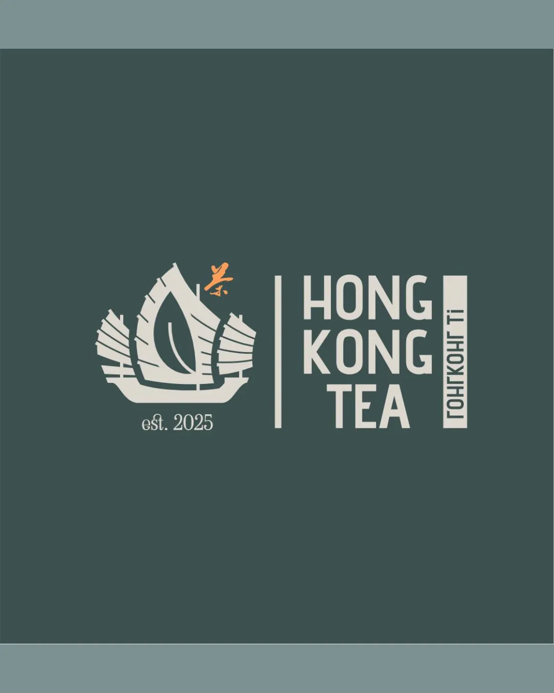
Try it Now!Logo review of HONG KONG TEA, est. 2025, ГОНКОНГ ТІ
 Logo analysis by AI
Logo type:
Style:
Detected symbol:
Negative space:
Detected text:
Business industry:
Review requested by Mary_v
**If AI can recognize or misinterpret it, so can people.
Structured logo review
Legibility
![]() Main English text 'HONG KONG TEA' is bold, geometric, and easy to read.
Main English text 'HONG KONG TEA' is bold, geometric, and easy to read.![]() Contrast with background is strong, ensuring visibility.
Contrast with background is strong, ensuring visibility.
![]() 'est. 2025' is quite small and may lose legibility at smaller scales.
'est. 2025' is quite small and may lose legibility at smaller scales.![]() Vertical Cyrillic text may not be immediately legible for all audiences and is visually second-tier.
Vertical Cyrillic text may not be immediately legible for all audiences and is visually second-tier.
Scalability versatility
![]() Bold, flat design and simple color palette allow for good scalability on packaging and signage.
Bold, flat design and simple color palette allow for good scalability on packaging and signage.![]() Logo can work on menus, cups, and storefronts.
Logo can work on menus, cups, and storefronts.
![]() High level of detail in the junk boat and small 'est. 2025' may get lost at smaller sizes such as favicons or embroidery.
High level of detail in the junk boat and small 'est. 2025' may get lost at smaller sizes such as favicons or embroidery.![]() Vertical text element ('ГОНКОНГ ТІ') may be indecipherable at very small scales.
Vertical text element ('ГОНКОНГ ТІ') may be indecipherable at very small scales.
200x250 px
100×125 px
50×62 px
Balance alignment
![]() Overall composition is symmetrical and well-structured with clear separation between symbol and wordmark via vertical bar.
Overall composition is symmetrical and well-structured with clear separation between symbol and wordmark via vertical bar.![]() Pleasant visual weight distribution.
Pleasant visual weight distribution.
![]() Slight disconnect in alignment between the boat symbol and baseline of the main text block.
Slight disconnect in alignment between the boat symbol and baseline of the main text block.![]() Cluster of design elements in the boat may overwhelm the cleaner wordmark area.
Cluster of design elements in the boat may overwhelm the cleaner wordmark area.

Originality
![]() Creative combination of a Chinese junk boat with a tea leaf for regional and industry relevance.
Creative combination of a Chinese junk boat with a tea leaf for regional and industry relevance.![]() Negative space use for tea leaf is thoughtful.
Negative space use for tea leaf is thoughtful.
![]() Junk boat imagery is somewhat recognizable in Asian tea branding, though the leaf integration adds some uniqueness.
Junk boat imagery is somewhat recognizable in Asian tea branding, though the leaf integration adds some uniqueness.![]() Small orange character seems decorative and doesn't add conceptual strength.
Small orange character seems decorative and doesn't add conceptual strength.
Logomark wordmark fit
![]() Both logomark and wordmark have a modern, geometric style for cohesion.
Both logomark and wordmark have a modern, geometric style for cohesion.![]() Shared color and clean lines unify the two elements.
Shared color and clean lines unify the two elements.
![]() Vertical text panel’s style (Cyrillic/other script) feels tacked on compared to the bold sans-serif English wordmark.
Vertical text panel’s style (Cyrillic/other script) feels tacked on compared to the bold sans-serif English wordmark.![]() Slight disconnect in the proportions between the logomark and wordmark; the boat is compact, but the text block is elongated.
Slight disconnect in the proportions between the logomark and wordmark; the boat is compact, but the text block is elongated.
Aesthetic look
![]() Minimal color palette and modern typographic choices give a premium, contemporary feel.
Minimal color palette and modern typographic choices give a premium, contemporary feel.![]() Design is pleasing, not overly busy.
Design is pleasing, not overly busy.
![]() Orange accent feels disjointed from the overall color story.
Orange accent feels disjointed from the overall color story.![]() Slight overcrowding within the logomark could be minimized for more visual calmness.
Slight overcrowding within the logomark could be minimized for more visual calmness.
Dual meaning and misinterpretations
![]() No accidental or inappropriate meanings detected.
No accidental or inappropriate meanings detected.![]() Imagery is clear and brand-relevant.
Imagery is clear and brand-relevant.
Color harmony
![]() Color pairing (teal, ivory, small orange accent) is sophisticated and harmonious.
Color pairing (teal, ivory, small orange accent) is sophisticated and harmonious.![]() Palette is consistent with tea/heritage themes.
Palette is consistent with tea/heritage themes.
![]() Orange accent on character seems out of place and draws disproportionate attention.
Orange accent on character seems out of place and draws disproportionate attention.
Deep Teal
#455957
Ivory
#F0ECE5
Pale Orange
#FCA66F


