Wondering how your logo performs? 🧐
Get professional logo reviews in seconds and catch design issues in time.
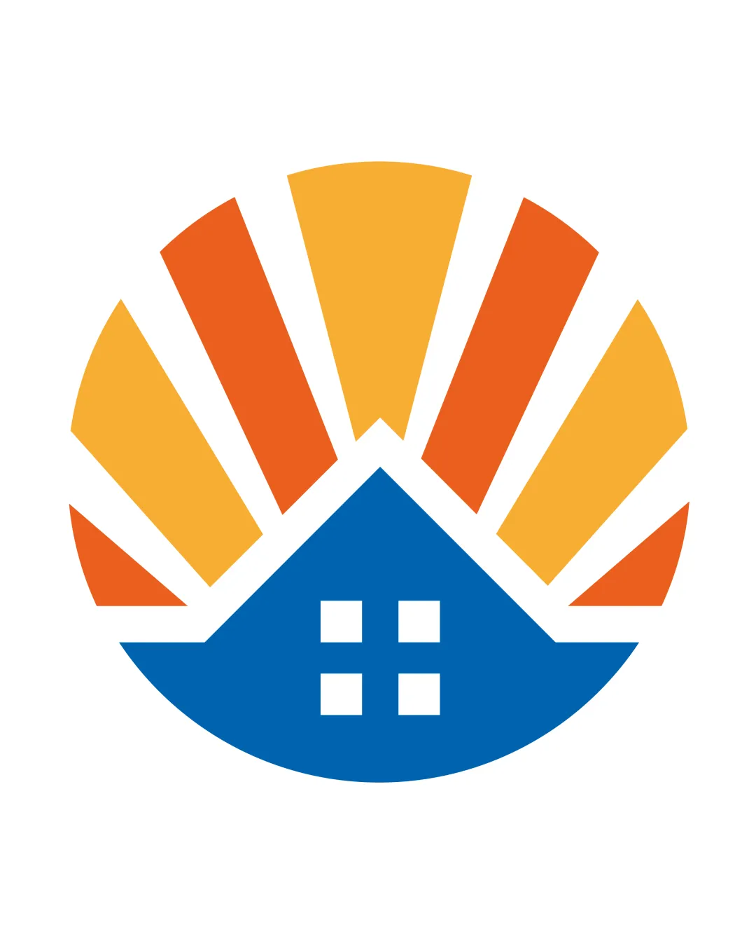
Try it Now!Logo review of house shape with sun rays
 Logo analysis by AI
Logo type:
Style:
Detected symbol:
Business industry:
Review requested by Ailurxphile
**If AI can recognize or misinterpret it, so can people.
Structured logo review
Scalability versatility
Minimal, bold shapes make the logo adaptable across most sizes, such as signage and digital icons.
Simple geometric design works for both print and digital applications.
Some thinner sunrays could lose clarity at very small sizes, such as favicons or embroidery.
Gradient effects (if added in future applications) could impact legibility on low-resolution or monochrome outputs.

200x250 px

100×125 px

50×62 px
Balance alignment
Centralized and symmetrical design delivers good visual balance, with equal weight on both sides.
The alignment of the sunrays above the house feels consistent and visually stable.
The spacing between the sunrays and the edge of the house creates slightly awkward gaps, which affects overall smoothness.
The base of the house seems a bit heavy compared to the lighter rays, marginally diminishing vertical balance.


Originality
Classic combination of house and sun rays communicates industry effectively and is straightforward.
The house and sun rays motif is very generic within the real estate/home services sector.
No unique twist or creative integration between the shapes, resulting in a logo that is easily lost among competitors.
Aesthetic look
Clean, bold, and approachable visual appeal.
Color choices are energetic but not overwhelming, leading to a friendly look.
Lack of uniqueness prevents the design from truly standing out.
The geometric segmentation can feel a bit dated and uninspired.
Dual meaning and misinterpretations
No inappropriate or confusing symbols detected.
Instant recognition of house and sun imagery.
Color harmony
Pleasing triadic palette that maintains strong contrast between elements.
Colors communicate warmth (orange/yellow) and stability/trust (blue).
California
#F8B133
Orange
#EF6B1B
Science Blue
#0069B4
White
#FFFFFF

