Wondering how your logo performs? 🧐
Get professional logo reviews in seconds and catch design issues in time.
Try it Now!Logo review of JE INTEGRADORES ELECTRICOS
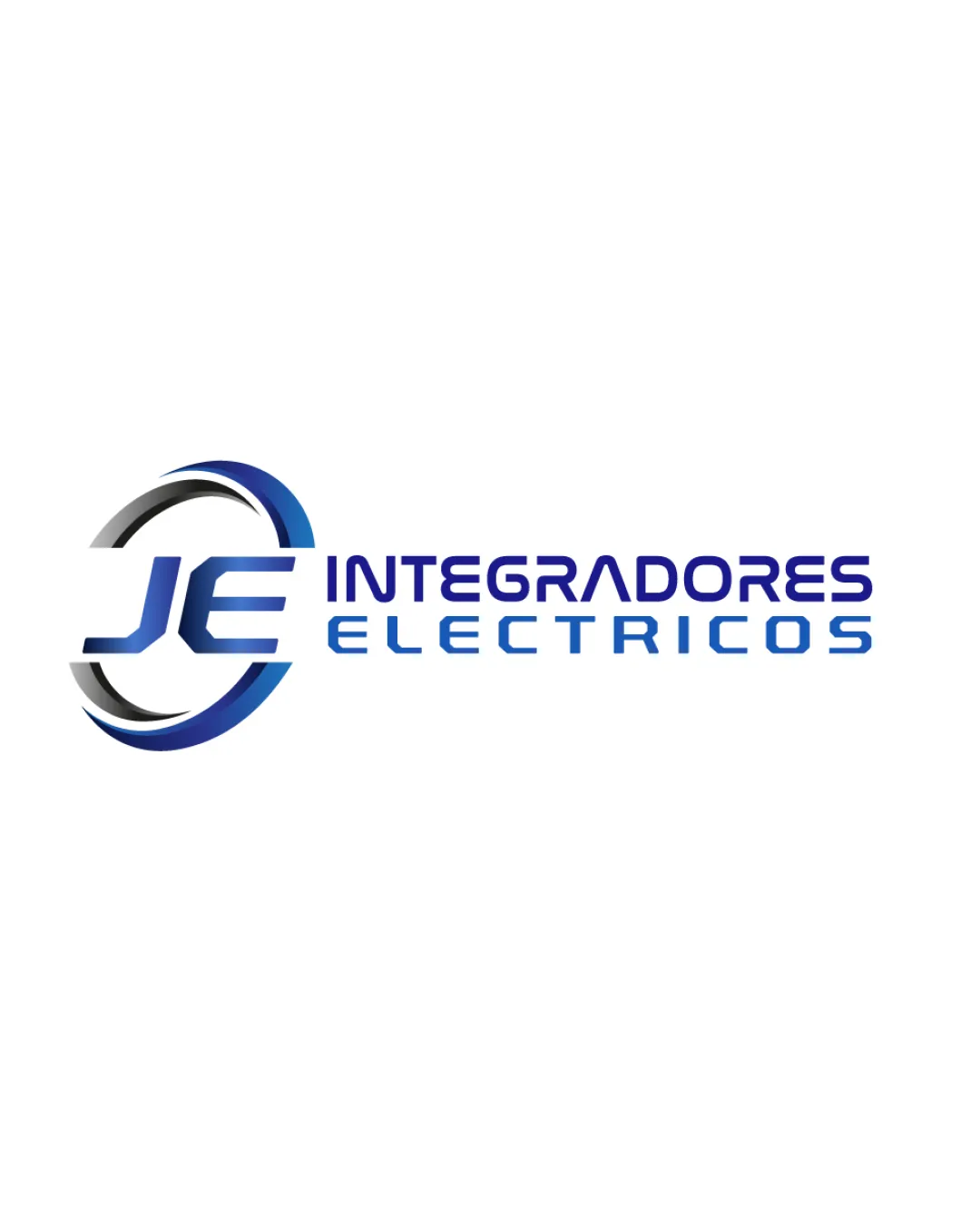
 Logo analysis by AI
Logo type:
Style:
Detected symbol:
Detected text:
Business industry:
Review requested by Wenn
**If AI can recognize or misinterpret it, so can people.
Structured logo review
Legibility
Primary text 'INTEGRADORES ELECTRICOS' is clear and readable.
'JE' monogram is bold and stands out.
Contrast between text and background ensures readability.
Gradient fill in 'JE' could present minor legibility issues at smaller sizes.
Rounded geometric font for 'INTEGRADORES' may hinder immediate readability due to non-traditional letterforms, especially at very small scales.
Scalability versatility
'JE' monogram and circular swoosh are simple enough for use on larger formats such as signage and vehicle livery.
Logo can work on white and light backgrounds easily.
Gradient and fine swoosh details may be lost or look muddled when scaled down for business cards or embroidery.
The combination of a monogram and two lines of text reduces flexibility for compact applications like favicons or mobile app icons.

200x250 px

100×125 px

50×62 px
Balance alignment
The weight of the 'JE' monogram is visually balanced with the accompanying text.
Circular swoosh pulls visual focus to the left, making the overall composition feel slightly off-center.
Vertical alignment between logomark and wordmark creates a slight imbalance—monogram feels isolated.
No clear anchoring between the logomark and the stacked wordmark for holistic unity.


Originality
Monogram and swoosh add an element of visual interest.
Circular swoosh is an overused motif in technology and electrical industries.
'JE' monogram in this style is generic; lacks unique custom letter modifications.
Standard geometric, sans-serif fonts don't provide distinct personality.
Logomark wordmark fit
Logomark and wordmark share blue gradients and a modern theme.
Both elements utilize geometric curves for some visual connection.
'JE' monogram has boldness and a dynamic arc, but the wordmark is more static and less visually impactful.
Swoosh and wordmark do not fully integrate—the two pieces feel like separate components rather than a unified design.
Aesthetic look
Crisp lines and contemporary color palette create a modern, industry-appropriate look.
Gradient blues evoke a technological and professional feel.
Swoosh makes the design feel dated and reminiscent of early 2000s tech logos.
Overall composition is cluttered, lacking white space.
Dual meaning and misinterpretations
Logo forms do not resemble inappropriate or misleading imagery.
Color harmony
Color choices (blues, black, white) are functionally harmonious and fitting for a tech/electrical brand.
Gradient adds controlled dynamism to the palette.
Heavy use of gradient may hinder versatility in monochrome applications.
Resolution Blue
#204384
Picton Blue
#31A7E5
Black
#000000
White
#FFFFFF

