Wondering how your logo performs? 🧐
Get professional logo reviews in seconds and catch design issues in time.
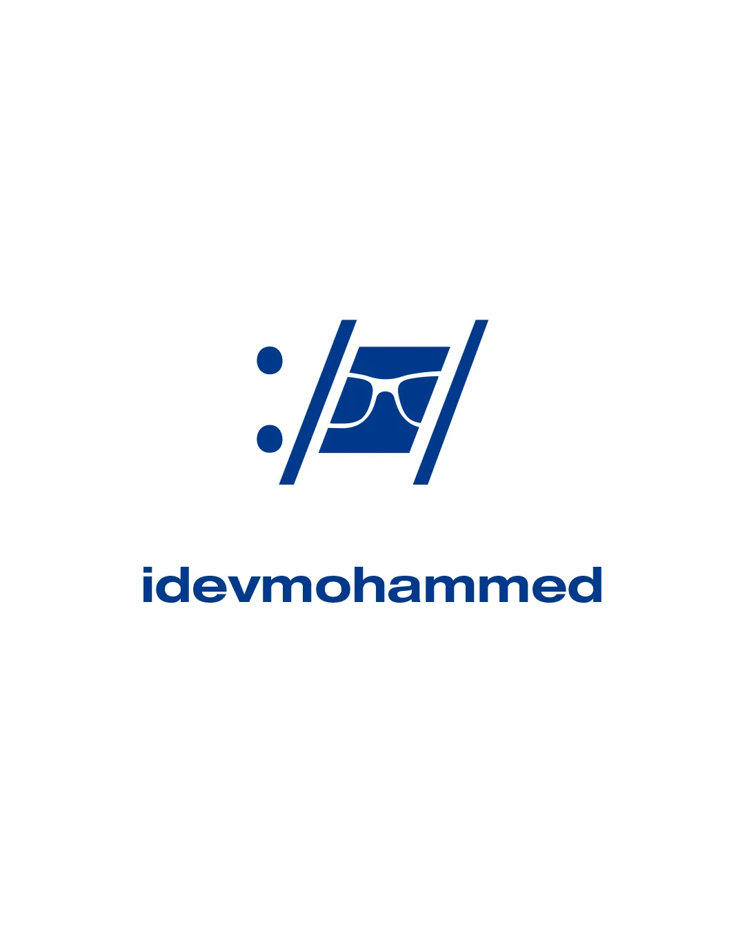
Try it Now!Logo review of idevmohammed
 Logo analysis by AI
Logo type:
Style:
Detected symbol:
Detected text:
Business industry:
Review requested by Nj_des
**If AI can recognize or misinterpret it, so can people.
Structured logo review
Legibility
![]() Text is clear, bold, and easy to read.
Text is clear, bold, and easy to read.![]() Consistent font weight enhances clarity.
Consistent font weight enhances clarity.
Scalability versatility
![]() Simple, bold shapes make the logo recognizable at smaller sizes.
Simple, bold shapes make the logo recognizable at smaller sizes.![]() Works well on digital applications, app icons, and business cards.
Works well on digital applications, app icons, and business cards.
![]() Fine elements inside the symbol (glasses frame) may lose detail in very small print (e.g., on pens or embroidery).
Fine elements inside the symbol (glasses frame) may lose detail in very small print (e.g., on pens or embroidery).
200x250 px
100×125 px
50×62 px
Balance alignment
![]() Central alignment between logomark and wordmark keeps the design grounded.
Central alignment between logomark and wordmark keeps the design grounded.![]() Weight distribution is visually balanced.
Weight distribution is visually balanced.
![]() The angled filmstrip/code bracket lines cause a slight visual tilt, making the mark feel a bit dynamic but a touch less stable.
The angled filmstrip/code bracket lines cause a slight visual tilt, making the mark feel a bit dynamic but a touch less stable.

Originality
![]() Creative use of code/filmstrip brackets with a face/glasses, relating to the tech/dev industry.
Creative use of code/filmstrip brackets with a face/glasses, relating to the tech/dev industry.![]() Unique visual approach among dev logos.
Unique visual approach among dev logos.
![]() Faces with glasses are somewhat common as tech/nerd tropes, slightly reducing uniqueness.
Faces with glasses are somewhat common as tech/nerd tropes, slightly reducing uniqueness.
Logomark wordmark fit
![]() The boldness and style of the wordmark complement the logomark, maintaining a cohesive look.
The boldness and style of the wordmark complement the logomark, maintaining a cohesive look.![]() Both components use similar line thickness.
Both components use similar line thickness.
Aesthetic look
![]() Clean and modern aesthetic.
Clean and modern aesthetic.![]() Single color keeps the look professional and not overdecorated.
Single color keeps the look professional and not overdecorated.
![]() Rounded elements (face, glasses) contrast strongly with sharp angled lines, slightly disrupting visual harmony.
Rounded elements (face, glasses) contrast strongly with sharp angled lines, slightly disrupting visual harmony.
Dual meaning and misinterpretations
![]() No inappropriate or unintended dual meanings detected.
No inappropriate or unintended dual meanings detected.
Color harmony
![]() Strong monochromatic blue provides a professional, tech-centric appearance.
Strong monochromatic blue provides a professional, tech-centric appearance.![]() High contrast ensures visibility.
High contrast ensures visibility.
Cobalt Blue
#054596
White
#FFFFFF