Wondering how your logo performs? 🧐
Get professional logo reviews in seconds and catch design issues in time.
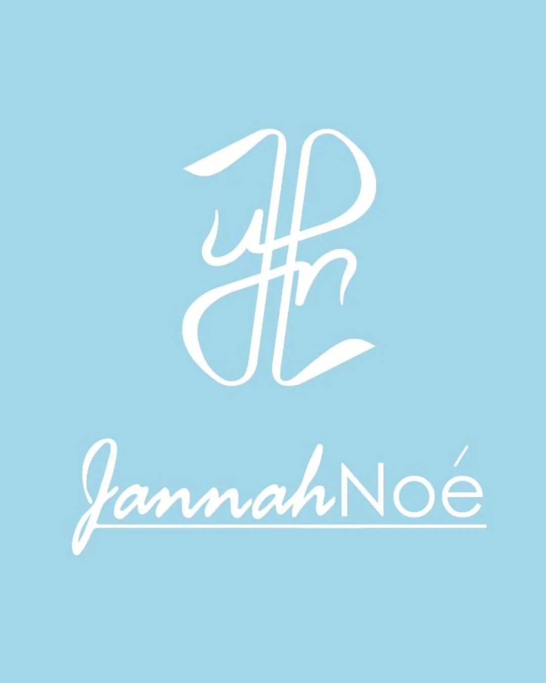
Try it Now!Logo review of JannahNoé
 Logo analysis by AI
Logo type:
Style:
Detected symbol:
Detected text:
Business industry:
Review requested by Nuar5207
**If AI can recognize or misinterpret it, so can people.
Structured logo review
Legibility
![]() The wordmark 'JannahNoé' is readable, especially the 'Noé' in clean sans-serif.
The wordmark 'JannahNoé' is readable, especially the 'Noé' in clean sans-serif.![]() Decent contrast between white text and blue background.
Decent contrast between white text and blue background.
![]() Script style on 'Jannah' sacrifices some clarity, especially with the join of 'J' and 'a'.
Script style on 'Jannah' sacrifices some clarity, especially with the join of 'J' and 'a'.![]() The monogram is difficult to decipher at first glance, as the initials are overly stylized.
The monogram is difficult to decipher at first glance, as the initials are overly stylized.
Scalability versatility
![]() The monogram as a stand-alone mark could scale well for use on tags or product labels.
The monogram as a stand-alone mark could scale well for use on tags or product labels.![]() Simple color palette allows for some adaptability.
Simple color palette allows for some adaptability.
![]() The thin, intricate script lines may lose clarity at small sizes—problematic for favicons, embroidery, or very small packaging.
The thin, intricate script lines may lose clarity at small sizes—problematic for favicons, embroidery, or very small packaging.![]() The underline in the wordmark may blur or disappear in small reproduction.
The underline in the wordmark may blur or disappear in small reproduction.
200x250 px
100×125 px
50×62 px
Balance alignment
![]() Both logo elements are vertically aligned and centered.
Both logo elements are vertically aligned and centered.![]() Weight distribution is decent between the monogram and wordmark.
Weight distribution is decent between the monogram and wordmark.
![]() The monogram feels a bit large compared to the wordmark, lacking optimal proportional balance.
The monogram feels a bit large compared to the wordmark, lacking optimal proportional balance.![]() The underline beneath 'Jannah' feels arbitrary and isn't integrated with the rest of the design.
The underline beneath 'Jannah' feels arbitrary and isn't integrated with the rest of the design.

Originality
![]() Custom monogram in script adds a personal and bespoke character.
Custom monogram in script adds a personal and bespoke character.![]() Mix of script and sans-serif is less common in mainstream branding.
Mix of script and sans-serif is less common in mainstream branding.
![]() Overly intricate monogram is reminiscent of classic, almost cliché fashion logos—lacks a clear, memorable twist.
Overly intricate monogram is reminiscent of classic, almost cliché fashion logos—lacks a clear, memorable twist.![]() Monogram doesn't strongly differentiate from many other fashion/beauty brands using initials.
Monogram doesn't strongly differentiate from many other fashion/beauty brands using initials.
Logomark wordmark fit
![]() Script of the monogram echoes the handwritten nature of 'Jannah' part, creating some visual synergy.
Script of the monogram echoes the handwritten nature of 'Jannah' part, creating some visual synergy.
![]() The monogram and 'Noé' in sans-serif feel disconnected—the contrast between script and geometric type feels abrupt rather than harmonized.
The monogram and 'Noé' in sans-serif feel disconnected—the contrast between script and geometric type feels abrupt rather than harmonized.![]() Size relationship between logomark and wordmark could be refined.
Size relationship between logomark and wordmark could be refined.
Aesthetic look
![]() Overall, the light blue and white give an elegant and airy feel appropriate for fashion or boutique markets.
Overall, the light blue and white give an elegant and airy feel appropriate for fashion or boutique markets.![]() Clean, uncluttered presentation.
Clean, uncluttered presentation.
![]() The monogram's complexity can feel slightly messy up close.
The monogram's complexity can feel slightly messy up close.![]() Mixing two very different type styles may divide visual focus for some viewers.
Mixing two very different type styles may divide visual focus for some viewers.
Dual meaning and misinterpretations
![]() No immediate, inappropriate visual associations.
No immediate, inappropriate visual associations.
Color harmony
![]() Restrained use of two colors ensures cohesiveness and professional look.
Restrained use of two colors ensures cohesiveness and professional look.![]() High contrast between blue and white delivers clarity and modern appeal.
High contrast between blue and white delivers clarity and modern appeal.
#A7D8EB (Polo Blue)
#FFFFFF (White)


