View review
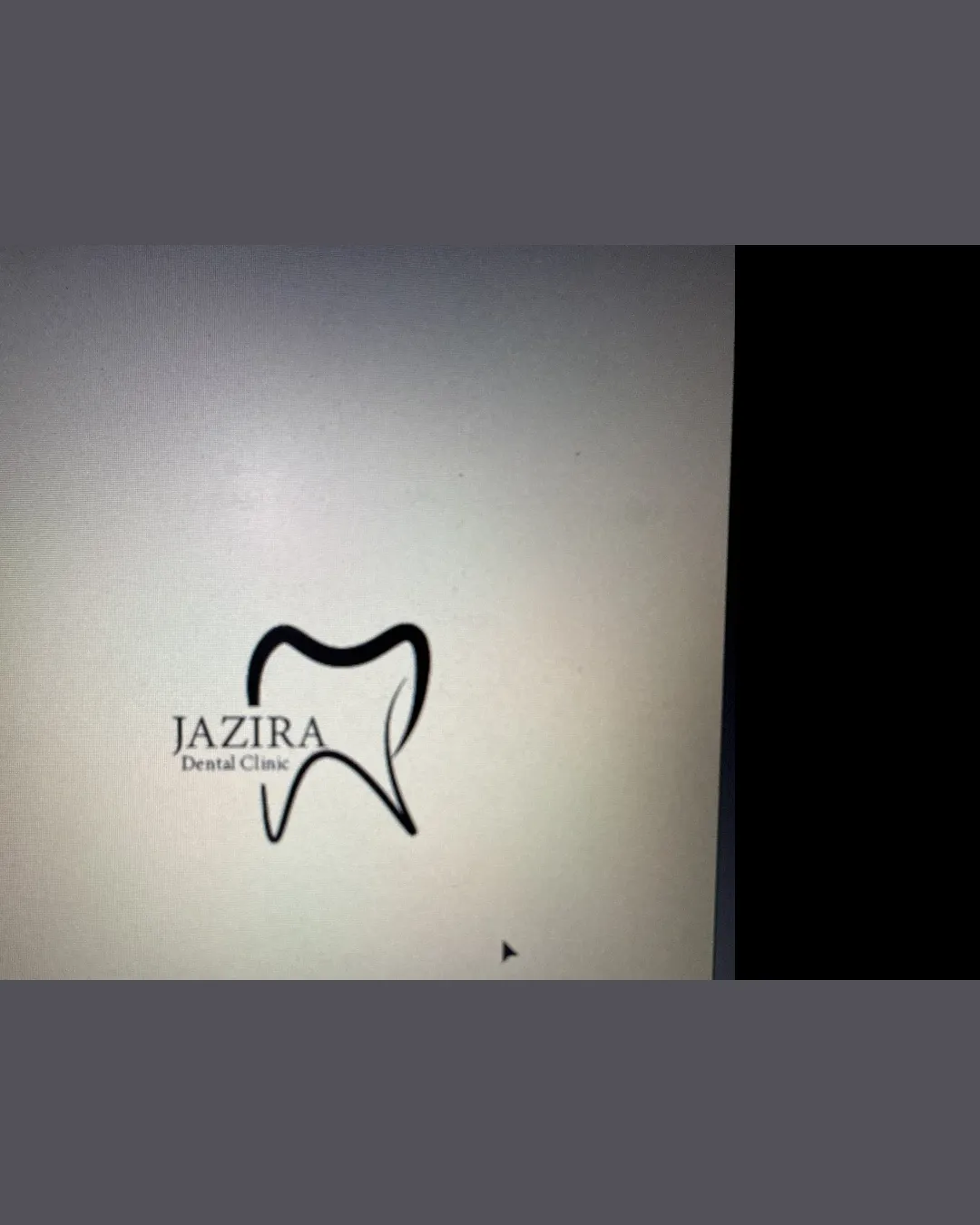
Jazira Dental Clinic
Review the detailed scores below to see what is working and what should be refined first.
Logo performance breakdown
Legibility
The main brand name 'JAZIRA' is clear and uses a relatively elegant serif font.
The subtitle 'Dental Clinic' is very small, making it difficult to read, especially at smaller scales.
The placement partially overlapping the tooth shape impacts quick readability.

Originality
Tooth outline attempts a fluid, minimal stroke.
Tooth icons are extremely generic in dental branding.
No unique twist or integration with the text.
No distinctive or memorable elements to set the logo apart from other dental practices.
Color harmony
Black-on-white is classic and always harmonious.
Simple palette avoids clutter.
Could benefit from a secondary accent color to enhance memorability or brand identity.
Black
#000000
White
#FFFFFF
Dark Gray background
#5C5B5B
Your palette is close. Refine the color roles and combinations before updating the logo.
Build brand colorsBalance alignment
The text and symbol are intended to sit together as a unit.
'JAZIRA' is left-aligned with the tooth symbol, but underlying imbalance appears due to the text overlapping the side of the symbol.
The 'Dental Clinic' subtitle is misaligned and does not follow a consistent baseline or visual flow.
The lines inside the tooth are asymmetrical, creating visual disruption.
Scalability
Minimalist line-art concept could theoretically be scalable.
Thinness of the tooth outline may be lost or break up entirely when scaled to very small sizes, especially for digital icons, embroidery, or stamps.
'Dental Clinic' text becomes illegible at small sizes.
Logo may lack presence or clarity on large outdoor signage due to thin lines and small text proportions.
200x250 px
100×125 px
50×62 px
Misinterpretations
No inappropriate or accidental imagery detected.
Symbol & text fit
Effort to combine the text and symbol.
Font style for 'JAZIRA' feels somewhat elegant but does not match the informality and irregularity of the tooth outline.
Uneven relationship between the logomark and wordmark.
Wondering how your logo performs?
Get a clear logo score, key risks, and priority fix ideas before your client or audience sees it.