Wondering how your logo performs? 🧐
Get professional logo reviews in seconds and catch design issues in time.
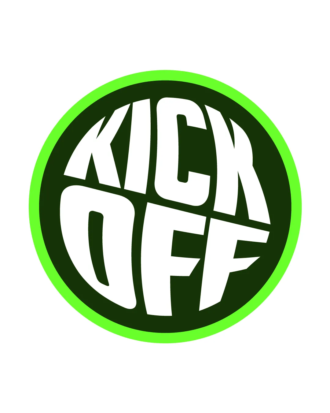
Try it Now!Logo review of KICK OFF
 Logo analysis by AI
Logo type:
Style:
Detected symbol:
Detected text:
Business industry:
Review requested by Ulmsae
**If AI can recognize or misinterpret it, so can people.
Structured logo review
Legibility
![]() Text is large, bold, and generally easy to read.
Text is large, bold, and generally easy to read.![]() High contrast between white text and dark background.
High contrast between white text and dark background.
![]() Distorted font style may make certain letters less immediately recognizable at smaller sizes, especially the 'Q' and 'O'.
Distorted font style may make certain letters less immediately recognizable at smaller sizes, especially the 'Q' and 'O'.![]() Spacing is slightly cramped due to the circular composition, which may reduce legibility at a glance.
Spacing is slightly cramped due to the circular composition, which may reduce legibility at a glance.
Scalability versatility
![]() Simple shape is easily adaptable across different backgrounds.
Simple shape is easily adaptable across different backgrounds.![]() Strong contrast aids visibility for signage and digital use.
Strong contrast aids visibility for signage and digital use.
![]() Distorted and thick typography may lose clarity at very small sizes such as business cards or app icons.
Distorted and thick typography may lose clarity at very small sizes such as business cards or app icons.![]() Fine details at intersection points may blur at small scales.
Fine details at intersection points may blur at small scales.
200x250 px
100×125 px
50×62 px
Balance alignment
![]() Circular badge creates a cohesive and balanced frame.
Circular badge creates a cohesive and balanced frame.![]() Letter distribution is carefully shaped to fill the circle.
Letter distribution is carefully shaped to fill the circle.
![]() Some letters (especially ‘K’, ‘C’, and ‘F’) appear slightly squeezed, diminishing overall optical balance.
Some letters (especially ‘K’, ‘C’, and ‘F’) appear slightly squeezed, diminishing overall optical balance.![]() The diagonal split between 'KICK' and 'OFF' generates minor tension in alignment.
The diagonal split between 'KICK' and 'OFF' generates minor tension in alignment.

Originality
![]() Custom typography and circular orientation offer a playful, energetic feel.
Custom typography and circular orientation offer a playful, energetic feel.
![]() Circular badge with bold wordmark is a highly popular format, making it somewhat generic.
Circular badge with bold wordmark is a highly popular format, making it somewhat generic.![]() No distinctive symbol or unique visual metaphor beyond the stylized text.
No distinctive symbol or unique visual metaphor beyond the stylized text.
Aesthetic look
![]() Bright color palette captures attention and fits a sporty or energetic brand.
Bright color palette captures attention and fits a sporty or energetic brand.![]() Bold look is visually impactful.
Bold look is visually impactful.
![]() Typography is heavily distorted, which may not appeal to all audiences.
Typography is heavily distorted, which may not appeal to all audiences.![]() The overall look feels a bit dated due to the overused circular sports badge trope.
The overall look feels a bit dated due to the overused circular sports badge trope.
Dual meaning and misinterpretations
![]() No inappropriate dual meanings or accidental imagery are present.
No inappropriate dual meanings or accidental imagery are present.
Color harmony
![]() Two-tone palette with green accent is visually striking and consistent.
Two-tone palette with green accent is visually striking and consistent.![]() Color choices suggest energy, aligning with sports themes.
Color choices suggest energy, aligning with sports themes.
![]() The neon green outline could overpower certain applications or clash with non-white backgrounds.
The neon green outline could overpower certain applications or clash with non-white backgrounds.
Lime Green
#16FF18
Dark Green
#11240D
White
#FFFFFF