Wondering how your logo performs? 🧐
Get professional logo reviews in seconds and catch design issues in time.
Try it Now!Logo review of kubebox
 Logo analysis by AI
Logo type:
Style:
Detected text:
Business industry:
Review requested by Orane
**If AI can recognize or misinterpret it, so can people.
Structured logo review
Legibility
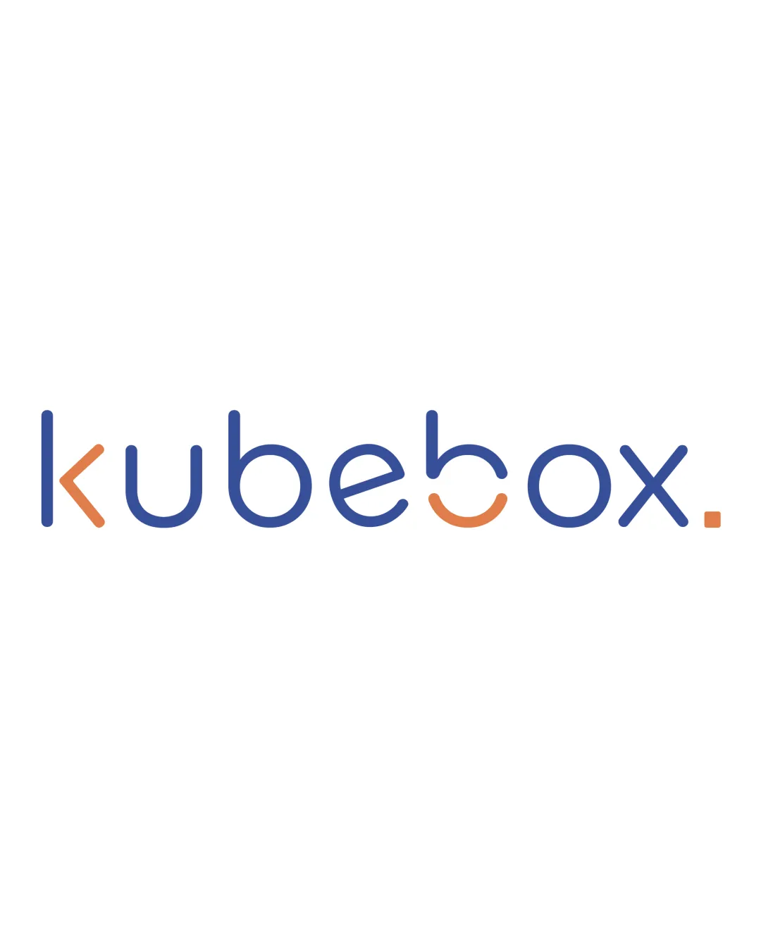
The font is highly readable at medium to large sizes.
Ample spacing between letters enhances clarity.
The partially orange 'b' and 'o' could be mistaken for other characters at small sizes.
The altered 'e' and 'o' may cause subtle confusion if scaled down or at a quick glance.
Scalability versatility
Simple forms and minimal details allow for decent scalability.
Works well for web and large format applications.
Thin lines and colored segmentation in the letter forms may become indistinct at small sizes, such as on mobile favicons or embroidery.
Some details may be lost when printed on small merchandise or labels.

200x250 px

100×125 px

50×62 px
Balance alignment
Consistent use of rounded letterforms creates a cohesive line.
Letter spacing is harmonious, and baseline alignment is solid.
The visual break with the orange 'b' and 'o' disrupts flow slightly.
The colored period at the end feels slightly disconnected from the rest of the wordmark.


Originality
Customized, geometric typeface with distinct character treatment.
Color splits in 'k', 'b', 'o', and period are visually unique.
Geometric sans-serif wordmarks are common in tech/saas spaces; color tricks add distinctiveness but don't break new ground.
No negative space or dual symbolism integrated.
Aesthetic look
Clean, contemporary feel with good color pairing.
Minimalist approach is visually pleasing to a modern audience.
Could be more distinctive with a subtle icon or clever negative space usage.
The dot at the end draws slight, possibly unnecessary, attention.
Dual meaning and misinterpretations
No accidental inappropriate symbolism or shapes detected.
Color harmony
Restrained color palette—just two accents and white background.
Blue and orange provide contrast and a dynamic feel without clashing.
Picton Blue
#4361A9
Zest
#E38851
White
#FFFFFF

