Wondering how your logo performs? 🧐
Get professional logo reviews in seconds and catch design issues in time.
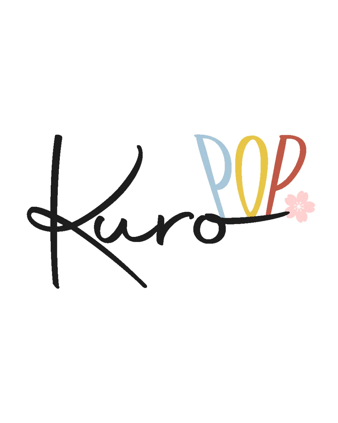
Try it Now!Logo review of Kuro POP
 Logo analysis by AI
Logo type:
Style:
Detected symbol:
Detected text:
Business industry:
Review requested by Kuropop
**If AI can recognize or misinterpret it, so can people.
Structured logo review
Legibility
![]() The 'POP' portion is very readable with high contrast colors and clean shapes.
The 'POP' portion is very readable with high contrast colors and clean shapes.![]() Distinct color differentiation helps to separate elements.
Distinct color differentiation helps to separate elements.
![]() The handwritten 'Kuro' could be challenging to decipher quickly due to the exaggerated script style, especially at smaller sizes.
The handwritten 'Kuro' could be challenging to decipher quickly due to the exaggerated script style, especially at smaller sizes.![]() The kerning between letters in 'Kuro' feels irregular and could cause confusion on first glance.
The kerning between letters in 'Kuro' feels irregular and could cause confusion on first glance.
Scalability versatility
![]() Simple colors are suitable for digital and print media.
Simple colors are suitable for digital and print media.![]() Would look playful and inviting on product packaging or digital banners.
Would look playful and inviting on product packaging or digital banners.
![]() Thin script of 'Kuro' may lose legibility at smaller applications such as business cards, favicons, or embroidery.
Thin script of 'Kuro' may lose legibility at smaller applications such as business cards, favicons, or embroidery.![]() The delicate cherry blossom icon may become indistinct at reduced scales.
The delicate cherry blossom icon may become indistinct at reduced scales.![]() Color transitions and multicolored text complicate reproduction in single-color or grayscale scenarios.
Color transitions and multicolored text complicate reproduction in single-color or grayscale scenarios.
200x250 px
100×125 px
50×62 px
Balance alignment
![]() Overall composition feels whimsical but still anchored.
Overall composition feels whimsical but still anchored.![]() The long flourish in the 'K' and horizontal line help tie together both wordmark elements.
The long flourish in the 'K' and horizontal line help tie together both wordmark elements.
![]() The 'POP' feels slightly disconnected from 'Kuro' due to vertical alignment and color break.
The 'POP' feels slightly disconnected from 'Kuro' due to vertical alignment and color break.![]() The cherry blossom feels like an afterthought and disrupts the visual flow slightly.
The cherry blossom feels like an afterthought and disrupts the visual flow slightly.

Originality
![]() Handwritten script adds unique character.
Handwritten script adds unique character.![]() Cherry blossom subtly references Japanese culture, aligning with the likely intent of the brand name.
Cherry blossom subtly references Japanese culture, aligning with the likely intent of the brand name.
![]() Multicolored sans-serif for 'POP' is playful but not particularly unique in visual identity.
Multicolored sans-serif for 'POP' is playful but not particularly unique in visual identity.![]() Bringing together script and geometric sans without a stronger binding visual concept is only moderately original.
Bringing together script and geometric sans without a stronger binding visual concept is only moderately original.
Aesthetic look
![]() Whimsical, lighthearted look that matches the presumed purpose.
Whimsical, lighthearted look that matches the presumed purpose.![]() Soft, pastel color palette is visually pleasing.
Soft, pastel color palette is visually pleasing.
![]() Too many disparate elements in composition can feel slightly cluttered.
Too many disparate elements in composition can feel slightly cluttered.![]() Colorful wordmark makes it less elegant and more casual, which may limit versatility.
Colorful wordmark makes it less elegant and more casual, which may limit versatility.
Dual meaning and misinterpretations
![]() No inappropriate or unintended dual meanings detected.
No inappropriate or unintended dual meanings detected.
Color harmony
![]() Colors are individually harmonious and evoke a playful, youthful vibe.
Colors are individually harmonious and evoke a playful, youthful vibe.
![]() Use of five colors can feel a bit busy and overdone.
Use of five colors can feel a bit busy and overdone.![]() May be difficult to reproduce the same feeling in monochrome or limited palettes.
May be difficult to reproduce the same feeling in monochrome or limited palettes.
Black
#191919
Light Blue
#A5C7E6
Yellow
#F5D76D
Red
#D96C64
Light Pink
#F9C5D1


