 View review
Logo score
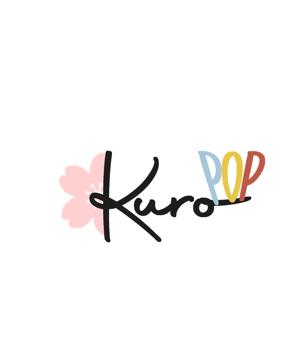
Logo review ofKuro Pop
Review the detailed scores below to see what is working and what should be refined first.
Legibility
Originality
Misread
Balance
Scale
Detailed review
Logo performance breakdown
Legibility
![]() 'Kuro' is fairly readable with a modern handwritten style.
'Kuro' is fairly readable with a modern handwritten style.![]() 'POP' uses clear uppercase lettering in fun colors that ensure distinction.
'POP' uses clear uppercase lettering in fun colors that ensure distinction.
![]() The handwritten 'Kuro' could be slightly misread at a glance, especially with the overlay of the flower, and the script K might be unclear in small sizes.
The handwritten 'Kuro' could be slightly misread at a glance, especially with the overlay of the flower, and the script K might be unclear in small sizes.
Originality
![]() Custom handwritten script feels unique.
Custom handwritten script feels unique.![]() Nice blend of Japanese iconography (cherry blossom) with pop elements (colorful 'POP').
Nice blend of Japanese iconography (cherry blossom) with pop elements (colorful 'POP').
![]() The cherry blossom motif and playful fonts are somewhat common in entertainment/K-pop/J-pop themed branding, slightly limiting originality.
The cherry blossom motif and playful fonts are somewhat common in entertainment/K-pop/J-pop themed branding, slightly limiting originality.
Color harmony
![]() The pastel and soft palette feels coordinated and fun.
The pastel and soft palette feels coordinated and fun.![]() Colors support the playful, cultural vibe.
Colors support the playful, cultural vibe.
![]() Too many distinct colors and light tones in the logo can reduce cohesion; 'POP' letters may reduce harmony as each letter has a different color, while the pink blossom can fade into some backgrounds.
Too many distinct colors and light tones in the logo can reduce cohesion; 'POP' letters may reduce harmony as each letter has a different color, while the pink blossom can fade into some backgrounds.
Pale Pink
#F8CBD0
Black
#000000
Light Blue
#A7C7DE
Mustard
#F6D06D
Terracotta
#C4624A
Color may be holding this logo back. Explore stronger palette options with Colorfly.design before updating the logo.
Explore palettesBalance alignment
![]() Overall horizontal axis is maintained, and elements generally feel cohesively grouped.
Overall horizontal axis is maintained, and elements generally feel cohesively grouped.
![]() The 'K' in 'Kuro' strongly anchors the left but appears too heavy compared to the delicate flower and the airy feel of 'POP', making the left somewhat visually dense.
The 'K' in 'Kuro' strongly anchors the left but appears too heavy compared to the delicate flower and the airy feel of 'POP', making the left somewhat visually dense.![]() The flower in the background creates minor distractions in balance, making the left side heavier than the right.
The flower in the background creates minor distractions in balance, making the left side heavier than the right.

Scalability
![]() Simplicity allows resizing for most digital media and casual branding applications.
Simplicity allows resizing for most digital media and casual branding applications.![]() Works well on web, social media, and product packaging.
Works well on web, social media, and product packaging.
![]() The thin handwritten script and pastel flower background will likely lose definition or readability at small sizes (e.g., favicons, embroidery).
The thin handwritten script and pastel flower background will likely lose definition or readability at small sizes (e.g., favicons, embroidery).![]() Colored letters in 'POP' may not print cleanly on some substrates.
Colored letters in 'POP' may not print cleanly on some substrates.
200x250 px
100×125 px
50×62 px
Misinterpretations
![]() No inappropriate or confusing visual double-meanings detected.
No inappropriate or confusing visual double-meanings detected.![]() All illustrated elements are clear in intent and meaning.
All illustrated elements are clear in intent and meaning.
Symbol & text fit
![]() The flower and script integrate reasonably well in terms of style.
The flower and script integrate reasonably well in terms of style.
![]() 'POP' adds a playful, modern counterpoint to the elegant 'Kuro' and blossom.
'POP' adds a playful, modern counterpoint to the elegant 'Kuro' and blossom.
![]() Flower feels almost like a background watermark rather than an equally weighted logomark; can be visually lost or look disconnected on certain backgrounds.
Flower feels almost like a background watermark rather than an equally weighted logomark; can be visually lost or look disconnected on certain backgrounds.
Try your own review
Review my logo
Wondering how your logo performs?
Get a clear logo score, key risks, and priority fix ideas before your client or audience sees it.
Keep exploring