Wondering how your logo performs? 🧐
Get professional logo reviews in seconds and catch design issues in time.
Try it Now!Logo review of LEGACY The Art of Preservation
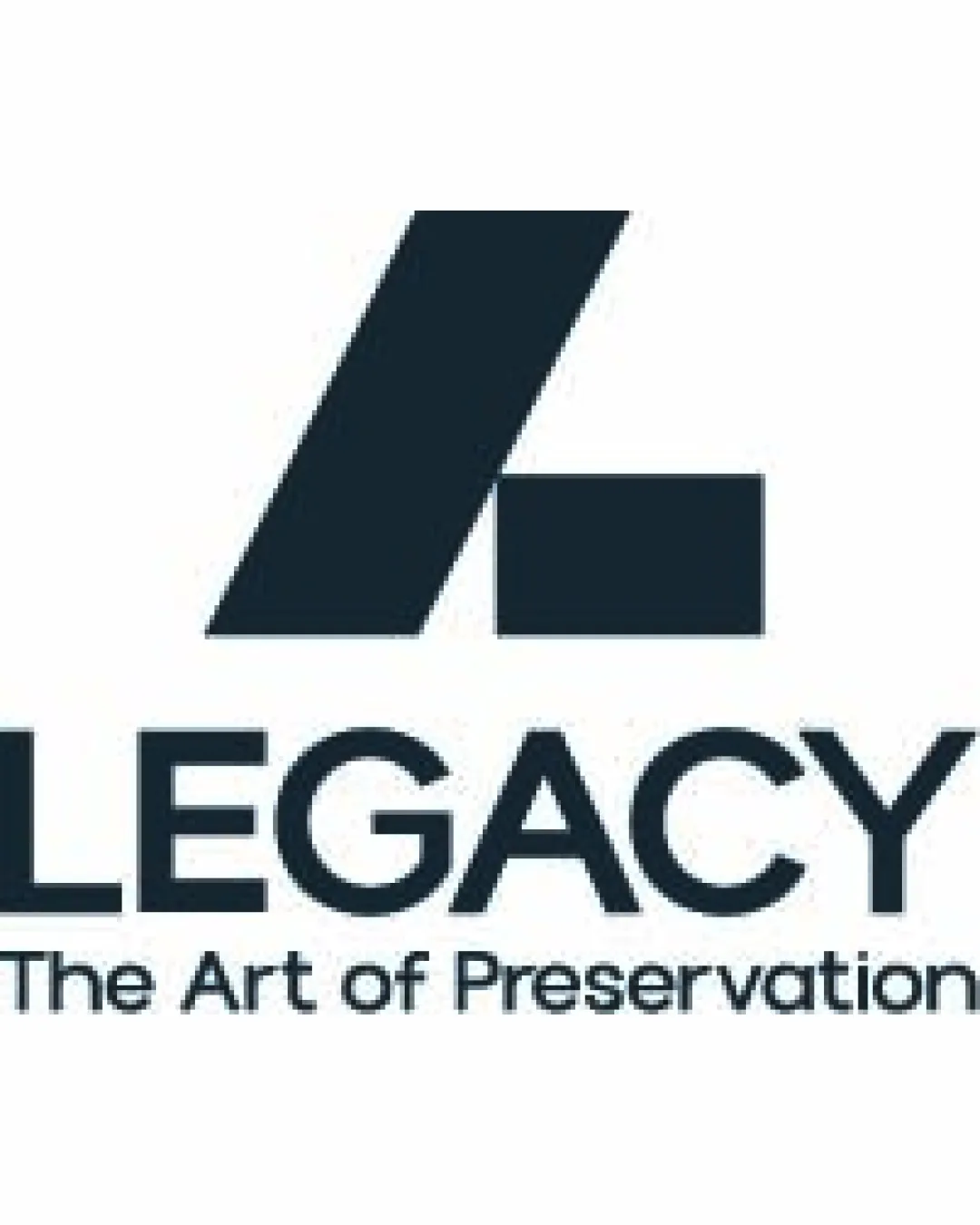
 Logo analysis by AI
Logo type:
Style:
Detected symbol:
Detected text:
Business industry:
Review requested by Kev
**If AI can recognize or misinterpret it, so can people.
Structured logo review
Legibility
Text is clear and readable.
Font choice is strong and professional.
Scalability versatility
Simple enough to scale down effectively.
Can be used on a variety of applications like business cards and billboards.
Thick lines might lose some detail at very small sizes.

200x250 px

100×125 px

50×62 px
Balance alignment
Good alignment between icon and text.
Visual weight is evenly distributed.
The icon could be slightly off-balance due to its unique shape.


Originality
Abstract interpretation of the letter 'L' is unique.
Combination of shapes is distinctive.
Could be more distinctive to avoid similarities with generic 'L' shapes.
Logomark wordmark fit
Seamless integration with text and symbol.
Both elements work cohesively together.
Aesthetic look
Clean and modern aesthetic.
Professional appearance.
Dual meaning and misinterpretations
Color harmony
Limited color palette enhances professionalism.
High contrast improves readability.

