Wondering how your logo performs? 🧐
Get professional logo reviews in seconds and catch design issues in time.
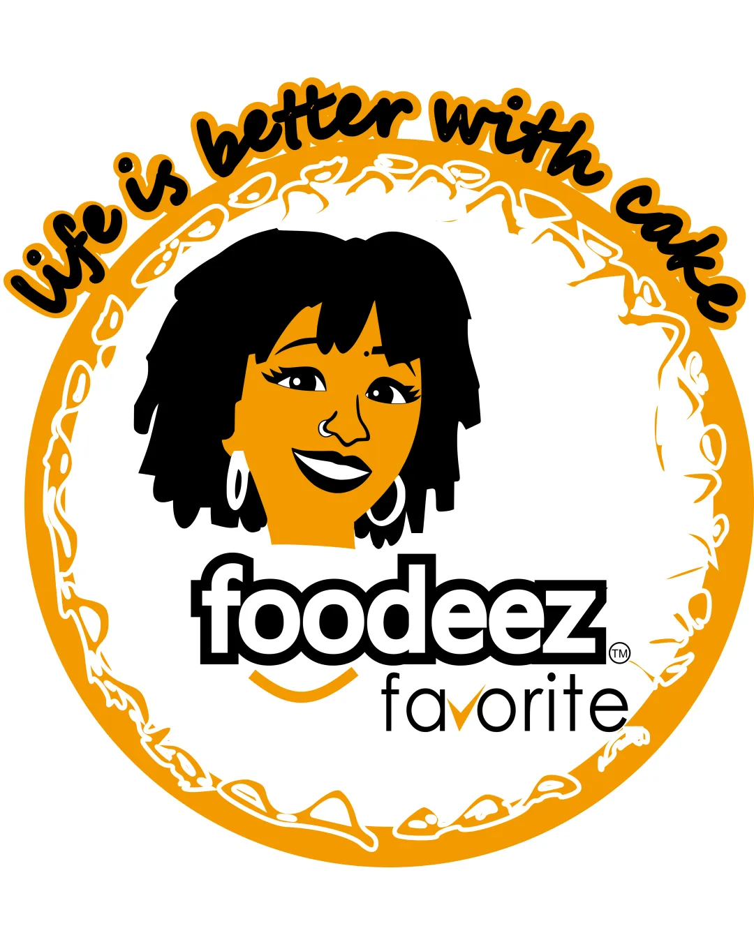
Try it Now!Logo review of life is better with cake, foodeez favorite
 Logo analysis by AI
Logo type:
Style:
Detected symbol:
Detected text:
Business industry:
Review requested by Excelgker
**If AI can recognize or misinterpret it, so can people.
Structured logo review
Legibility
![]() Primary logotype 'foodeez' is bold, clear, and highly readable.
Primary logotype 'foodeez' is bold, clear, and highly readable.![]() 'Favorite' is legible in a lighter, modern sans-serif font.
'Favorite' is legible in a lighter, modern sans-serif font.![]() Tagline 'Life is better with cake' is playful and fun, distinct from the rest of the text.
Tagline 'Life is better with cake' is playful and fun, distinct from the rest of the text.
![]() The tagline’s script style and curvature may cause legibility issues when scaled down.
The tagline’s script style and curvature may cause legibility issues when scaled down.![]() Mix of typefaces can feel a bit disconnected, leading to mild visual hierarchy confusion.
Mix of typefaces can feel a bit disconnected, leading to mild visual hierarchy confusion.
Scalability versatility
![]() Central components bold enough for medium-scale usage like posters or menu boards.
Central components bold enough for medium-scale usage like posters or menu boards.![]() Would reproduce adequately on large-scale applications like storefront signage.
Would reproduce adequately on large-scale applications like storefront signage.
![]() Complex illustration and tagline will lose clarity at small sizes (business cards, stickers, social icons).
Complex illustration and tagline will lose clarity at small sizes (business cards, stickers, social icons).![]() Thin lines within the border and on the 'favorite' text can become indistinct on small-format items.
Thin lines within the border and on the 'favorite' text can become indistinct on small-format items.
200x250 px
100×125 px
50×62 px
Balance alignment
![]() Visual weight is mostly centered with the face anchoring the composition.
Visual weight is mostly centered with the face anchoring the composition.![]() Circular border provides a unified frame for the design.
Circular border provides a unified frame for the design.
![]() The tagline arc is heavy on the top and unbalanced with the lighter bottom portion.
The tagline arc is heavy on the top and unbalanced with the lighter bottom portion.![]() Wordmark and illustration don’t cohesively unify due to spacing and style contrast.
Wordmark and illustration don’t cohesively unify due to spacing and style contrast.![]() The placement of 'favorite' feels detached and awkwardly floating under the logotype.
The placement of 'favorite' feels detached and awkwardly floating under the logotype.

Originality
![]() Custom facial illustration adds personality and memorability.
Custom facial illustration adds personality and memorability.![]() Playful use of script and illustration conveys a warm, welcoming brand.
Playful use of script and illustration conveys a warm, welcoming brand.
![]() Circular logo with a face and slogan is a recognizable template for food/bakery brands and may lack strong differentiation.
Circular logo with a face and slogan is a recognizable template for food/bakery brands and may lack strong differentiation.
Logomark wordmark fit
![]() Face illustration and wordmark share bold, approachable qualities.
Face illustration and wordmark share bold, approachable qualities.
![]() Stylistic disconnect between the detailed cartoon illustration and geometric, clean logotype.
Stylistic disconnect between the detailed cartoon illustration and geometric, clean logotype.![]() The tagline and stylistic elements feel independently developed rather than cohesively integrated.
The tagline and stylistic elements feel independently developed rather than cohesively integrated.
Aesthetic look
![]() Color choices are lively, energetic, and food-appropriate.
Color choices are lively, energetic, and food-appropriate.![]() Overall look is cheerful and friendly.
Overall look is cheerful and friendly.
![]() Overly busy with three distinct text areas, border detail, and cartoon face.
Overly busy with three distinct text areas, border detail, and cartoon face.![]() Visual clutter detracts from modern simplicity and quick recognizability.
Visual clutter detracts from modern simplicity and quick recognizability.![]() Scripted tagline adds additional visual noise.
Scripted tagline adds additional visual noise.
Dual meaning and misinterpretations
![]() No inappropriate visual elements detected in composition or negative space.
No inappropriate visual elements detected in composition or negative space.![]() Cheerful human element reinforces brand warmth.
Cheerful human element reinforces brand warmth.
Color harmony
![]() Strong, consistent palette with high contrast and clear differentiation.
Strong, consistent palette with high contrast and clear differentiation.![]() Orange/black/white is appetizing and friendly for food branding.
Orange/black/white is appetizing and friendly for food branding.
![]() The bright orange may be overpowering in certain use cases or clash with some backgrounds.
The bright orange may be overpowering in certain use cases or clash with some backgrounds.
Orange
#F7A815
Black
#000000
White
#FFFFFF


