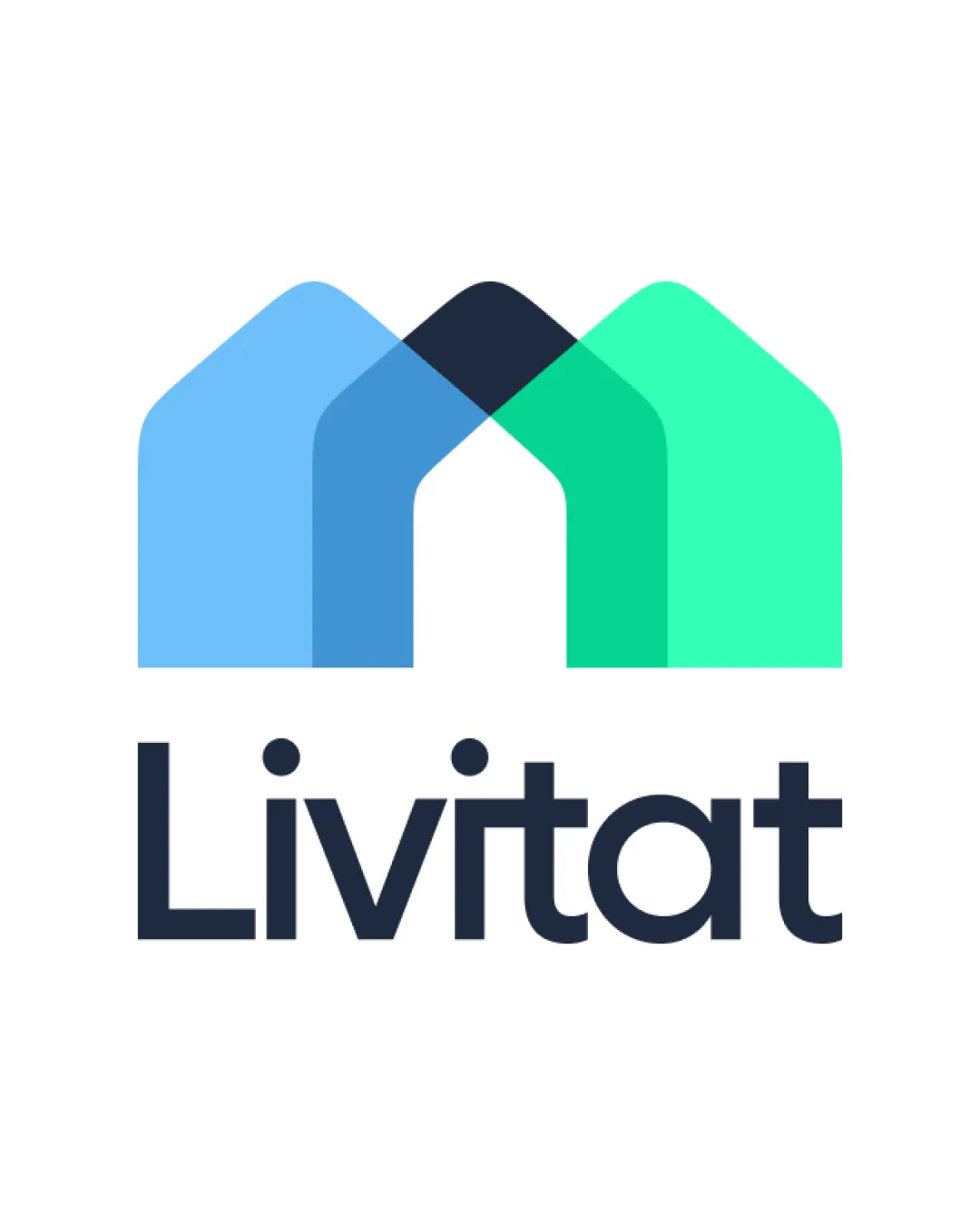
Livitat logo review
4.5/5
Logo score
Logo review of

Livitat

A distinctive, well-executed logo with strong industry relevance and only minor risk in detailed overlap at small sizes.

Combination Modern, Geometric, Overlapping Shapes Real Estate / Living / Home Services
5/5
Legibility
4/5
Originality
5/5
Misread
4/5
Balance
4/5
Scale
Your next steps

What to fix first

Focus on the changes that matter. Keep what makes the logo work.

1

Standalone mark

Test mark clarity and adjust overlap or opacity to avoid murky color blending in the center.

Optional refinement Medium priority Medium effort
Area to inspectApproximate location

The overlap of the house shapes leads to a visually dense center; this could create a focal imbalance, especially at small sizes.

How to check

Test legibility and recognizability of the mark at small sizes.

See the category review
Detailed review

Logo performance breakdown

4.5/5

Brief & logo match

Based on an inferred industry
Compared with

Implied home/living/real estate based on the graphic and name; no explicit brief provided.

Design is highly relevant and distinctive for a home or living-related business.

  • Industry Relevance

    Overlapping house/roof shapes directly signal a connection to homes or living spaces, fitting a real estate or residential brand.

  • Memorability

    The unique house motif and modern palette build strong brand recall potential.

5/5

Legibility

  • Wordmark is very clear and easy to read.
4/5

Originality

  • Distinctive use of overlapping house shapes creates a memorable identity.
5/5

Color harmony

  • Modern color palette with strong contrast.
LightBlue#4DC3FA
LightGreen#22E0BB
DarkBlue#1A2333
Navy#212942

Estimated colors. Use the original design file for exact values.

Create a full color palette using these colors

Create new palette
4/5

Balance alignment

  • Mark and wordmark have proportional weight and good spacing.
  • The overlap of the house shapes leads to a visually dense center; this could create a focal imbalance, especially at small sizes.

    Optional refinement Standalone mark

    Try: Test mark clarity and adjust overlap or opacity to avoid murky color blending in the center.

    Check: Test legibility and recognizability of the mark at small sizes.
    Area to inspectApproximate location
Uploaded logoAlignment guide overlay

Inspect spacing with the guide. Optical balance may differ from geometric centering.

4/5

Scalability

  • Geometric mark is structurally simple and likely scales well.
Uploaded logo at 200 pixels wide
200 × 250 px
Uploaded logo at 100 pixels wide
100 × 125 px
Uploaded logo at 50 pixels wide
50 × 63 px

Compare the detail at different sizes. Labels show the full image dimensions.

5/5

Misinterpretations

  • No confusing or unintended secondary readings.
5/5

Symbol & text fit

  • Symbol and text are well-aligned visually and thematically.

Black & white

Does the shape still work without color?

These tests are available only for logos uploaded in vector (SVG) format.

Background contrast

Find the surfaces where your logo stays clear.

These tests are available only for logos uploaded in vector (SVG) format.

Blur & silhouette

A 3px blur softens fine details so you can check whether the overall shape stays recognizable. If key gaps close or elements merge, the logo may rely too heavily on detail.

These tests are available only for logos uploaded in vector (SVG) format.

Try your own review

Wondering how your logo performs?

Get a clear logo score, key risks, and priority fix ideas before your client or audience sees it.

Review my logo