Wondering how your logo performs? 🧐
Get professional logo reviews in seconds and catch design issues in time.
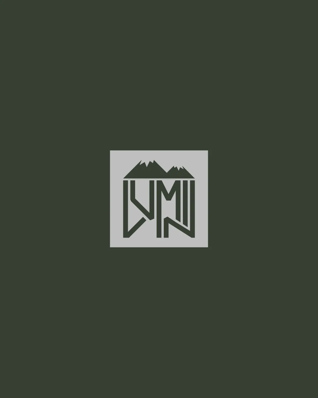
Try it Now!Logo review of LMN
 Logo analysis by AI
Logo type:
Style:
Detected symbol:
Negative space:
Detected text:
Business industry:
Review requested by Roman_oleksiyevych
**If AI can recognize or misinterpret it, so can people.
Structured logo review
Legibility
![]() Letterforms are distinct and generally recognizable.
Letterforms are distinct and generally recognizable.![]() Contrast between logo and background is strong.
Contrast between logo and background is strong.
![]() Angular and connected style makes the 'L' and 'M' less immediately apparent.
Angular and connected style makes the 'L' and 'M' less immediately apparent.![]() Spacing is tight, which may confuse quick reading at a glance.
Spacing is tight, which may confuse quick reading at a glance.
Scalability versatility
![]() Bold, minimal use of lines enhances mid-to-large size application such as signage or apparel.
Bold, minimal use of lines enhances mid-to-large size application such as signage or apparel.
![]() Thin line weights may disappear on smaller scales and digital favicons.
Thin line weights may disappear on smaller scales and digital favicons.![]() Mountain details may become muddled in smaller applications like business cards or embroidery.
Mountain details may become muddled in smaller applications like business cards or embroidery.
200x250 px
100×125 px
50×62 px
Balance alignment
![]() Monogram and mountain are visually centered in the square lockup.
Monogram and mountain are visually centered in the square lockup.![]() Good symmetry between left and right sides.
Good symmetry between left and right sides.
![]() Letter connections feel slightly forced, which disrupts perfect optical balance.
Letter connections feel slightly forced, which disrupts perfect optical balance.

Originality
![]() Creative integration of mountain motif with the LMN monogram.
Creative integration of mountain motif with the LMN monogram.![]() Mountain element adds unique character to the monogram.
Mountain element adds unique character to the monogram.
![]() Use of mountains is fairly common in the outdoor industry, slightly reducing distinctiveness.
Use of mountains is fairly common in the outdoor industry, slightly reducing distinctiveness.
Aesthetic look
![]() Bold and clean execution impresses visually.
Bold and clean execution impresses visually.![]() Minimalist approach avoids clutter.
Minimalist approach avoids clutter.
![]() Geometric lines make the logo feel a bit harsh, lacking organic flow.
Geometric lines make the logo feel a bit harsh, lacking organic flow.
Dual meaning and misinterpretations
![]() No inappropriate or unintended dual meanings detected.
No inappropriate or unintended dual meanings detected.![]() Clear representation without accidental symbolism.
Clear representation without accidental symbolism.
Color harmony
![]() Monochrome color palette offers elegance and maximum versatility.
Monochrome color palette offers elegance and maximum versatility.![]() Strong contrast ensures readability across contexts.
Strong contrast ensures readability across contexts.
Rich Black
#111D14
Iron
#E3E7E8